Logo Strive Enterprise

Conversational Interfaces Are Changing the Way Seattle Websites Convert

Many websites still expect visitors to figure everything out on their own. A person lands on the homepage, sees a long menu, scrolls through several sections, opens a few pages, and tries to guess where to click next. Sometimes that works. Many times it does not. People leave, not because the business is bad, but because the path is unclear.

That is where conversational interfaces are making a big difference. Instead of forcing visitors to sort through a maze of links, categories, and dropdowns, a conversational interface starts with something simple. It asks what the person needs. Then it helps them move in the right direction.

This idea sounds small at first, but the impact can be huge. When a website feels easier to use, people stay longer. When they feel understood, they trust faster. When the next step is obvious, they are more likely to take action.

For businesses in Seattle, this matters more than ever. The city has a strong mix of technology, healthcare, professional services, construction, tourism, home services, education, and growing local brands. It also has a population that is used to digital convenience. People order food from apps, compare services in minutes, book appointments online, and expect websites to respond quickly. If a website feels slow, confusing, or too manual, many users simply move on.

That is why conversational design is becoming such an important topic. It helps websites feel more human, more direct, and more helpful. It reduces confusion and creates a smoother path from visitor to lead, customer, appointment, or sale.

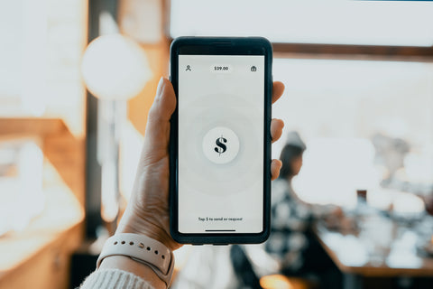
In simple terms, a conversational interface is a digital experience that guides the visitor the way a good employee would. It asks questions, listens to answers, and points the person to the best next step. This can happen through a chatbot, an AI assistant, an interactive form, a guided quiz, a booking flow, or even a search experience that feels more like a conversation than a filter menu.

For a Seattle business, that could mean helping a visitor choose the right legal service, find the right medical treatment, request the right roofing quote, pick the right software plan, or locate the nearest service area without digging through page after page.

The real reason these interfaces perform so well is not just technology. It is psychology. People often want help making decisions. Too many choices create hesitation. Clear guidance creates movement.

Why Traditional Website Navigation Often Fails

Most websites are built from the company’s point of view, not the visitor’s. The menu is based on internal departments, service lines, or technical labels that make sense to the business. But the person arriving on the site may not know what any of that means.

Imagine a Seattle homeowner looking for urgent plumbing help during a rainy week. They are stressed. They are not interested in exploring a website. They want a fast answer. If they land on a page with ten service categories, six subcategories, a generic contact page, and multiple calls to action, they may feel lost almost immediately.

Traditional navigation often creates a few common problems:

  • Too many options at once
  • Labels that are too broad or too technical
  • No clear starting point for new visitors
  • Important actions buried several clicks deep
  • A structure that forces users to think too much

When that happens, visitors start guessing. They click around, open the wrong pages, lose patience, and leave. This is one of the hidden reasons bounce rates rise and conversion rates stay lower than they should.

A person rarely says, this business seems good but the navigation style is outdated. They simply leave without saying anything. The company loses the opportunity, and the problem goes unnoticed.

In a city like Seattle, where people compare businesses quickly and often have many options, that kind of friction is expensive. Whether someone is looking for a Belltown dentist, a Ballard electrician, a software consultant in South Lake Union, or a family law attorney near downtown, the smoother website usually has an advantage.

What a Conversational Interface Really Looks Like

When some people hear the phrase conversational interface, they imagine only a chatbot in the corner of the screen. That is one example, but the idea is much broader than that.

A conversational interface is any digital system that helps a person move forward through guided interaction instead of forcing them to navigate alone.

It can look like this:

  • A message that asks, “What are you looking for today?”
  • A guided service finder that narrows choices based on answers
  • A booking flow that asks the right questions before showing times
  • An AI assistant that recommends the best page, service, or solution
  • A quote tool that asks questions in plain language
  • A smart contact form that changes based on the user’s needs
  • A support tool that routes people faster without long menus

The common thread is simple. The website does more of the work.

Instead of saying, here are 47 things, go figure it out, the site says, tell us what you need, and we will guide you.

That change may sound subtle, but it changes the whole experience. It lowers mental effort. It gives people direction. It feels more personal, even when the system is automated.

Why Guided Experiences Convert Better

People convert when they feel confident. Confidence usually comes from clarity. A guided experience creates clarity by reducing uncertainty at the exact moment a person is trying to make a decision.

Think about the difference between walking into a store with no signs and no staff versus walking into a store where someone asks what you need and takes you straight to the right section. The second experience is faster, easier, and less tiring.

That same logic applies online.

Guided digital journeys tend to perform better because they help visitors do four important things:

1. They reduce choice overload

Too many choices feel like freedom, but in practice they often create hesitation. When users are given a guided path, they spend less time deciding where to go and more time moving forward.

2. They create momentum

When a visitor answers one easy question, they are more likely to answer the next one. Small steps create progress. Progress increases commitment.

3. They feel more relevant

A conversational interface can adjust based on the user’s needs. This makes the website feel more personal. Relevance builds trust.

4. They make action easier

Once the right path is clear, the visitor is more likely to book, buy, request a quote, or contact the business. The site removes effort instead of adding it.

This is especially important for local businesses in Seattle that depend on fast lead generation. Every extra second of confusion can mean a lost phone call, a lost form submission, or a lost appointment.

What This Means for Seattle Businesses

Seattle has a practical, digital-first audience. People in the area are used to strong technology experiences and quick access to information. They do not want to waste time trying to understand what a business does or where to click next.

That makes conversational interfaces a strong fit for many Seattle industries.

Healthcare and clinics

A clinic website can guide visitors by asking if they need urgent care, routine care, insurance information, directions, or appointment scheduling. This is much easier than expecting a patient to search through multiple tabs while worried about their health.

Home services

A plumber, roofer, HVAC company, or electrician in Seattle can use a conversational flow to ask about the issue, location, urgency, and property type. The result is faster lead qualification and a better experience for the user.

Law firms and professional services

Instead of a broad services page with many legal or consulting terms, a guided interface can ask what kind of help the person needs and send them to the right page or intake process.

Real estate and property services

A conversational site can help users decide whether they are buying, selling, renting, investing, or looking for property management. This reduces confusion and increases quality leads.

Technology companies and software providers

Seattle has a strong tech presence, and many software websites are packed with product pages, documentation, integrations, and pricing options. A guided interface can help users identify the right plan or solution faster.

Tourism, hospitality, and local attractions

Visitors coming to Seattle may want quick help finding places to stay, things to do, restaurant suggestions, or booking details. A conversational experience can make those decisions easier.

A local coffee roaster, boutique hotel, tour provider, or event company can benefit from this kind of approach because it brings the digital experience closer to real hospitality.

Local Examples in Seattle That Make the Idea Easy to Understand

It helps to imagine real situations.

Picture a family visiting Seattle for the first time. They want to know whether to spend the day around Pike Place Market, the Seattle Aquarium, the waterfront, or the Space Needle area. A normal website may force them to click through several pages. A conversational interface could ask what kind of day they want, such as family-friendly, scenic, indoor, food-focused, or budget-friendly, then guide them accordingly.

Now imagine a Seattle law firm. A new visitor may not know whether they need a business attorney, contract help, dispute support, or general legal advice. Instead of scanning a long list of services, the site can ask a few plain questions and point them in the right direction.

Or think about a home services company serving neighborhoods like Queen Anne, Capitol Hill, West Seattle, and Bellevue. The website could begin by asking:

  • What problem are you dealing with?
  • Is it urgent?
  • What type of property do you have?
  • Where are you located?

That instantly feels more useful than a generic homepage with a giant menu.

These examples show something important. Conversational interfaces are not only for giant tech brands. They are practical for local businesses too.

The Difference Between Talking and Helping

Not every chatbot helps. That is worth saying clearly.

Some websites add a chat tool just because it looks modern. But if the tool gives vague answers, repeats the same line, or blocks the user from reaching a real solution, it can make the experience worse.

The goal is not to make a website talk more. The goal is to make it more helpful.

A good conversational interface should do these things well:

  • Use plain language
  • Ask useful questions
  • Lead people toward action
  • Provide clear options
  • Know when to hand off to a real person
  • Save time instead of adding steps

If a visitor is trying to get a quote, book an appointment, or find an answer quickly, the conversation should feel smooth and direct. It should not feel like a gimmick.

That is why strong design matters. The best conversational interfaces are built around the customer journey, not around trendy technology.

Simple Ways Seattle Companies Can Use Conversational Design

You do not need to rebuild your entire website overnight to benefit from this approach. Many businesses can start small and still improve results.

Start with one high-intent page

Choose a page where visitors are close to taking action. This could be a services page, pricing page, booking page, or contact page. Add a guided flow that helps them reach the right next step faster.

Replace long forms with guided questions

Many contact forms feel cold and overwhelming. Breaking them into simple conversational steps can improve completion rates and make users feel more comfortable.

Add a smart service finder

If your business has many services, help visitors narrow them down through plain questions rather than making them read everything.

Use conversational prompts on mobile

Mobile users often need even more guidance because screen space is smaller. A simple prompt can help them act faster.

Guide local visitors by intent

A Seattle business can ask if the visitor is looking for same-day help, a free estimate, a consultation, service areas, pricing, or support. That kind of intent-based routing works very well.

Connect the conversation to a real outcome

Every guided experience should lead somewhere useful. That could be a quote request, an appointment, a phone call, a recommended page, a map, or a live handoff.

Why This Works So Well on Mobile Devices

Many people in Seattle browse on their phones while commuting, walking, traveling, or handling several tasks at once. They are not sitting down to study a website. They are trying to solve a problem quickly.

Traditional navigation can feel even worse on mobile because menus collapse, pages become longer, and clicking around takes more effort. A conversational path fits mobile behavior better because it simplifies the experience into small, clear steps.

That is a major reason these interfaces can improve conversions. They are often more natural on the device people already use most.

For example, someone searching on their phone for an emergency roofer during heavy rain in the Seattle area does not want to read five service pages first. They want a quick path to help. A guided interface can get them there faster.

Trust, Speed, and the Feeling of Being Understood

There is another benefit to conversational design that people do not always talk about enough. It creates emotional comfort.

When users arrive on a website and immediately see a helpful question, they feel guided instead of abandoned. That matters because many people come to a website with some level of uncertainty.

They may be asking themselves:

  • Am I in the right place?
  • Does this company handle what I need?
  • Will this take a long time?
  • Is there an easy next step?

A good conversational interface answers those concerns early. It reassures the visitor that they are not alone in figuring things out. That small sense of support can increase trust quickly.

For Seattle brands that want to feel modern, customer-friendly, and efficient, this can strengthen the brand experience as much as the conversion rate.

Common Mistakes to Avoid

While conversational interfaces can be powerful, there are some common mistakes businesses should avoid.

Making the conversation too long

If users have to answer too many questions before getting value, they may drop off. Keep the path focused.

Using robotic or unnatural wording

Plain English works better. People respond well to language that feels clear and human.

Hiding important pages behind the conversation

Some users still prefer direct navigation. A conversational interface should improve the experience, not trap the user inside one path.

Offering generic responses

The guidance should actually help. If every answer leads to the same result, users will notice.

Ignoring local intent

For Seattle businesses, local relevance matters. Mentioning service areas, response times, neighborhood familiarity, or local conditions can make the experience more useful.

What the Future Looks Like

Websites are slowly moving away from being digital brochures and becoming active guides. That shift makes sense. People are busy, attention is limited, and expectations are higher than they used to be.

In the future, more websites will likely feel less like menus and more like smart assistants. Visitors will describe what they need, and the website will help them move forward with fewer clicks and less confusion.

That does not mean every page will disappear or every menu will be replaced. It means the role of the website is changing. Instead of simply presenting information, it will increasingly help people make decisions.

Seattle is a strong place for that shift because the city combines innovation with everyday digital use. Local businesses that adopt more guided experiences now may be better positioned as customer expectations keep rising.

What Businesses in Seattle Should Take Away From This

The main lesson is simple. People do not want more options. They want the right direction.

If a website leaves visitors guessing, even a strong business can lose leads. If a website helps people quickly understand where to go and what to do next, results usually improve.

Conversational interfaces are valuable because they bring order to confusion. They turn a passive website into an active helper. They make it easier for visitors to move from uncertainty to action.

For businesses in Seattle, that can mean better user experience, stronger lead quality, and more conversions from the traffic they already have.

This approach is not about adding hype or making a site look futuristic. It is about making digital experiences easier for real people. When users feel guided instead of lost, good things tend to happen.

If your website currently asks visitors to do too much thinking on their own, there may be a better way to guide them. In many cases, the best next improvement is not adding more pages or more content. It is reducing friction and helping people reach the right answer faster.

That is the real strength of conversational design. It feels simple to the user, but it can create meaningful business results behind the scenes.

Conversational Interfaces Are Changing the Way Miami Websites Convert

Most websites still work the same way they did years ago. A visitor lands on the homepage, sees a menu full of options, and has to figure out where to go next. In theory, that sounds simple. In real life, it often creates hesitation. People click around, get lost, feel unsure, and leave before taking action.

That is one of the main reasons conversational interfaces are getting so much attention. Instead of forcing users to sort through menus, pages, and categories on their own, a conversational interface helps guide them through the experience in a more natural way. It asks simple questions, understands intent, and points people in the right direction faster.

For businesses in Miami, FL, this matters a lot. Miami is full of competition. People here are constantly comparing options, whether they are looking for a law firm in Brickell, a medical clinic in Coral Gables, a roofing company in Kendall, a real estate service in Downtown Miami, or a restaurant in Wynwood. If a website feels confusing, slow, or hard to use, many visitors will leave and go to the next option without thinking twice.

A conversational interface changes that dynamic. Instead of presenting a wall of choices, it creates a guided path. That path can help visitors feel more confident, move faster, and reach the action the business wants them to take, whether that is booking a call, requesting a quote, asking a question, or making a purchase.

This shift is not only about design trends. It is about user behavior. People want clarity. They want speed. They want websites to feel simple. The less mental effort required, the better the experience tends to be.

That is why guided experiences often perform better than traditional navigation alone. When people are given too many choices too early, friction goes up. When they are guided with simple prompts and clear next steps, conversions often improve.

What a Conversational Interface Really Means

When some people hear the phrase conversational interface, they immediately think of a chatbot in the corner of a website. That can be part of it, but the idea is broader than that.

A conversational interface is any digital experience that helps a user move forward through a back and forth style interaction. Instead of saying, “Here are 47 links, go figure it out,” the website says something closer to, “What are you looking for?” and then responds based on the answer.

That response might happen through a chatbot, a guided quiz, a smart form, a service finder, an interactive assistant, or a step by step booking flow. The format can vary, but the purpose stays the same. It reduces confusion and helps people get where they need to go faster.

In simple terms, it turns the website from a static directory into something that feels more like a helpful guide.

Examples of conversational interfaces on a website

  • A home services site that asks what service the visitor needs before showing the right page
  • A medical office website that asks whether the person is a new or existing patient
  • A law firm website that asks what type of case the visitor has
  • An ecommerce store that helps users find the right product through a few short questions
  • A local service company that guides visitors to book an estimate based on their location and needs

These experiences feel natural because they reflect how people communicate in real life. Most people do not walk into a business and scan a giant wall of options in silence. They ask questions. They explain what they need. They respond to prompts. A conversational interface brings more of that same logic into the digital experience.

The Problem With Traditional Navigation

Traditional website navigation is not always bad. In many cases, it is still necessary. Visitors still expect to see menus, important pages, and a clear site structure. The issue is not that navigation menus exist. The issue is that many websites depend on them too much.

When a business keeps adding pages, services, subservices, resources, FAQs, industries, and locations, the site can become crowded. From the business owner’s point of view, this feels helpful. They want to show everything they offer. From the visitor’s point of view, it can feel overwhelming.

That is where friction begins.

Imagine someone in Miami searching for a website design agency, a dental office, or a legal service. They click on a site and see a large menu, several buttons, multiple banners, and different service categories. They may not know where to start. If they do not find the answer quickly, they leave.

This is what too much choice can do. It slows down decision making.

Signs that navigation is creating friction

  • Visitors leave after viewing only one page
  • Important service pages get traffic but few inquiries
  • Users click around a lot but do not convert
  • Forms are abandoned before completion
  • People call or message with questions that the website should have answered clearly

Many businesses assume low conversion means the offer is weak. Sometimes that is true. But in many cases, the real problem is that the user journey is harder than it needs to be.

A person who has to think too much is more likely to leave. A person who feels guided is more likely to continue.

Choice Is Friction and Guidance Helps People Move

One of the most useful ideas behind conversational design is simple. Too many choices create resistance. Clear guidance reduces it.

People like freedom, but they also like clarity. On a website, those two things are not always the same. If visitors are shown too many equal options at once, they often delay action. They compare. They second guess. They wonder which page matters. In some cases, they do nothing at all.

Guidance changes this. Instead of placing all the weight on the user, the interface carries part of the burden. It narrows the path. It reduces uncertainty. It makes the next step feel obvious.

This is especially important on mobile devices, which matter a lot in Miami. Many people browse on their phones while at work, on the move, at a restaurant, in a waiting room, or between errands. Mobile users are even less patient with cluttered experiences. If a site is hard to navigate on a small screen, conversions can drop fast.

A conversational interface is often more mobile friendly because it breaks the experience into smaller, easier steps. Instead of asking a visitor to scan an entire page full of links, it focuses attention one step at a time.

Why guided journeys often work better

  • They reduce the number of decisions users need to make at once
  • They help visitors feel understood
  • They move people toward action faster
  • They make websites feel easier to use on mobile
  • They can improve lead quality by asking better questions early

That is why guided journeys are not just about making a website look modern. They are about helping people feel less lost and more ready to act.

Why This Matters So Much in Miami, FL

Miami is not a slow market. It is fast, crowded, visual, and highly competitive. Businesses fight for attention every day across many industries. People compare brands quickly, and expectations are high. A site that does not help users move forward clearly can lose business very fast.

Think about the variety of users in Miami. You have local residents, seasonal visitors, tourists, international buyers, investors, young professionals, families, and business owners. Many are bilingual. Many are busy. Many are comparing several companies at once. Their patience is limited.

That means a website has a very small window to make the experience feel easy.

Conversational interfaces are useful in a city like Miami because they help simplify choice in a place where people already deal with a lot of noise and options. They can quickly guide a person to the right answer without forcing them to dig.

Local examples where conversational design can help

  • A Miami real estate website can ask whether the visitor wants to buy, sell, rent, or invest
  • A med spa can guide users to the right treatment based on their goals
  • A law firm can direct users to immigration, personal injury, family law, or business law services
  • A contractor can ask for the user’s zip code and service need before showing the right next step
  • A restaurant group can help users choose a location, menu, or reservation option quickly

In each of these cases, the visitor avoids confusion and gets to the point faster. That improves the experience, and in many cases, improves conversions too.

What Makes Conversational Experiences Feel Better to Users

People do not always describe websites in technical terms. They rarely say, “This interface has poor information architecture.” They usually say something simpler, like, “I could not find what I needed,” or “It was confusing,” or “It took too long.”

That is why conversational interfaces can be powerful. They solve a human problem in a human way.

They make websites feel more helpful because they mirror normal communication. The website feels less like a digital brochure and more like an assistant that is ready to help.

What users usually respond well to

  • Short questions that are easy to answer
  • Clear options that reduce guesswork
  • Fast movement from question to answer
  • Relevant follow up based on what they selected
  • A sense that the website understands what they need

When done well, this creates a smoother experience. Visitors feel like progress is happening. They are not just wandering through pages. They are being led somewhere useful.

That feeling matters. A smoother experience builds trust. Trust makes action easier.

Industries in Miami That Can Benefit the Most

Almost any business can use conversational elements in some way, but some industries in Miami can benefit from them even more because their services are complex, urgent, or highly competitive.

Legal services

Many law firm websites list practice areas, locations, attorney pages, and long blocks of text. A visitor dealing with stress may not want to read through all of that. A guided experience that asks what kind of legal issue they have can shorten the path significantly.

Medical and wellness services

Whether it is a clinic, a dental office, a chiropractor, or a med spa, potential patients often have simple questions first. Are you taking new patients? What treatment fits my need? Can I book online? A conversational flow can reduce hesitation and help turn interest into appointments.

Home services

Roofing, plumbing, HVAC, electrical, landscaping, and remodeling companies often serve people who want answers quickly. A conversational assistant can ask what service is needed, whether it is urgent, and where the property is located. That makes the inquiry process easier and can improve lead quality.

Hospitality and tourism

Miami depends heavily on tourism, events, nightlife, and hospitality. Visitors often want fast answers about reservations, directions, hours, menus, and experiences. Conversational interfaces can help reduce confusion and improve user satisfaction.

Real estate and property services

Miami’s real estate market is active and competitive. Buyers and renters often have different goals, budgets, and timelines. A guided interface can help sort that intent early and deliver a more useful path.

Simple Ways Businesses Can Use Conversational Design

Not every business needs a fully advanced AI assistant. In many cases, even a few conversational elements can make a website much easier to use.

The best approach is often to start simple. Focus on the pages where users get stuck the most or where the business loses the most potential leads.

Practical ideas businesses can implement

  • Add a simple question based service finder on the homepage
  • Use a guided quote form instead of one long generic form
  • Create a smart contact flow based on service category
  • Offer a quick assistant for location based routing
  • Use an interactive quiz to match users with the right service or product

These tools do not need to feel robotic. In fact, they work better when the language feels natural. The goal is not to sound futuristic. The goal is to remove friction.

What Businesses Should Avoid

Conversational design can help a lot, but only when it is implemented carefully. Some businesses add a chatbot or guided tool and assume the job is done. That can create a poor experience if the system is annoying, repetitive, or disconnected from what users actually want.

Common mistakes to avoid

  • Making the interaction too long before offering real help
  • Using vague questions that do not move the user forward
  • Forcing users into a chat when they just want direct access to a page
  • Using language that sounds unnatural or overly scripted
  • Failing to connect the conversation to real business actions like booking, calling, or requesting a quote

The best conversational experiences feel light, useful, and efficient. They do not trap the user. They guide the user.

Traditional Navigation Still Has a Role

It is important to be realistic. Conversational interfaces are not meant to replace every part of traditional navigation. People still need menus, page links, footer navigation, and clear structure. Some users prefer to browse on their own, and they should still be able to do that.

The goal is not to remove navigation. The goal is to improve the journey.

In many cases, the best setup is a combination of both. The site keeps strong navigation for users who want to explore, while also offering a conversational path for users who want guidance.

This hybrid approach often works well because it supports different behaviors without forcing everyone into the same experience.

Why This Trend Is Growing

The growth of conversational interfaces is connected to a larger change in digital behavior. People are getting more used to interactive technology in everyday life. They talk to voice assistants, use chat based tools, ask questions instead of typing only keywords, and expect systems to respond in smarter ways.

That changes what people expect from websites too.

If a website still feels like a maze, it can feel outdated even if the design looks nice. Users want websites to do more than display information. They want websites to help them make decisions.

That is why conversational design continues to grow. It matches the direction of user expectations. People want less friction and more direction.

What This Could Look Like for a Miami Business

Imagine a local business in Miami with strong services but a complicated website. The business has invested in design, SEO, and ads, yet the site still loses visitors because too many people are unsure what to do next.

Now imagine that same site adds a simple guided experience near the top of the homepage.

It asks:

  • What are you looking for today?
  • Which service do you need?
  • Are you looking for help now or just exploring options?
  • What area are you located in?

Based on those answers, the site directs the user to the right page, booking form, estimate request, or contact option.

That small shift can make a major difference. Instead of leaving people to figure everything out alone, the site acts like a helpful team member.

For many Miami businesses, that could mean more qualified leads, fewer abandoned visits, and a stronger connection between traffic and actual conversions.

What to Remember Moving Forward

The core idea behind conversational interfaces is not complicated. People convert better when the path feels clear. Traditional navigation often asks users to do too much work. Guided experiences reduce that burden.

For businesses in Miami, FL, this matters even more because competition is strong and attention is short. Visitors want quick answers and smooth experiences. They do not want to guess their way through a website.

When a website helps users move with confidence, it becomes more than an online brochure. It becomes a tool that supports action.

That is why conversational interfaces matter. They make digital experiences feel simpler, more human, and more useful. And when that happens, users are often more likely to stay, engage, and convert.

For businesses looking to improve results online, the lesson is clear. A website should not just present options. It should help people move forward.

Why Guided Website Experiences Are Winning in Las Vegas

Las Vegas is built around attention. Every business is competing for a few seconds of interest before a visitor moves on to the next option. That is true on the Strip, in local service businesses, in hospitality, in entertainment, and online. People want fast answers, clear direction, and an easy path to the thing they already came for. When a website makes them stop, think, compare, and guess, many of them leave before taking action.

That is one reason conversational interfaces have become such an important topic. A conversational interface is a guided digital experience that talks to the user in a simple, helpful way. Instead of asking people to explore a big menu and click around on their own, the website asks a question like, “What are you looking for?” Then it guides them toward the right page, service, product, or next step.

For many businesses, this changes the entire experience. Traditional website navigation often puts pressure on the visitor. The visitor has to understand the layout, learn the labels, pick the right path, and hope they made a good choice. A conversational interface changes that. It reduces uncertainty and replaces it with direction.

This matters even more in Las Vegas, where many users are in a hurry. A tourist looking for a last minute reservation, a homeowner needing urgent help, a business owner comparing services, or a local customer browsing on a phone does not want to study a complicated website. They want a fast route to the answer.

That is why guided experiences often perform better than traditional self directed navigation. The simpler the path, the easier it is for a visitor to stay engaged. The easier it is to stay engaged, the more likely that person is to convert.

What a Conversational Interface Actually Means

The term may sound technical, but the idea is simple. A conversational interface is any digital feature that helps users move forward through a question and answer style interaction. It can be a chatbot, a guided search tool, a smart form, a service finder, a virtual assistant, or even a landing page that adapts its next step based on what the visitor selects.

The key point is not the technology itself. The key point is the experience. A conversational interface feels like help. Traditional navigation often feels like work.

Imagine opening a website and seeing a long list of menu items, dropdowns, buttons, categories, and service pages. You have to decide where to start. That can feel overwhelming, especially if you are not familiar with the business, the industry, or the website’s structure.

Now imagine opening a website and seeing one simple prompt: “Tell us what you need.” From there, the website asks one or two useful questions and takes you directly to the most relevant option. That feels lighter. It feels easier. It feels like the website understands what people actually came to do.

Examples of conversational interfaces

  • A hotel website that asks whether the visitor wants to book a room, reserve a table, or ask about event space
  • A local law firm website that asks what type of case the visitor needs help with
  • An HVAC company site that asks whether the problem is urgent, routine, or part of a new installation
  • An ecommerce site that asks what product goal the shopper has before showing options
  • A medical practice website that asks whether the visitor wants to book an appointment, verify insurance, or ask a question

In each case, the system is doing something important. It is reducing friction. It is helping the user make progress without asking them to understand the whole site first.

Why Traditional Navigation Often Loses People

Traditional navigation is not useless. It still has value, and many websites need it. But on its own, it can create too much effort for the average visitor. Most users do not arrive ready to explore. They arrive with a goal. If the website does not help them reach that goal quickly, their patience fades.

Many websites are designed from the business’s point of view instead of the visitor’s point of view. The menu reflects departments, internal categories, brand language, or service groupings that make sense to the company but not necessarily to the customer.

Let’s say a person lands on a website for a Las Vegas home service company. The menu might show options such as solutions, maintenance plans, installations, commercial services, financing, service areas, promotions, about us, resources, and support. Those options may all be valid, but they also create mental work. The visitor has to interpret the labels and guess where the real answer is.

That guesswork hurts performance. Every extra choice adds delay. Every unclear label adds doubt. Every extra click increases the chance that a user gives up. This is especially true on mobile, where screens are smaller and patience is shorter.

Common problems with traditional navigation

  • Too many choices presented at once
  • Labels that sound clear to the company but not to the visitor
  • Important actions hidden inside dropdown menus
  • Pages that force people to read too much before acting
  • Mobile layouts that make browsing slower and more frustrating

Choice can feel like freedom, but too much choice creates friction. That is one of the most important ideas behind conversational design. When people have less confusion, they usually move faster.

Why Guided Experiences Often Convert Better

A guided experience works because it matches natural behavior. In real life, when people need help, they ask a question. They do not want a map of every possible answer. They want someone or something to point them in the right direction.

That same principle applies online. If a website can act more like a helpful guide and less like a maze, the experience becomes easier to trust and easier to use.

Guided experiences improve conversion because they simplify decision making. They narrow the path. They organize information in the order the user needs it. They reduce the chance of the wrong click. They also make the experience feel more personal, even when the interaction is automated.

That does not mean every visitor wants to have a long conversation with a chatbot. In fact, many do not. What they want is a fast, smart interaction that gets them somewhere useful. A good conversational interface respects that. It asks only what matters and then moves the person forward.

Why guidance helps conversion

  • It reduces hesitation
  • It gives users a clear next step
  • It helps people find what fits them faster
  • It prevents visitors from landing on the wrong page
  • It turns passive browsing into active progress

For businesses, that can mean more inquiries, more bookings, more calls, more form submissions, more product views, and better quality leads. A visitor who reaches the right place faster is more likely to take action.

Why This Matters So Much in Las Vegas

Las Vegas is not an average market. It is fast, competitive, and full of different types of visitors. Some people are local residents. Some are business travelers. Some are tourists making quick decisions from a phone while walking through a casino, leaving a show, or heading to dinner. Some are event planners comparing options on tight timelines. Some are homeowners or business owners who need a service now, not later.

Because of that, a Las Vegas website often has to serve users with very different goals and very little time. A traditional menu can slow them down. A guided interface can help separate those audiences quickly and direct each one to the right experience.

Take a resort or hotel website in Las Vegas. One visitor wants to book a room. Another wants to reserve a restaurant. Another wants to check a show schedule. Another needs information about wedding packages. Another wants to ask about a convention or private event. Putting all of those paths into a standard navigation menu may still work, but it asks the user to figure it out alone. A guided interface could ask one simple question and instantly segment the visitor into the right journey.

The same applies to local businesses. A med spa in Las Vegas may serve tourists looking for a same day appointment, local clients interested in monthly treatments, and customers who want pricing before anything else. A guided experience can direct each group more efficiently than a static menu with many service categories.

Las Vegas use cases where conversational design makes sense

  • Hotels and resorts with multiple booking goals
  • Restaurants managing reservations, group dining, and private events
  • Entertainment businesses selling tickets and answering visitor questions
  • Home service companies handling urgent and non urgent requests
  • Medical and wellness practices guiding appointment types
  • Law firms qualifying leads by case type
  • Real estate businesses helping users filter by intent and budget

Las Vegas businesses often live or die by speed. The faster the website can connect the user to the right next step, the better the results tend to be.

What Makes a Good Conversational Interface

Not every chatbot or guided tool is useful. Some feel slow, robotic, or annoying. A good conversational interface is not there to show off technology. It is there to remove obstacles. The experience should feel natural, easy, and useful from the first interaction.

A good system starts with simple questions. It avoids unnecessary steps. It does not force people into a long script when a short answer would do. It uses plain language. It makes the next action obvious.

Most importantly, it is built around real user intent. It should reflect the actual reasons people visit the website, not just what the company wants to say.

Traits of a strong conversational experience

  • It starts with one clear question
  • It uses normal language instead of technical language
  • It gives options that match real customer needs
  • It moves quickly and does not feel heavy
  • It works well on mobile devices
  • It allows users to reach a human if needed
  • It supports the main conversion goal, not distracts from it

For example, a Las Vegas roofing company could ask: “What do you need help with today?” The choices could be roof repair, leak inspection, storm damage, commercial roofing, or request an estimate. That is better than expecting the user to guess whether they should click services, support, contact, or commercial solutions.

The best conversational interfaces are often the simplest. They guide, they clarify, and then they get out of the way.

Local Examples From Las Vegas Businesses

To understand the practical value of conversational design, it helps to picture how it would work in real local situations.

A restaurant near the Strip

A busy restaurant may get traffic from tourists, locals, convention attendees, and group planners. A guided interface can ask what the visitor wants to do. The options could be reserve a table, view the menu, book a private event, or ask a question. This removes confusion and gets each person to the right place fast.

A personal injury law firm

A law firm in Las Vegas may handle car accidents, slip and falls, hotel injuries, rideshare accidents, and workplace cases. Many visitors do not know which category they fall into. A conversational interface can ask a few quick questions and guide them to the relevant intake path.

A med spa or cosmetic clinic

People may be interested in injectables, facials, laser treatments, skin tightening, or consultations. A good guided tool can help first time visitors who are not sure where to begin. Instead of making them browse many service pages, it can help them narrow the options based on goals.

A home service company

In Las Vegas, homeowners dealing with AC issues in extreme heat do not want to hunt through a complicated menu. A guided prompt like “Is this an emergency?” can immediately route urgent cases toward the fastest call or booking path, while routine visitors can go to maintenance or installation pages.

In each example, the business gains something powerful. The website becomes easier to use, and the customer feels supported instead of confused.

Simple Does Not Mean Small

Some businesses worry that reducing choices will make the website feel less complete. In reality, the opposite is often true. Simplicity does not mean removing depth. It means organizing depth in a smarter way.

A conversational interface does not have to replace the whole website. It can sit on top of it. The full content, menus, service pages, and resources can still exist. The difference is that users who need faster help are not forced to dig through everything first.

This is important because different visitors behave in different ways. Some want to explore. Others want direct answers. A smart website can support both.

Ways to combine conversational and traditional navigation

  • Keep the standard menu, but add a guided assistant on the homepage
  • Use a service finder for visitors who are unsure where to start
  • Add a smart booking flow for high intent traffic
  • Use guided questions on landing pages for paid ads
  • Create mobile first prompts that simplify common actions

This blended approach works well because it respects user choice while still reducing friction for those who want a faster path.

How Businesses Can Start Without Overcomplicating It

Many business owners hear terms like AI, chatbot, automation, and conversational UI and assume the project must be complex or expensive. It does not have to start that way. In many cases, the best first step is not a full advanced system. It is simply a more guided digital experience.

The first question to ask is this: what are the top reasons people come to your website? Once that is clear, you can build a guided path around those reasons.

A Las Vegas business could start by reviewing call logs, contact form submissions, customer service questions, and landing page data. These usually reveal patterns very quickly. Most visitors are not trying to do ten things. They are trying to do a few common things. That gives you the foundation for a better user journey.

Practical first steps

  • Identify the top three to five user goals on the website
  • Write those goals in plain language
  • Create a homepage prompt that reflects those goals
  • Build short guided paths to the right pages or actions
  • Test the experience on mobile first
  • Track whether more people complete the desired action

For example, a Las Vegas dental office may discover that most visitors want to book an appointment, confirm insurance, get pricing information, or ask about emergency care. Those can become the main conversational choices. That instantly makes the site easier to use.

What Businesses Should Avoid

Even a good idea can fail if it is executed poorly. Some conversational tools create more friction instead of less. That usually happens when businesses focus too much on the tool and not enough on the user.

If the interaction feels slow, forced, or overly scripted, people lose patience. If the chatbot keeps asking questions without helping, it becomes a barrier. If the system hides basic information behind unnecessary prompts, users may feel trapped instead of guided.

Common mistakes to avoid

  • Asking too many questions before giving value
  • Using robotic or unnatural wording
  • Making the visitor talk to the tool when a simple button would work
  • Hiding contact information behind the conversation flow
  • Forgetting to offer a human option when needed
  • Building the experience around company language instead of customer language

The goal is not to force conversation. The goal is to remove confusion. If the interface does that well, users will respond positively. If it slows them down, it will hurt the experience no matter how advanced it looks.

The Real Business Value Behind Better Guidance

At the end of the day, this is not just a design trend. It is a business issue. A website that guides users well can improve the quality of leads, reduce bounce rates, support faster decisions, and make marketing traffic perform better.

For Las Vegas businesses spending money on SEO, Google Ads, social media, email campaigns, or local search, the website experience matters just as much as the traffic source. Driving clicks to a confusing website wastes attention. Driving clicks to a guided experience gives those visitors a better chance of converting.

This is especially important in competitive markets where user expectations are high. People compare brands quickly. If one site feels easier, clearer, and more useful, that brand often wins the action.

Conversational interfaces are not magic, and they are not the answer to every problem. But they reflect an important shift in digital behavior. People do not want to work hard to find what they need. They want websites to help them move with confidence.

That is the real lesson. Guidance creates momentum. Momentum creates action. And in a city like Las Vegas, where every click has value and every second matters, that can make a meaningful difference.

Why More Las Vegas Brands Should Pay Attention

Many businesses still think website success depends mostly on visual style. Design does matter, but a beautiful website that makes people think too much is still difficult to use. What often matters more is clarity. Can the visitor understand the next step right away? Can they find the right path without effort? Can they act without frustration?

That is where conversational thinking becomes valuable. It changes the focus from showing everything to guiding people toward what matters most. It respects attention. It respects time. It respects the fact that not every visitor is ready to decode a full website structure.

In Las Vegas, where customer attention moves quickly and competition is everywhere, that kind of clarity can become a real advantage. Businesses that make digital experiences easier will usually be in a stronger position than businesses that keep adding more options, more pages, and more complexity.

Better guidance is not about making a website talk more. It is about making it easier for people to move forward. That is why conversational interfaces continue to matter. They turn websites from passive information hubs into active tools that help visitors get where they need to go.

Accessible Web Design for Austin Businesses and Better User Experience

Good design is not only about making a website look modern. It is also about making sure people can actually use it. That is where accessibility comes in. Many people hear the word and assume it only applies to a small group. In reality, accessible design helps almost everyone. It helps people with disabilities, older adults, busy users on mobile phones, people dealing with glare on a screen, and even customers trying to complete a task quickly while distracted.

For businesses in Austin, TX, this matters more than ever. Austin is a fast growing city with a strong mix of startups, local service businesses, restaurants, health providers, shops, music venues, real estate companies, and tech brands. In a city with so much competition, your website needs to be easy to use for as many people as possible. If your site is hard to read, hard to navigate, or confusing on mobile, you are likely losing visitors before they ever call, buy, book, or fill out a form.

Accessibility is often discussed as a legal or ethical topic, and it is true that those angles are important. But there is another side that many businesses overlook. Accessibility is also practical. It can improve user experience, support SEO, increase conversions, and help people trust your brand. In simple terms, accessible design can help your business perform better online.

That is why this topic deserves more attention in Austin. A website should not force people to struggle just to read a page, click a button, or find basic information. Clear text, strong color contrast, meaningful alt text, logical page structure, and keyboard friendly navigation are not little details. They shape the entire experience. When people feel comfortable using your site, they are more likely to stay longer and take action.

What accessible design really means

Accessible design means creating a website that people with different needs and abilities can use without unnecessary difficulty. This includes people with visual, hearing, motor, or cognitive disabilities. It also includes users dealing with temporary situations, such as a broken arm, tired eyes, poor lighting, or a noisy environment.

For example, a person with low vision may need strong contrast between text and background. A person who cannot use a mouse may need to navigate your site with a keyboard. Someone using a screen reader may rely on proper headings and alt text to understand the page. A person with attention difficulties may benefit from a clear layout and simple navigation.

Accessible design is not about building a separate version of your website for a small group of people. It is about building one better website that works well for more people from the start. That makes it both a smart design choice and a smart business choice.

Accessibility is not only for one type of user

One common misunderstanding is that accessibility only helps people with severe disabilities. That is not true. A lot of accessibility practices improve the experience for everyday users.

Think about someone in Austin checking your site from their phone outside a coffee shop on South Congress in bright sunlight. Strong contrast helps them read your content. Think about a busy parent trying to book an appointment while holding a child. Bigger buttons and simpler forms help them move faster. Think about an older customer searching for a local service on a tablet at home. Clear text and well organized pages help them feel more confident.

When businesses see accessibility only as a technical checklist, they miss the bigger picture. This is about removing friction. Every improvement that reduces friction can make your website easier to use, more welcoming, and more effective.

Why this matters for businesses in Austin

Austin has a unique business environment. It is a city known for technology, creativity, tourism, education, healthcare, real estate growth, events, and small business energy. With so many choices available to consumers, people are quick to leave a site that feels frustrating.

Whether someone is searching for a law firm near Downtown Austin, a restaurant near East Austin, a home service company in South Austin, or a boutique near The Domain, they expect a smooth digital experience. If they land on a page that is hard to read, hard to click through, or confusing to navigate, they may leave and choose a competitor instead.

Accessibility can become a competitive advantage because it improves the basics that people notice right away. A clear layout makes your business seem more professional. Readable text makes your message easier to understand. Better navigation helps people find answers faster. These are simple things, but they have a direct effect on whether users stay engaged.

Austin audiences are diverse and digital

Austin attracts students, families, professionals, retirees, business owners, remote workers, and visitors from around the country. That means your website may be viewed by people with many different devices, internet speeds, ages, and accessibility needs.

Some people may browse your site from a brand new laptop with a fast connection. Others may use an older phone, a screen reader, or only a keyboard. Some may be comfortable with technology. Others may not be. If your website only works well for one kind of user, you are shrinking your audience without even realizing it.

Accessible design helps your business meet people where they are. In a city as active and varied as Austin, that flexibility matters.

The simple business case behind accessibility

It is easy to think of accessibility as something extra, but it is closer to a performance upgrade. A website that is easier to use often produces better business results. Visitors can find information faster. They can understand your offer more clearly. They are less likely to get stuck during key actions such as calling, booking, buying, or filling out a form.

This matters because every extra point of confusion can cost you a lead. If a potential customer cannot read your service page comfortably, they may not contact you. If your navigation is unclear, they may leave. If your checkout or contact form is difficult to complete, they may give up. Accessibility helps reduce these losses.

Accessible design can support SEO

Many accessibility improvements also make your site easier for search engines to understand. For example, clear heading structure helps organize content. Alt text gives context for images. Descriptive link text helps explain where a click will lead. Cleaner page structure can improve the overall quality of the experience.

This does not mean accessibility automatically guarantees top rankings. SEO depends on many factors. But accessibility supports a more understandable and usable website, which is good for both users and search visibility. When your content is easier to interpret and your pages are better structured, you are building a stronger foundation.

Accessible design can improve conversions

A conversion happens when a visitor takes the action you want, such as calling your office, requesting a quote, scheduling a consultation, joining a mailing list, or making a purchase. Accessibility helps because it removes the obstacles that prevent people from completing those actions.

If a form has unclear labels, some users may not finish it. If buttons are too small, some users may click the wrong thing. If important text blends into the background, users may miss the offer completely. If a page is confusing, users may not trust the business enough to continue.

On the other hand, when people can move through your site with confidence, conversions tend to become easier. In that sense, accessibility supports better outcomes not through tricks, but through clarity.

Common accessibility issues many websites still have

Many websites look polished on the surface but still fail at basic usability and accessibility. Some problems are easy to overlook during design or development. Others happen because businesses focus too much on style and not enough on function.

Low contrast text

Light gray text on a white background may look sleek in a design mockup, but it can be hard to read in real life. This is especially true for older users, people with low vision, and anyone using a screen outdoors. In Austin, where bright sunlight is common, poor contrast can become even more frustrating on mobile devices.

Readable text should be easy to see without strain. Strong contrast helps everyone, not only people with diagnosed vision issues.

Poor keyboard navigation

Not every user navigates with a mouse or trackpad. Some depend on a keyboard. If a person cannot move through menus, buttons, and forms by pressing the tab key, your site may be difficult or impossible for them to use.

Keyboard access is one of the clearest examples of accessibility in action. It also tends to reveal whether the site is organized logically. If the tab order is confusing, that confusion often affects the full user experience.

Missing or weak alt text

Alt text is a short description added to an image so screen readers can explain that image to users who cannot see it well. Good alt text should be useful and specific when the image adds meaning. If your page has an image of a storefront, product, service, or chart, that description can matter.

Alt text also helps search engines understand image context. So while its main role is accessibility, it can offer SEO value too when done correctly.

Unclear headings and messy content structure

A page should be organized like a clear conversation. Headings help users scan the content and understand what each section covers. Screen readers also rely on heading structure to help users move through a page.

If a page jumps around with random font sizes and no clear section order, it becomes harder to follow. That is frustrating for all readers, not only those using assistive technology.

Forms that are harder than they need to be

Forms are often where businesses lose leads. Sometimes labels are missing. Sometimes error messages are vague. Sometimes the fields are too small or too crowded. If people cannot easily understand what to enter, they may stop halfway through.

Accessible forms use clear labels, helpful instructions, and logical spacing. They guide people instead of making them guess.

Real life examples for Austin businesses

Let us bring this closer to home. Imagine an Austin based HVAC company with a website that gets traffic from homeowners searching during summer heat. A visitor lands on the site in a hurry, looking for emergency service. If the phone number is hard to spot, the buttons are small, and the text is difficult to read on mobile, that lead may disappear. Better accessibility could make the difference between a bounce and a booked call.

Now imagine a restaurant near Rainey Street with an online menu and reservation form. If the menu uses low contrast colors and the booking process is confusing, users may leave and pick another place. Accessible design helps people browse comfortably and reserve with less effort.

Consider a clinic in North Austin with patients of different ages. An older adult may need larger text and a cleaner page layout to schedule an appointment. A parent may need to complete a form quickly from a phone. A patient using assistive technology may need a form that is properly labeled. In each case, accessibility improves the experience and supports the business goal.

Local competition makes usability even more important

Austin has many strong businesses competing online. Even if your service is excellent, your website still needs to make a strong first impression. Users may compare several businesses in minutes. If one site feels smooth and easy while another feels stressful, the choice becomes easy.

Accessible design helps you stand out in a positive way. It shows care, professionalism, and attention to detail. It tells visitors that your business respects their time and makes things easier instead of harder.

Accessibility and brand trust

Trust is built through experience. People may not always use the word accessibility, but they notice when a website feels easy and comfortable. They also notice when it feels frustrating.

A clean and readable site sends a message. It suggests that the business is organized, thoughtful, and serious about quality. A cluttered or hard to use site can create doubt, even if the business itself is strong.

In Austin, where many consumers have high expectations online, digital trust matters. People often judge businesses quickly by the quality of their websites. Accessibility improves that impression because it usually leads to clearer communication and a better user journey.

Small details shape big impressions

A button that is easy to find. Text that does not strain the eyes. A page that works well on mobile. An image with a useful description. A form that clearly says what went wrong. These may sound like small things, but together they create a strong experience.

When businesses ignore these details, users feel the result. When businesses improve them, users feel that too. That is why accessibility is not separate from branding. It is part of how your brand is experienced online.

What businesses can do to improve accessibility

The good news is that accessibility does not always require a complete rebuild. Many improvements can start with the basics. The most important step is to stop seeing accessibility as something extra and start treating it as a standard part of good website quality.

Use readable text and strong contrast

Start with your content. Make sure text is large enough to read comfortably. Choose colors that create enough contrast between text and background. Avoid making style choices that look trendy but hurt readability.

If someone visits your site from a mobile phone in bright Austin daylight, your content should still be clear. That is a practical test that many businesses can understand right away.

Organize pages with clear headings

Use headings in a logical order so users can scan the page easily. Each section should have a clear purpose. This helps readers, screen reader users, and search engines understand the page more effectively.

When a page is structured well, people feel less overwhelmed. That helps them stay engaged.

Write useful alt text for important images

Not every decorative image needs a long description, but meaningful images should include alt text that explains their purpose. If the image supports a service, shows a product, or provides useful context, the alt text should help communicate that.

Think of alt text as part of the content, not as an afterthought.

Make forms simpler and clearer

Review every form on your site. Ask whether the labels are clear, whether the instructions are simple, and whether error messages actually help the user fix the problem. Reduce unnecessary fields when possible. Keep the process easy.

For service businesses in Austin, forms are often one of the most important conversion points. Improving them can have a direct effect on lead generation.

Check keyboard access

Try using your own site without a mouse. Move through the navigation, buttons, and forms using the keyboard only. If the experience feels awkward or broken, that is a sign your site needs work.

This simple test can reveal problems that are easy to miss during normal browsing.

Accessibility is also good customer service

Sometimes accessibility sounds technical because it is often discussed in design and development circles. But for business owners, another way to think about it is customer service. A website is often the first place people interact with your business. If that experience is difficult, it is like greeting customers with confusion instead of clarity.

Good customer service means making things easier for people. It means being clear, respectful, and helpful. Accessible websites do exactly that. They reduce effort, lower frustration, and help people get what they came for.

This is especially important for local businesses in Austin that rely on trust, word of mouth, and quick online decisions. Whether someone is trying to book a service, ask a question, compare options, or make a purchase, your website should support them, not slow them down.

People remember friction

Even if users do not complain directly, they remember when a site feels difficult. They may not explain that your contrast was weak or your form labels were unclear. They may simply leave and choose another business.

That is why accessibility should not be seen only as something to avoid problems. It should be seen as a way to create better experiences that people appreciate and remember.

Moving forward with a stronger website in Austin

For Austin businesses, accessible design is not just a nice improvement. It is part of building a website that works in the real world. It helps people read, navigate, understand, and take action. It supports better user experience, stronger trust, and a broader reach. It can also support SEO and conversions by making your website clearer and easier to use.

The most important idea is simple. When your website is easier for more people to use, your business becomes easier to choose. That applies whether you run a law firm, medical practice, home service company, eCommerce brand, restaurant, agency, or local shop in Austin.

Accessible design is better design. It respects the user, improves the experience, and strengthens the performance of your website at the same time. In a growing city like Austin, that kind of improvement is not small. It can shape how people see your business from the very first click.

If your website has not been reviewed through that lens yet, this is a smart time to start. Better contrast, cleaner structure, stronger navigation, clearer forms, and more thoughtful content can go a long way. Often, the result is not just a more accessible website. It is a more effective website overall.

Navigating the Digital World: How to Find Peace of Mind in Web Design and Digital Marketing Services

In today’s fast-paced digital landscape, establishing a strong online presence is essential for businesses and individuals alike. From websites that serve as virtual storefronts to digital marketing strategies that drive engagement, the digital world offers tremendous opportunities. However, it’s also a realm that can evoke a range of worries and concerns, especially for those embarking on the journey for the first time. In this blog post, we’ll explore some of the common concerns that prospective clients often have when considering web design and digital marketing services and offer insights on how to find peace of mind in this dynamic space.

At Strive Enterprise, we’re your silent companions on the path to digital peace. Together, we can explore how our expertise can transform concerns into confidence, and hesitation into harmonious success in the digital sphere!

The Budget Worries

https://unsplash.com/photos/black-android-smartphone-3-Tc_5LROrM

Concern: One of the most common worries is the budget. Clients often wonder if they can afford professional web design and digital marketing services, especially if they’re a small business or a startup.

Solution: It’s essential to recognize that digital services come in a variety of price ranges. The key is to align your budget with your goals. Start with a clear understanding of what you want to achieve and find a service provider that offers scalable solutions. Remember, digital marketing can be highly cost-effective when executed strategically, delivering a strong return on investment (ROI).

The ROI Question

https://unsplash.com/photos/500-indian-rupee-banknote-4kIM7ED8F1A

Concern: Clients often question the return on investment for web design and digital marketing services. They wonder if the money they invest will translate into tangible results.

Solution: ROI is a legitimate concern, but it’s essential to view it in the long term. Digital marketing, when done right, can yield substantial ROI. Look for a service provider that can provide case studies or references to demonstrate their track record. Moreover, define clear, measurable goals and ensure they align with your business objectives. Transparency and data-driven strategies can help you track progress and gauge the impact of your investment.

The Complexity Conundrum

https://unsplash.com/photos/green-blue-and-yellow-text-on-computer-screen-O2MdroNurVw

Concern: The digital world can seem complex and overwhelming. Clients worry about navigating the intricacies of web design, SEO, PPC advertising, and other digital marketing strategies.

Solution: Digital marketing can indeed be intricate, but you don’t have to go it alone. Seek a service provider that offers guidance and education throughout the process. A good partner will explain the complexities in simple terms and involve you in decision-making. You don’t need to be a digital expert; you just need a trusted guide.

Transparency and Trust

https://unsplash.com/photos/a-man-and-a-woman-shaking-hands-in-front-of-a-laptop-qFSQFSmfZkA

Concern: Clients may fear a lack of transparency in digital marketing services. They worry about hidden costs, undisclosed strategies, and uncertain outcomes.

Solution: Transparency should be a non-negotiable factor in your partnership. Look for a service provider that provides clear, itemized pricing and a breakdown of services. Ask for regular reports and updates on progress. A trustworthy provider will have nothing to hide and will welcome your questions.

Achieving Desired Results

https://unsplash.com/photos/turned-on-black-and-grey-laptop-computer-mcSDtbWXUZU

Concern: The ultimate worry is whether the services will deliver the desired results. Clients fear investing time and resources without seeing their online presence grow.

Solution: Finding the right partner is crucial to achieving desired results. Look for a service provider with a proven track record and a portfolio of successful projects. Ask for references and case studies. Additionally, communicate your goals and expectations clearly from the beginning. A good provider will tailor strategies to align with your objectives.

At Strive Enterprise, we are dedicated to turning your concerns about achieving your desired results into successful outcomes. Hand-in-hand, we can discover how our time-tested strategies and customized approach can propel you towards your online objectives.

Finding Peace of Mind in the Digital World

  • Seek Recommendations: Ask for recommendations from peers or industry associations. Word of mouth is a powerful indicator of a service provider’s reliability.
  • Check Reviews: Look for online reviews and testimonials. Feedback from previous clients can provide valuable insights into the service provider’s performance.
  • Inquire About Experience: Don’t hesitate to ask about the service provider’s experience in your industry or niche. Experience often translates into a better understanding of your specific needs.
  • Evaluate Communication: Assess the provider’s communication style and responsiveness. Effective communication is key to a successful partnership.
  • Request a Consultation: Many service providers offer free consultations. Take advantage of this opportunity to discuss your concerns, goals, and expectations in detail.
  • Review Contracts Carefully: Before committing, review service agreements carefully. Ensure they outline services, timelines, pricing, and expectations clearly.
  • Start Small: If you’re unsure, consider starting with a smaller project to gauge the service provider’s capabilities and reliability.

The digital world is undoubtedly complex, but it’s also a realm of boundless opportunities. Your peace of mind in web design and digital marketing services can be achieved through careful planning, education, transparency, and choosing the right partner.

At Strive Enterprise, we understand the worries and concerns that can come with venturing into the digital landscape. Our team is dedicated to addressing these concerns and empowering you to navigate the digital world with confidence. We offer scalable solutions that align with your budget and goals, ensuring that you receive a strong ROI on your investment. Our transparent communication and data-driven strategies provide clarity and peace of mind as we work together to achieve your desired results.

In your quest for peace of mind in web design and digital marketing services, don’t hesitate to reach out to us. We are experienced professionals who can provide guidance, support, and a customized approach to help you succeed in the digital age. The digital landscape is full of potential, and with Strive Enterprise as your partner, you can harness it to achieve your goals and thrive online.

“Why Do I Need a Website if I Have Social Media?” Dallas Web Design vs Social Media for Business

In the era of social media dominance, you might be wondering, “Do I really need a website if I have a strong presence on platforms like Facebook, Instagram, and Twitter?” It’s a valid question, but one that deserves careful consideration. While social media is undoubtedly a powerful tool for connecting with your audience, building a brand, and driving engagement, it shouldn’t be a substitute for having your own website. In this blog post, we’ll explore the reasons why a website is still essential, even in the age of social media.

Elevate your digital strategy with Dallas Web Design at Strive Enterprise, where we blend the art of web design with the science of digital marketing. Hop on a transformative journey that transcends the limits of social media and unlocks the true potential of your brand online with the help of a trusted Dallas website design agency!

https://unsplash.com/photos/a-close-up-of-a-computer-screen-with-a-graph-on-it-qfp4-Ud6Fyg

1. Ownership and Control

Your Digital Headquarters: Your website is like your digital headquarters. It’s the one place on the internet that you own and control entirely. Unlike social media platforms, where rules and algorithms can change at any moment, your website is yours to design, manage, and customize as you see fit. You have full control over the content, design, and user experience.

No Algorithmic Limitations: Social media platforms use algorithms to determine what content is shown to your followers. With a website, you don’t have to worry about your content getting lost in a crowded feed or facing restrictions due to platform policies. Your website’s content is always accessible to visitors.

2. Credibility and Professionalism

Online Credibility: Having a website lends credibility to your brand. It shows that you’re serious about your business or endeavor. A well-designed website with professional content and contact information instills trust in your audience. It’s a place where potential customers or partners can go to learn more about you in a structured and professional manner.

Branding Control: Your website allows you to create a cohesive and branded online presence. You can align your website’s design, colors, and messaging with your brand identity, ensuring consistency across all touchpoints.

Here at Strive Enterprise, we help boost a brand’s credibility and establish trust with their audience through Dallas Web Design. As a trusted Dallas website design agency, we always work together with our clients to create a professional and credible online presence that aligns perfectly with their brand identity.

3. Content Ownership and Longevity

Content Preservation: On social media, your posts may disappear over time, buried by newer content. On your website, you have the ability to create an archive of your content, making it accessible for years to come. This not only helps with SEO but also allows you to showcase your journey and accomplishments over time.

https://unsplash.com/photos/white-and-pink-digital-device-Tk9m_HP4rgQ

Evergreen Content: Websites are perfect for hosting evergreen content such as blog posts, articles, and resources. These pieces can continue to attract organic traffic and provide value to your audience long after they’re published.

4. Search Engine Visibility

SEO Benefits: Search engines like Google favor websites when it comes to ranking content. A well-optimized website with quality content can rank higher in search engine results pages (SERPs). This means more people can discover your business or content through organic search, expanding your reach beyond your social media followers.

5. Customization and Flexibility

Tailored User Experience: Your website allows you to create a tailored user experience. You can design landing pages, interactive features, and e-commerce capabilities that align with your specific goals. This level of customization is often limited to social media platforms.

6. Data and Analytics

In-Depth Insights: Websites provide you with detailed analytics about your visitors. You can track user behavior, demographics, and engagement metrics. These insights help you understand your audience better and make data-driven decisions to improve your online strategy.

https://unsplash.com/photos/graphs-of-performance-analytics-on-a-laptop-screen-JKUTrJ4vK00

7. E-Commerce and Monetization

Direct Sales: If you sell products or services, a website offers a direct platform for e-commerce. You have full control over your sales process, payment gateways, and customer interactions. It’s an essential tool for businesses looking to sell online.

Monetization Opportunities: For bloggers, content creators, and entrepreneurs, websites offer various monetization opportunities, from affiliate marketing to ad revenue. You can diversify your income streams beyond what social media platforms provide.

8. Ownership of Customer Relationships

Direct Communication: With a website, you can collect visitor information and build your email list. This allows you to communicate directly with your audience, nurturing relationships and keeping them informed about your latest updates, products, or offers.

9. Privacy and Data Control

Data Security: You have control over user data and privacy on your website, ensuring that you comply with data protection regulations. This is crucial for safeguarding your reputation and building trust with your audience.

10. Future-Proofing Your Presence

Adaptability: While social media platforms come and go, your website remains a constant. It serves as a hub that can adapt to changing trends and integrate with new technologies. You can seamlessly incorporate social media feeds, plugins, and integrations into your website.

If you’re prepared to make your website a dynamic hub that adapts to trends and integrates new technologies effortlessly, Dallas website design agency Strive Enterprise is the perfect partner as we always communicate properly—your dream design + our magic = your website’s enhanced adaptability and staying ahead of the digital curve!

https://unsplash.com/photos/macbook-pro-on-top-of-brown-wooden-table-during-daytime-KiEiI2b9GkU

At Dallas Web Design agency Strive Enterprise, we’re committed to helping you achieve your online goals. With a team of experts led by our founder, Jose Silvera, boasting over nine years of industry experience, we offer comprehensive web design and SEO services.

Our dedication to excellence and recognition in the form of international awards set us apart as a leading Dallas website design agency. We specialize in tailoring solutions to your unique needs, ensuring your digital presence stands out. If you’re ready to enhance your online presence and achieve digital success, contact us today.

15 Signs That You Are Talking to a Good Las Vegas Website Design Agency

In the digital age, your website is often the first point of contact between your business and potential customers. It serves as your virtual storefront, a reflection of your brand, and a powerful marketing tool. Therefore, when it comes to Las Vegas website design, you want nothing but the best. But how can you tell if you’re talking to a good Las Vegas website design agency? We’ve got you covered with an in-depth guide to help you identify the signs of a top-notch Las Vegas web design partner.

Ready to transform your online presence? Your journey to exceptional web design starts here. Join forces with Strive Enterprise, where innovation meets design excellence—embark on a digital transformation that will set your brand apart in the digital arena!

https://unsplash.com/photos/black-smartphone-near-person-5QgIuuBxKwM

1. A Stellar Portfolio: The Proof Is in the Pudding

A good Las Vegas website design agency will proudly showcase its portfolio of past projects. Take the time to explore their previous work in detail. Look for diversity in design styles and industries served. A portfolio should reflect creativity, innovation, and the ability to tailor designs to the unique needs of each client. Pay attention to the user experience (UX) in the showcased websites. A well-designed site should be intuitive and easy to navigate.

2. Client Testimonials and Reviews: Real-World Feedback

Client feedback is invaluable. Check for client testimonials and reviews on the agency’s website, Google, or social media platforms. Positive reviews and satisfied clients are strong indicators of a reputable Las Vegas website design agency. Dive deeper by reading the content of the reviews. Are clients praising the agency’s communication, responsiveness, and problem-solving skills? These factors are often just as important as design prowess.

At Strive Enterprise, we take pride in our long list of satisfied clients and positive reviews. Our commitment to communication, responsiveness, and delivering exceptional results sets us apart as a trusted Website Design Las Vegas agency.

3. Clear and Open Communication: The Foundation of Success

Effective communication is paramount to a successful web design project. A good agency will be transparent about their processes, timelines, and costs. They will listen to your ideas and goals and provide clear explanations of their strategies. Look for an agency that asks questions about your business, target audience, and objectives. Their understanding of your needs will shape the success of your project.

https://unsplash.com/photos/two-person-handshaking-vWchRczcQwM

4. Comprehensive Services: Beyond Aesthetics

Website design is more than just aesthetics. It involves user experience (UX) design, responsive design for mobile devices, SEO optimization, content strategy, and more. A good agency offers a comprehensive suite of services to ensure your website not only looks great but also performs well and ranks high on search engines. They should be well-versed in the latest design trends and digital marketing strategies.

5. Customization: Tailored to Your Business

One size does not fit all when it comes to web design. A reputable agency will tailor their designs to your specific business needs and target audience. They won’t rely on cookie-cutter templates but will create a unique online presence for your brand. Customization goes beyond aesthetics; it involves understanding your brand’s identity and values.

6. SEO Expertise: Visibility in the Digital Jungle

A well-designed website is only effective if it can be found online. A good agency understands the importance of search engine optimization (SEO) and will incorporate SEO best practices into your site’s design and content. They should conduct thorough keyword research, optimize meta tags, and ensure your site is structured for search engine visibility.

https://unsplash.com/photos/laptop-computer-on-glass-top-table-hpjSkU2UYSU

7. Mobile Responsiveness: Where the World Is Heading

With the majority of internet traffic coming from mobile devices, it’s essential that your website is mobile-responsive. A good Las Vegas Web Design agency like Strive Enterprise ensures that your site looks and functions flawlessly on smartphones and tablets. This includes optimizing images and content for smaller screens and providing an intuitive touch experience.

8. Up-to-Date Technology: Staying Ahead of the Curve

The digital landscape evolves rapidly, and your website should stay up-to-date with the latest technologies. A good agency stays ahead of the curve and can integrate new features and trends seamlessly into your site. They should be familiar with emerging technologies such as Progressive Web Apps (PWAs), chatbots, and artificial intelligence.

9. Strong Project Management: Timely Completion

The timely completion of your project is crucial. A good agency will have a well-defined project management process in place, ensuring that your website is delivered on time and within budget. They should provide you with a clear project timeline, milestones, and regular updates on progress.

10. Ongoing Support and Maintenance: Beyond the Launch

Your relationship with a Las Vegas website design agency shouldn’t end when your site goes live. Look for an agency that offers ongoing support, maintenance, and updates to keep your website running smoothly. Regular updates are essential for security, bug fixes, and keeping your content fresh.

Just like how we do things here at Strive Enterprise: making our Clients experience ongoing excellence. We’re committed to providing continuous support to ensure your website stays secure, updated, and vibrant. If you’re seeking a web design partner who values long-term relationships and ongoing excellence, we can embark on a journey of digital growth together!

https://unsplash.com/photos/person-using-laptop-FlPc9_VocJ4

11. Competitive Pricing: Quality Comes at a Price

While quality comes at a price, a good agency offers competitive pricing without compromising on the quality of their work. Be cautious of agencies that significantly undercut the market, as this can be a red flag. A transparent pricing structure with no hidden fees is a sign of professionalism.

12. Legal and Ethical Practices: Respecting the Rules

Ensure the agency adheres to legal and ethical standards. They should respect copyright laws, provide proper attribution for images and content, and use licensed software. Ethical practices build trust and protect your business from potential legal issues.

13. Results-Oriented: Measuring Impact

Ultimately, a good website design agency is results-oriented. They measure success by the impact your website has on your business, whether that’s increased traffic, higher conversion rates, improved brand recognition, or better user engagement. They should be able to provide data-driven insights into the performance of your site.

14. Accessible Portfolio: Inclusive Design

Check if the agency’s portfolio includes accessible websites. Accessibility ensures that all users, including those with disabilities, can navigate and interact with your site. An inclusive design approach not only benefits users but also enhances your brand’s reputation.

15. Personality Fit: A Harmonious Partnership

Last but not least, consider the personality fit between your business and the agency. A good working relationship is built on trust, respect, and collaboration. You should feel comfortable discussing ideas, providing feedback, and working together toward common goals.

https://unsplash.com/photos/selective-focus-photography-of-people-sits-in-front-of-table-inside-room-sggw4-qDD54

In conclusion, choosing a Website Design Las Vegas agency is a pivotal decision for your business. By evaluating these key factors in-depth, you can confidently identify whether you are talking to a good Las Vegas Web Design agency. Remember, your website is an investment in your brand’s future, so it’s essential to partner with a team that can turn your online vision into a reality.

In your pursuit of a top-tier website design agency, consider Strive Enterprise. As an award-winning company with a proven track record, we are dedicated to helping businesses thrive online in the realm of Las Vegas Web Design.

At Strive Enterprise, we bring expertise, dedication to excellence, and a commitment to customization to every project. Whether you’re looking for web design, SEO services, or comprehensive digital marketing solutions in the context of Website Design Las Vegas agency, we’re here to empower your digital journey. Contact us today to take your online presence to the next level with Strive Enterprise.

Getting A Website: What You Need To Know

by Charleen Montano April 1, 2022

So, you’re thinking of getting a website for your business.

But you’re stuck on the process of where to start, what should be things to consider, and you’re having trouble getting the best design that fits your business.

Do you really need a website? Is getting a website essential to growing a business?

Well, yes, and yes!

“Your website is one of the biggest assets your business has, it’s like a salesman that never stops and keeps your door open 24/7”

You can think of your website as the front door to your business; it provides your clients with more information about you and gives them a sense of what you offer. So, make a good impression through it by taking the time to learn about what you need to know before getting one.

Ready to dig in? 

Let’s do this.

Is video more your thing? See the video version of the post, right here:

See dozens more videos on our YouTube channel.

Jose Silvera – YouTube

In this guide we will be covering the following:

What is a Website? (Most common types of Websites)

How does the website work?

Why do you need a website?

The 5 Elements to know before getting a website

How do you want your website to serve your business? (Factors to consider when getting a website)

Ready to get the most creative and catchy website?

WHAT IS A WEBSITE?

OK, let’s start by defining it briefly.

So, what is a website exactly?

Generally, a website consists of one or more web pages as well as related content that is published on one or more servers under a common domain name.

Websites usually consist of photos, videos, and text, and contain information about a business or organization.

Examples are wikipedia.orggoogle.com, and amazon.com. All publicly accessible websites collectively constitute the World Wide Web.

But what are the types of Websites by the way?

What kind of websites will you actually need?

There are actually dozens of different types of websites, and choosing one that is right for your business is crucial. And in order to choose the web that is right for your needs as a designer or small business owner, you need to be familiar with all the types of web pages available.

And because we care for you so much, here are the most popular type of websites you should know:

  • Business

            Basically, a business website serves to provide general information about your company or as a platform for e-commerce.

  • eCommerce

            It allows people to buy and sell physical goods, services, and digital products online rather than in a physical location. It also allows a business to accept orders, ship and handle logistics, and provide customer service.

  • Personal Blog

            This site allows people to share their experiences or information with other readers on any topic.

  • Online Portfolio

            Online portfolios (also called digital portfolios) are a digital collection of works, skills, and experiences that you have developed.

  • Online forum

            A website that facilitates the exchange of information between users about a particular topic. The forum allows for questions and answers and may be monitored to ensure that the content is appropriate.

  • Non-profit websites

            While non-profit websites do not intend to sell products or services to their visitors, they still need to convince people to donate to their cause. Charity organizations use their websites to connect with potential patrons.

  • Brochure website

                        It is a short site that contains the main information people need to know about your business. In addition to allowing uninterrupted access to information about you and providing communication with those who visit your website, the brochure website also serves as a communication tool for your customers.

Often, business uses their websites to attract leads or prospects but don’t close sales through them. Instead, the website aims to generate qualified leads and allow them to submit their information to the business, who will then contact them directly.

It should be obvious by now that the purpose of having a website is to express yourself in any way you wish.

But, let me explain it further, but briefly….

HOW DOES THE WEBSITE WORK?

Not a techie? No worries. It is vital that you know how a website works to avoid being taken for a ride in the future.

It’s easy for anyone to understand what a website is: we click on the letters with the blue thing, we Google things, we type in the www-dot-something, then we are looking for a bunch of pictures. Websites work like that right?

To explain it further, as soon as your domain name is typed into a visitor’s browser address bar, their computer makes a request to connect to your web server. DNS looks up the server’s IP address before the request reaches the webserver.

Web servers are internet-connected computers that receive requests to display web pages. An IP address provides your computer with access to a web server.

That’s how websites work.

Don’t worry, you don’t need to understand everything to get a website. Just knowing a simple glimpse of how it works will do. You just gotta have an idea.

Really.

Now, you got an idea of what is a website and how it works. And now you are thinking, why do you need one.

Are you a small business owner? Did you just start your business and your friend told you that you need to get one?

Hmm, I like your friend.

Really.

So, if I was right then keep reading. We will help you out.

WHY DO YOU NEED A WEBSITE?

 The majority of businesses cannot survive without a web presence, so there is no reason not to have one. You can make great use of your company’s website as an effective marketing tool. The benefits outweigh the downsides.

 In fact, “81% of retail shoppers research products online buying.” GE Capital Retail Bank reports that a majority of retail consumers start their search online.

Customers would be unlikely to think of you without a website.

Therefore, if you do not have a website for your business then you are not set up for success.

 Now, you must be thinking “So, does this mean I simply need a website to gain customers and then become successful?”

 The answer is: Yes and no, my friend.

 Businesses often make the mistake of thinking that any website will do. The logic goes: If you build it, they will come. Beware! It is also better to not have a website than have a bad one.

 By getting a website, I recommend you talk to an expert about it. They can help you out with the type of website you are looking for or what may be the type of website that fits your business. Or if you have a friend that can help you out, then talk to them.

 The process of getting a website is not that as simple as “Hello, and thank you.” You need to go through all the factors to consider. Talk to someone you can trust to avoid making a mistake and regret it in the future.

Trust me, it will all be worth it!

 And because we care a lot about you so much,

 Here’s the list of things presented by Jose Silvera – Owner of the GUI Web Pro, CEO of Strive Enterprise, a website expert, digital Marketer recognized by Google, and Bing ads for training campaigns with over 100% conversion rates.

THE 5 ELEMENTS YOU SHOULD HAVE BEFORE YOU BEGIN GETTING A WEBSITE:

Images

Make sure you have images that represent your business. Whether you hire a professional photographer or a friend who takes good photographs, I recommend taking your own picture. It is important to get your original picture.

Imagine visiting a website and seeing familiar Google images, the experience will make a bad impression on you and your business.

Images can be used to draw attention to your site and direct your visitor’s gaze. Using them to present information can be very beneficial. Additionally, images are a great way to draw your visitors in and engage them in your content.

 Now, you must realize that using your own pictures on your site will not only make you unique but will also help you build rapport and trust with your customers.

 Domain Name

A good way to name your website is [Businessname].com. In addition to making your website appear more professional, by having a website address such as this, you can establish a brand.

 Avoid having a website name such as  “We are the best in the market – dot-com.” — No! Please. Do you know how that sounds?

 I hope you know.

 It sounds lame, my friend. So, do me a favor. Don’t do that. Thank you.

 Remember this formula: yourbusinessname.com that will do the trick.

 Text / Content

When getting a website, you should also consider getting the text before you begin. Think about what you really want to highlight such as your experiences.

Content that captures the reader’s attention can be challenging. The average website visitor will spend just a few seconds on the page before deciding what to do. To figure this out, you must also know your audience, which we will discuss later on this page, by doing so, as they are seeing what they want, they are most likely to stay longer and even engaged.

Logo

By creating an original logo for your business, you will be able to create or establish your brand. You should ensure it is creative and attractive enough to catch the attention of potential clients.

 Ensure your logo reflects your business and the services you provide.

 You can hire someone to create one for you by getting freelancers from websites such as fiverr.com and upwork.com and of course, pays them as per their particular rate in dollars to build an awesome logo for you. Or, you can create your own if you are crafty and know how to use Photoshop.

 Now, if you have these 5 elements, you are good to go.

 Do not even begin until you have it!

 OK, So, you have those 5 things done? Now what?

 WELL, THE NEXT THING TO CONSIDER IS: HOW YOU WANT YOUR WEBSITE TO SERVE YOUR BUSINESS…

 Think about…..

What is the Purpose of your website? Or what SHOULD be the purpose of your website?

                   This could be something like, “I want to have some online presence because my business is already established and I’m doing fine.” Or you just want people to glance at your design and the stuff you do, or you want to have a place you want to show your portfolio, and whatever…

Just think of the things like, what do you want a website to do for you, what do you want the website to accomplish, or why do you want a website?

Let me help you…

Understand Your Customer.

A businessman should, of course, understand their customer by doing some research and knowing who they are and what they want such as general preferences that could easily catch their interest. 

“In the business world, it doesn’t matter what you like, but what the customer likes!”

So, here is what he got to say for getting to understand your customer: Get a sheet of paper and make your customer’s profile.

 Take note: If you are a business owner, you are helping your customer’s problem. You are solving them. So, figure out what their problem is and make a solution for them.

In general: By knowing your customer’s backgrounds, you will have an idea of what they want and how to help them out. Build a rapport!

Keep in mind: Only the relevant things, you can ask them. Don’t be a stalker, it’s illegal:)

 Create an Appropriate Design.

Now, we get to the part of the design. You might want to consider how your website should look, but you have no idea what that should be like. Make sure to not make your website look like that of your competitors, or you will fall behind them. 

Making a good impression on potential customers is easier with a well-designed website. You can also nurture leads more effectively and increase conversion rates. More importantly, it provides an enjoyable user experience for your website visitors, allowing them to navigate and access it easily.

So, by getting a website you should also make a big consideration on what is your customer’s general ideal design. And going back to the last topic, you can achieve this by getting to know their preferences and how you can make it an enjoyable experience for them for visiting your website.

Remember to always think about how to keep your customers interested in your business, and don’t even consider what your competitors do to their sites.

“If you just copy the competition, they will always be ahead of you.”

Be unique and original!

Dominate the market!

Be the map, let them follow you!

READY TO CREATE THE MOST AMAZING AND CATCHY WEBSITE?

 If you’ve made it this far, then looks like you can start looking for a good designer/developer.

 Great business owners aren’t born, they are made.

 Go and take the lead!

 Hey, before we say goodbye. Would like to meet the most amazing web developers that can help you with your problem in getting the right website for you?

 I know,

 I should’ve said it before, but here you go….

Contact us!

Strive Enterprise Official Website

Strive Enterprise has been selected among the Top Web Design Companies in Las Vegas by Designrush

We are the Best Web developers & Online Marketers in Las Vegas, Nevada!

Check out our Portfolio

We Also Offer Digital Marketing For Small & Big Businesses, SEO, E-Commerce, WordPress, PPC Campaign Development & Management for Google, Bing & Yahoo!, Facebook Ads, and more!

Adios!  See you!

Strive Enterprise has been selected among the Top Web Design Companies in Las Vegas by Design rush

3 Ways Web Designer/Developers Charge You

by Charleen Montano April 8, 2022

As a general rule, you should expect a web designer to charge based on their proficiency. On top of that, you’ll have to pay for the monthly maintenance. However, this depends on the nature of the website. And have in mind that custom websites will cost more.

But before we dig into this, if you are a small business owner I want to remind you that you don’t need to have a fancy website to start. A decent website will do for a fresh start and then you can upgrade later.

However, if you are willing to take the chance and if you are ready to take the risk then do it.

“If you’re going to achieve your dream, go higher.”

I love this quote, it inspires me to look forward to something in life without even knowing what that is….

ANYWAYS!

Here we go.

Is video more your thing? See the video version of the same topic, right here:

See dozens more videos on our YouTube channel.

Jose Silvera – YouTube

What Affects Website Design Prices?

When it comes to creating and maintaining websites, web design encompasses many different skills and techniques. As a result of these overlapping roles, web design encompasses a wide range of skill sets from graphic design to authoring to Search Engine Optimization.

Setting up a price is a pain for web designers. I mean, as much as their effort and talent go, it is fair enough to price themselves however, considering the high level of competition in the market, as well as to pay rent and eat, setting a decent profit while aiming to get a client is also part of the equation.

Nevertheless, if you are a client, you may want to take a look and see what you are paying for.

Size. The page size is equal to the sum of the page sizes of each of these files. For instance, a 420 KB web page will consist of a 110 KB HTML document, a 223 KB image, and an 87 KB sheet file, all of which take up space.

When it comes to your website’s search engine rankings, page size does play a role. Both your websites’ ranking and its performance will be impacted.

To put it simply, your website would cost more since the web designer needs to do more to your website to accomplish this.

Design. The type of business and the necessity of the entrepreneurs influence the choice of website design. Each of these websites will be built on a different platform. Web design is the process of designing websites that appear on the internet. In website development, user experience is usually a consideration rather than software development.

Customization. Allows you to choose what you want your users to see or how you want the information on your website to be displayed. In general, the harder it is to apply, the higher the cost.

SEO. Search Engine Optimization is a term used to describe the process of improving your website so that it appears higher in search engine results when people search for products or services that are relevant to your business.

A website must build its SEO because it raises your website’s visibility, resulting in increased traffic and, ultimately, more sales.

Content. Text, images, and audio are all examples of web content that can be found online and used by users as part of their experience on a website. In addition to text and images, multimedia content, such as online videos and audio files, can be included on web pages.

Mobile website. To access a traditional website, one must have a computer, which includes a mouse and a large monitor. Smartphones and tablets with smaller screens and touchscreens are used to access mobile websites.

You will increase the number of users by giving them the option to search your website both on computers and mobile devices. This will also make your website more accessible at any time.

Email Newsletter. In simplest terms, an email newsletter is a message sent to a list of people who have signed up to receive it. Included in this list should be the customer’s agreement to receive marketing communications from your brand via digital mediums. Both current and potential customers are included here.

Training. Launching your website will require your employees to learn how to use it, so training will increase the cost of website design.

Apart from what was mentioned above, prices also vary by adding Social Media, Usability, Content Management System, and Additional Revisions to your website.

The 3 Ways Web Developer Charge You.

Ok, so now let’s go into the ways your developer charges you.

 The profession of a web designer/developer is one that requires a hands-on approach – there is a lot to study to become an expert.

 Study and coding are the only things that the finest web designers and developers do.

 Yay nerds!

 So, how would they really charge you by executing your desired website for your business?

 Before you begin your project, always remember that you can pay for their services in several ways, so make sure to include this in your contract before stepping any steps forward. Check this out: Want to Get a Website for Your Business? Here’s How. In this blog, we tackle the contract and planning in getting a website. 

 And to answer the question, here you go,

1). FIRST HALF BEFORE START AND SECOND HALF BEFORE THE LAUNCHING.

Generally, you will be required to pay half of your agreed price before anything is completed. This is usually done upon signing the contract.

And then you proceed with going through the process of making the website then boom! Your website’s done and then you pay the rest of the amount. 

Case closed.

Nah! Make sure to do all the testing and then you’re good to go.

This type of payment method is commonly used, and it covers both parties. The first payment is the first step to ensure your developer that he will be compensated, and that will serve as a kick-start for them. The rest of the payment is for you to ensure that they will complete the project according to your specifications. And worst of all, they won’t disappear during that time.

But, hey! Again, should you be reading the previous article to avoid that?

And because I care about you so much, here you go: Want to Get a Website for Your Business? Here’s How.

2). START-UP FEE OR SET-UP FEE

 As mentioned above, the most common method used is First Half Before Start and Second Half Before the Launching, however, in my opinion, by using a Start-Up fee you can get the most out of it.

I mean, typically in this method, you will be paying less than the original price for the service, and then you’ll be paying a monthly fee which usually includes maintenance. Maintenance covers updates, little SEO, little content changes, and so on depending on the agreement. Some companies though, provides promo images, content creation, etc.

Maintenance! In this way, you will be able to make sure that your website will be okay for the rest of your life for as long as you want it to.

Right? I mean, just my opinion.

In addition, the start-up fee for a website usually costs $300 or so then monthly fees will also depend on your developer or your agreement.

Right? What do you think?

Always remember that the start-up fee method will be a good choice only if you’re going to use it and take advantage of it. Make sure to utilize the service and make your monthly payment worthwhile.

Come on, it’s a pretty cool deal!

2). PAY IN THREE PARTS (BEFORE YOU START, AT THE MIDDLE OF THE PROJECT, THEN BEFORE LAUNCHING)

Payment in this manner is not very common because this often leads to conflicts between the client and web developer.

 Typically, in this method, you will be paying around 30% of the total payment of the service before anything else or before implementing the project. Then, another payment for the other 30% should be done midway, and lastly, 40% shall be done before the website launching.

 Now, usually, conflicts begin in the last part in which most of the clients stop paying after the second payment. The common reason is, busy and will pay after the launch which leads to never. This is sometimes an issue and it happens pretty much often so better yet pay before launch.

 As a matter of fact, some companies take down sites because of the same reason.

 Well, fair enough.

 After all, it’s all in the contract.

 In this case, web design companies or freelancers especially, don’t prefer having this payment method for smooth operations and relationship success.

 Also on the client’s side, testing is very important before the remaining payment is made. Prior to paying the exact amount, make sure everything meets your expectations and requirements.

Monthly Maintenance and Why Do You Need It?

Checking your website for errors and problems on regular basis and keeping it up to date and relevant is known as website maintenance. If you want to keep your website in good health, keep traffic flowing in, and improve your search engine rankings, you need to do this on an ongoing basis.

Regardless of how big or small your company is, you’ll need website maintenance.

So, what is it exactly?

What are the main advantages of maintaining a website?

Continue reading to learn more about this subject.

For the sake of this article, let’s put it this way: think of your website as your physical store that needs to be maintained in terms of paints, updated style, and should be clean all the time to ensure that you are following the trend and that your store is always presentable to your market.

In order to keep this store attractive and appealing to all ages, you must maintain it well.

The same is true for your website’s design. You’ve paid for it, and you’ve spent a lot of time and effort getting the word out about your company. When it comes to creating a website, however, it’s not a one-time endeavor that you can leave to run on its own. For the time being, that’s not how things work in the digital world.

WHAT IS WEBSITE MAINTENANCE?

How often do you inspect your physical store for leaks and other damages? Well same goes with your website. Checking your website’s performance is known as website maintenance. Keep up security updates, promote traffic growth, and make sure Google is pleased. Website maintenance services are, in fact, a vital part of attracting and retaining customers.

Now, in order to maintain your website, you need to perform regular checks.

Nope! We’re not talking about once-a-year or twice-a-year checks.

But, we are talking about “regular check-ups.” Yes, you hear me. Regular! like monthly monitoring, my friend.

This is to keep your business running smoothly equals your customers happy and enjoy their experience whenever they’re on it.

WHY IS IT IMPORTANT TO MAINTAIN A WEBSITE?

Don’t know how many times I said this in my blogs but, your website creates the first impression of your business. This serves as the front desk if you’re a hotel. Or a 24/7 store that waits for your customer anytime they want to visit you. Or a bridge to your potential customers.

 Now, let’s dig in deeper…

In Customer’s Perception.

Imagine you are a customer that tumbles upon a website or you really search for the website because you heard about it and that you are looking for something and thought the business could help you on it somehow. Then, while scrolling through it, it keeps on crashing, links not working, slow load times, and spam messages pop up to your face every 5 seconds. You will probably, no, surely you’ll get annoyed. Unless you’re having the best day of your life?

Now, imagine that you land on a well-maintained website with professional design and trends. You find relevant content on the blog and smoothly move through the website. How do you feel now? Better, huh?

For over years, Garner for Marketing Leaders clients has seen an increase in the percentage of companies who believe they will compete based on customer service experience by 2016, from 36% to 90%.

Steve Cannon, CEO of Mercedes Benz USA, may have said it best. According to him, “customer experience is the new marketing” in Loyalty360. This is exactly what every business owner needs to hear.

With that being said, you’ll not only delight your clients, but you’ll also generate more revenue. Having a positive online impression will encourage customers to buy from you.

And the best-case scenario, they will likely spread the word about your website and recommend your business to others. 

And this is another way of marketing, for free!


In Business/Website Owner’s Perception.

Customers are searching for a company they can rely on. Poorly maintained websites, on the other hand, are a  turnoff for potential customers. They’ll think you are out of touch, outdated, and unreliable. As a result, they will likely avoid doing business with you.

Another thing is the long-term neglect of your website’s health can lead to a buildup of problems.  When a site is not properly maintained, it can cause downtime or even lead to a loss of revenue. It will cost you tens of thousands of dollars to fix multiple problems, so might as well, maintain it the way I said it above.

There are many benefits to investing in web maintenance services and keeping your website up-to-date and error-free at all times.

You’ll reap the benefits for your business and your wallet.

Choosing a Payment Method.

Anyways are possible depending on your agreement with your developer. This may include cash, a gift card, credit cards, prepaid cards, debit cards, or mobile payments.

But what I want to tell you is, what is the safer way to do your payment in which most web developer as well, prefers this method.

Disclaimer alert! This article is not sponsored by PayPal. But hey PayPal, maybe we can talk about this?

ANYWAYS!

1). PayPal– is a known and widely used method of online payment. More than 254 million people used Paypal as their way of purchasing as well as paying bills, etc. Customers who use PayPal to make a purchase convert at a rate of 82% higher than those who use other payment means.

Another reason PayPal is a popular way to pay for a service is that it is secure for both parties. PayPal makes it hard to disappear with the money or mess someone because you can always call PayPal right away in case something bad happens and they will assist you. PayPal’s customer service response is amazing.

 Additionally, creating an account with PayPal is very easy. Just present a valid ID to be verified to get the most out of the service.

 2). Amazon Pay– this is a payment method you already have associated with your Amazon account. By using Amazon Pay, you can be assured that the fraud protection technology used by Amazon.com is keeping you safe. In this online payment service, you can give your fraud models more time to analyze transactions by processing authorizations asynchronously.

3). Google Pay– To facilitate online payments, you can also use Google Pay for your web designer via your smartphones. You can use Google Pay to store e-money and credit card information. 

4). Apple Pay– If you are an iPhone user, you don’t need to do anything more than open the Wallet app on your iPhone and enter your credit or debit card information and you’re good to go.

5). Masterpass– As with American Express and Visa, Mastercard offers a contactless payment option called Masterpass. Anyone with a Mastercard can now check out your website with ease. Tokenization, issuer authentication, and fraud monitoring are just some of the advanced security features you’d expect from a credit card company.


So, now that you got the whole idea in the big picture of getting your website for your business. The steps and processes you learn through this and the other blogs and videos will help you find your website in a better way and result. I bet you’ll have some fun in the process.


Looking for a starting point? 

Contact Us!

(833) 886-2681

Strive Enterprise Official Website

And meet The Best Web Developers & Online Marketers in Las Vegas, Nevada!

Check Out Our Portfolio

We Also Offer Digital Marketing for Small & Big Businesses, SEO, E-Commerce, WordPress, PPC Campaign Development & Management for Google, Bing & Yahoo!, Facebook Ads, and more!

Goodbye! See you!!

10 Super Simple Tricks for Designing Websites that Crush It

by Charleen Montano April 26, 2022

“We are still in the first minute of the first day of internet revolution”

– Scott Cock

….and yes, we still have far to go.

Image Source

Technologies nowadays are fast-growing and thus, every company must cope with these changes and it has to start where it all started— the website.

Ever heard of “A good first impression can work wonders” quote by JK Rowling? Well, it is a pretty common and over used quote ever. But have we truly understand its value and impact?

I don’t think so.

Potential clients search for the character of its company by visiting its profile through the website, so you want to create a creative, informative, and exciting website design. 

So what are the keys to building a better Web design?

It’s something you can start right now. 

We’re going to teach you.

Keep reading and learn the tips and tricks you should follow to have a successful website design by Jose Silvera— CEO of Strive Enterprise, a website expert, digital Marketer recognized by Google, and Bing ads for training campaign with over 100% conversion rates. 

A super simple way to help you attract clients is to reach out to you and make a good deal with your business.

So grab a snack and get ready to dig in.

Perhaps you are more of a video person, check this out:

Websites design has become an ever-changing field, with new trends and tools popping up every day. The field is also becoming more accessible to casual users, so it’s essential to keep up with the latest changes in design and development. This list of tips and tricks is meant to give you a little something that will help you make your site look better, function better, or just be a little bit more fun for everyone who visits.

Why Do You Need to Improve Your Website?

There are many reasons for it, but most importantly, it’s good for business. When your customers have a positive experience on your website, there is a greater chance that they will trust you and come back again.

 “If the customer doesn’t find what he’s looking for, he’s gone.”

 Having a good-looking website and intuitive navigation is critical because it allows customers to visit your site and find the information they are looking for. A website will enable you to share the news with customers, promote special offers and coupons, or simply provide a great way to get in touch with them.

You can also showcase your products and services and project a professional image of your company. If people can easily find what they are looking for on your website, they are more likely to order from you instead of going to a competitor.

It’s not just about design anymore.

The web is now a place where people come to read your content, enjoy your media, and learn about your products and services. Your website needs to be an extension of your business that does all of these things in the most effective way possible. Many companies are still using their websites as brochure sites or as glorified online catalogs, but those who have made the leap into creating a truly powerful asset use their websites to attract visitors.

A website with a great design can help you sell more products and services, but if it’s not optimized for search engines or doesn’t communicate clearly what you do, then all the pretty pixels in the world don’t matter.

Website design is an art form combining both art and science. Like any art, it needs to be beautiful, but unlike other arts, it also needs to be functional.

The main goal of website design is to make it easy for visitors to find information and navigate the website using different devices, browsers, and platforms. The following are some of the tips and tricks that can help you achieve that goal.

Tip # 1: Fixed header

A fixed header, also known as a sticky header, follows your visitor throughout the website. A header is the top part of the website, which is the first thing that visitors see. It usually displays the name of the website, the logo, the navigation area, and the contact number.

A website without a fixed header can easily have its users confused. This is because it is harder to navigate through the website when there are no visual cues to direct the user’s eyes towards where they must click next. A website with a fixed header, however, has clear visual cues that tell you where you need to go next.

One of the most important benefits of having a fixed-header website is that it gives the user an idea of where they are on the page.

It does this by providing you with a mental map.

The user will know that there are links above their current position on the page that lead to other pages and sections on the site. Below their current position, there are links that take them back to the main menu or forward them to other sections or pages of the site.

The main menu that appears above your current position on the page should be straightforward and easy to read. It should contain links to all of your sites, as well as links to other areas such as contact information and copyright statements. It should not be cluttered with unnecessary information or links, but instead kept simple and clean so that anyone using your site can quickly find what they are.

And for the sake of this blog, allow me to explain it further and simply…..

The importance of having a fixed header on a website is like the importance of having your pants on when going to a job interview. You can look great and be really good at your job, but if you don’t have your pants on, you’ll find yourself going home unemployed. 

If you’ve ever used a website without a fixed header, you’ll know why it’s important to have one: it gives the user a sense of place and trust. It’s also important because people will expect it and they’ll be annoyed if it isn’t there.

The biggest benefit is that people visiting your site will have consistency with other sites they’ve visited. It’s just easier for them to interact with the site if they know what to expect– for example, their screen won’t suddenly shift around as content gets added or moved around.

 A fixed header (which usually means “no scroll”) is also used as an anchor for links that point outside of your site, such as social media buttons (Twitter, Facebook, etc.) or a link to email someone about the site.

When these things are constantly moving up and down the screen as users scroll through your site, it breaks the user’s immersion in the content of the site and pulls them out of whatever experience they were having.

Tip # 2: Background Video

Videos are inarguably the most powerful visual medium. They can evoke strong emotions, make us remember things for longer periods of time, and, most importantly, they’re fun!

While videos are more common on landing pages and in social media posts, they’re also starting to be used more often in website design. Video backgrounds can be a great way to engage visitors with your content and keep them on the page longer.

If you want your website to be imprinted on the minds of your visitors and be more engaging, adding a video is a step forward. Here are some tips on how to accomplish this:

Website design and development should be user-friendly.

The use of video will make your website more appealing to users.

Sometimes it can be hard for a person to stay focused on the content of your page if there is no background video playing because a lot of times, these videos play annoying music or sounds that people cannot stand listening to. If you want them to stay engaged, then make sure that the sound is turned off or muted for this type of project when working with background videos on web pages!

The best thing about using a video as opposed to an image is that you can use high-resolution photos in the background, which gives your website more of an artistic feel while still being very professional looking at the same time!

You need to remember just a few things when it comes to having a background video as a part of your website. The main thing is that your video needs to be compatible with all of the browsers out there. So make sure you have both HTML5 and flash versions, and if possible, go for the flash version if the users have it.

Tip # 3: Compressed Images

As the saying goes, 

“A picture is worth a thousand words.” 

Well, the same goes for websites.

Having pictures on your website is one of the best ways to grab a visitor’s attention, but it’s also one of the most effective ways to slow down your website. 

Image compression is the act of reducing the size of an image without losing quality to an acceptable level. The goal is to produce images that load quickly without sacrificing quality.

For many reasons, it is important to have compressed images on your website. The first reason is that it speeds up the time it takes for your page to load. If you have a website with many images that are not compressed, then you will see a dramatic slowdown in the time it takes for a web page to load. It can also decrease the amount of server space you use, which will result in a lower cost to host your site. Compressed images can also help people using mobile devices view your site because it will help reduce their data usage.

To sum it up, here are five reasons why you need to compress images on your website:

  1. A website with compressed images loads faster.
  2. It improves the user experience.
  3. It reduces bandwidth usage, which in turn reduces hosting costs.
  4. It helps you save on SEO costs.
  5. Google rewards you for it by ranking your website higher in search results because page speed has been a ranking factor on mobile devices since 2018 and on desktop devices since 2010. 

The next question you probably have is… “How do I compress my images, then?”

There are many ways to do this, actually, and most of them are free! There are websites out there that will allow you to upload your pictures and they will compress them for you and then allow you to download them, such as the sites that we are using:

https://compressimage.toolur.com

https://www.ps2pdf.com/video-compressor

“Even if it’s just a few milliseconds, that could be the difference between your site either gaining or losing countless website visitors. And you need those visitors so you can increase your web leads. ”

Tip # 4: Lazy Loads and Script Defer

A very important technique to make your web page load faster is to lazy load images and scripts that are not critical for the initial page rendering.

Lazy loading is an optimization technique for online content, be it a website or web app. It delays the loading of non-critical resources at page load time. Instead, these non-critical resources are loaded at the moment of need.

When a user visits a web page, the browser begins to construct it. If the page includes external resources, such as images, style sheets, JavaScript files, etc., the browser has to download them all before showing anything on the screen. Lazy loading helps prevent that by delaying resource downloading until they’re really needed.

Script deferring allows you to write code that will run after the DOM has finished loading rather than before, which helps with performance.

Tip # 5: Section Distinction

Don’t you hate it when you get to the end of a website and have no idea where to click next?

With all the scrolling, swiping, and clicking between pages, there are so many opportunities for things to get lost in cyberspace. When there is no clear distinction between sections of a website, it can be easy to get lost or become confused about where to go next. It’s important for sites to make it clear where one section ends and another begins so that visitors know that they’re not missing anything by clicking the wrong link.

The best way to achieve a visually pleasing but user–friendly design is by using section distinction. Here are a few tips for doing so:

     Use different colors for different sections of your website, such as complementary colors (red/green) or those with high contrast (blue/yellow).

     Add images or icons that complement each in different sections but not elsewhere on the page.

    Keep each section simple and related to the main idea of its respective page.

As a rule, content is king. You’ve probably heard that a million times before. But that doesn’t mean it’s the only thing you need to consider while creating a website.

You also need to think about how the content is organized and how it’s presented, otherwise, your site will quickly become cluttered and confusing, with important information buried under a pile of visual distractions.

That’s why section distinction matters– this simple technique can go a long way toward creating an effective website.

Tip # 6: Call to Action Buttons

There are different elements that you will find on a website, but one of the most important is the call-to-action button. If you want to make sure your website is converting visitors into prospects or customers, then this is one of the key things you need to include.

This is what can help to increase conversion rates, but there are also other benefits associated with these buttons as well.

One of the main functions of a call-to-action button is to encourage the visitor to take action by clicking on it. They are used in all kinds of ways, such as encouraging people to subscribe to a mailing list or purchase a product. If a person has no way of making purchases on your site, they will not be able to do anything, so they may leave and never come back again. The only way that you can get them to stay on your site and buy something is if you have some sort of button that encourages them to take action. When someone clicks on the button, then it will take them directly to the page where they can make a purchase, which means more sales for you.

Click here to buy, sign up for our newsletter, join our community, etc. But how do you make a good one? 

Well, it doesn’t take a genius, but there are some simple tricks that can help you make your CTAs more effective. You may want to read our previous article, “How to Make a Perfect Call to Action That Generates Leads,” to have a better understanding of this topic and use those tips to get your call to action buttons noticed.

First of all, keep in mind that the CTA button is not just another link in the sea of links on your website. It should be different so that it stands out and gets noticed by your visitors. Use colors that contrast with the colors on the rest of your website. Choose colors that have high contrast with other colors on your site—for example, if your site is predominantly white, use bright red or yellow for your CTA buttons because they will be easy to spot among all that white.

Secondly, make sure that your CTAs are easy to find. Don’t hide them at the bottom of a page or behind other information like text and images—they should be front and center so that people see them first thing when they come to your site.

In conclusion, a call to action button is extremely important to have following a landing page or an offer website. Without it, you would be wasting your time.

If your goal is to make the maximum profit while spending the minimum, then you should add a “Call to Action” button to the website design for your next project.

Tip # 7: Never add YouTube Videos to the Homepage

The website’s homepage is the first thing your visitors will see, so it’s important to make good decisions about how you design it. Some people might argue that you should always add a YouTube video to your homepage because it looks nice and grabs people’s attention. But we’re here to tell you that this is a mistake.

To begin with, not everyone has high-speed internet or unlimited data plans on their phones. A video can take up a lot of space on someone’s device and may cost a lot of money if they end up paying for excess data charges. If a visitor sees a video on your homepage, they may immediately decide that your site isn’t worth the risk of using up all their data for the month.

Also, videos are really annoying to some people. They don’t want anything to distract them from their task. They just want to view your website without having to worry about turning off the volume or clicking on something to pause the video. And when you add YouTube videos to your website, you’re also making visitors watch ads—because Google doesn’t let you share videos unless you have advertisements included on them too!

At the end of the day, it’s about being respectful of other people’s preferences and experiences.

Tip # 8: Simple Design

The best website designs are simple, clean, and direct. But there’s a lot more to know about the importance of simple web design than just that. The best designers don’t fall into the trap of going overboard with design elements. They understand what their users want, how to give it to them, and why less is more.

Macaroni and cheese are delicious because it’s one of the simplest recipes out there. It’s just elbow macaroni and melted cheese, with salt and pepper for taste. Sure, you can add other ingredients, but why bother? Adding veggies or meat makes a macaroni dish “better” in some people’s eyes, but others would argue that you’re ruining its simplicity—and, therefore its taste.

Simple web design is the same way.

You may be tempted to add all the bells and whistles to your site (sliders, carousels, hamburger menus), but this often detracts from usability and causes confusion for visitors. A simple design gives users what they want without making them feel overwhelmed or confused. If users feel overwhelmed by a website, they tend to leave without buying anything or taking action—which means no conversion for you!

When it comes to web design, simplicity is essential. While there are many ways to go about designing your site in a complex fashion, you’ll find that it’s best to stick to the essentials when it comes to your visitors’ experience. The simplest designs are often the most effective and can be achieved in several ways.

Simplicity makes for faster loading, by the way.

In this day and age, it’s essential for your website to load as quickly as possible. Even the most loyal of customers will likely give up on a site if it takes too long to load, so the faster your site runs, the better. A simple design means that you’ll have fewer images on each page, which will lead to much faster loading times.

Tip # 9: Don’t Use Stock Photo

Stock photos are everywhere. Whether you need a picture of a smiling couple, a beach at sunset, or an office space, the internet is awash in photos of people who don’t know you. These images have become synonymous with lazy web design and have the potential to turn off your website visitors.

Why?

Because they’re fake. And people can tell. 

People can tell when something doesn’t seem right. And stock photos on your website definitely don’t feel right. They create this sense that something is off—that what we see isn’t really what we’re getting.

It creates this little seedling of distrust, which makes it hard to connect with visitors on an emotional level. This makes it harder to convert visitors into customers because they don’t feel like they can trust you yet.

If you use stock photos on your website, you give the impression that you don’t care about your brand enough to take real pictures for it. It also makes it appear like you have nothing real to say about yourself or your business because all of your photos are fakes, and you have no real experience in the field you claim to be an expert in.

I know you want your website to look legit, but using a stock photo of generic people in business clothing just makes your site look like a template.

Think about it: if you’re looking for a trustworthy service provider and come across two websites, one of which has photos that look staged and unnatural, and the other has photos that are clearly of real people who are visibly happy with what they do, which one would you be more likely to choose? If it’s the latter, then you know where I’m going with this.

You want site visitors to buy into your credibility—the best way to do that is by showing them the real people behind your business.

Don’t be afraid to show off your fun side on your website!

The human brain is wired to be attracted to things that are familiar and relatable. So let people see you for who you really are.

Tip # 10: Reviews & Testimonials

“Customer reviews are critical; they count as much as a personal recommendation to 72% of online users.”

As you know, word-of-mouth marketing is the most valuable source of marketing. According to a Nielsen study, 92% of consumers believe suggestions from friends and family more than they do advertising—the stat alone solidified the word of mouth use case.

Testimonials are a great way of connecting with your customers. It’s a human thing: we love to know what other humans think, and we love to hear stories that make us feel good.

Reviews and testimonials will help you connect with your users on a more personal level, but they also have plenty of practical benefits. Let’s take a look at some of the main ones:

     Testimonials build trust.

     They provide proof that you are legitimate and can be trusted.

     They help create social proof.

     They give you an idea of what people like about your product or service, allowing you to improve it.

So, it is best to add a review section to your home page or your landing page and showcase the best reviews you’ve ever gotten from social media, either from Google, Twitter, or Facebook.

Ready to Create the Best Website Design You’ve Ever Had?

Contact Us!

Strive Enterprise Official Website

And meet The Best Web Developers & Online Marketers in Las Vegas, Nevada!

Check Out Our Portfolio

We Also Offer Digital Marketing for Small & Big Businesses, SEO, E-Commerce, WordPress, PPC Campaign Development & Management for Google, Bing & Yahoo!, Facebook Ads, and more!


Goodbye! See you!!

home Flag es Mobile Español