Logo Strive Enterprise

How Better Online Experiences Help Salt Lake City Businesses Grow

When people hear the word accessibility, they often think about rules, technical checklists, or something that only large companies need to worry about. But accessibility is much more practical than that. At its core, it means making a website easier for people to use. That includes people with disabilities, older adults, people using phones in bright sunlight, busy parents scrolling quickly, and anyone who simply wants a smoother online experience.

For businesses in Salt Lake City, UT, that matters more than ever. A website is often the first place where people learn about your company. Before they call, visit, book, or buy, they usually check your website. If that experience feels confusing, hard to read, or frustrating to navigate, many people will leave and move on to someone else. If the experience feels simple, clear, and welcoming, they are much more likely to stay.

That is why accessibility is not just ethical. It is also profitable. A more accessible website can help your business connect with more people, improve trust, support search visibility, and create a better experience for every visitor. In many cases, accessibility is simply good web design.

This is especially important in a city like Salt Lake City, where people search online for local services every day. They look for contractors, restaurants, doctors, attorneys, fitness studios, real estate help, retailers, and many other businesses. Some are locals comparing options. Others are visitors looking for places to eat, stay, or shop while they explore downtown, attend an event, or pass through the area. In all these situations, the website experience can shape the decision.

An accessible website helps remove barriers that stop people from taking action. It can make text easier to read, menus easier to use, forms easier to complete, and content easier to understand. These may seem like small improvements, but together they can have a big effect on how people feel when they interact with your business online.

What accessibility means in simple terms

Accessibility means designing and building a website so that more people can use it comfortably. It is about making the experience clear, readable, and usable for people with different needs and situations.

Some visitors may have low vision and need stronger contrast between text and background. Some may not use a mouse and rely on a keyboard to move through the page. Some may use screen readers that read website content out loud. Others may deal with temporary issues, like a broken wrist, eye strain, or a noisy environment where they cannot easily hear audio. Accessibility helps all of these people use the site more effectively.

At the same time, it also helps the average visitor. A clean layout, readable text, strong headings, and clear buttons make life easier for everyone. That is one of the biggest reasons accessibility matters. It is not only for one specific group. It improves the overall experience for a much wider audience.

Accessibility is not just about compliance

Some business owners only hear about accessibility when the topic of legal compliance comes up. While that side of the conversation exists, it should not be the only reason to care about it. Accessibility also affects customer experience, brand image, and business performance.

If someone lands on your website and cannot read the text well, find the right page, or complete a form, you may lose a lead without ever knowing it happened. You might think the problem is traffic, ad quality, or low demand, when the real issue is that the site is harder to use than it should be.

Accessibility supports real business goals

Every business wants certain outcomes from its website. Usually that means more calls, more form submissions, more bookings, more purchases, or more foot traffic. Accessibility can support all of those goals because it removes friction. When people can move through the site more easily, they are more likely to take the next step.

Why this matters for Salt Lake City businesses

Salt Lake City has a growing and active business environment. The city serves residents, students, families, professionals, and tourists. It has a strong mix of local businesses, service providers, medical offices, restaurants, legal firms, retail shops, home service companies, and hospitality businesses. All of them depend in some way on online visibility and a strong first impression.

People in Salt Lake City often browse websites quickly. They may be looking for a nearby lunch spot downtown, checking a contractor in Sugar House, comparing health providers near the University of Utah, or searching for a hotel or service before heading to an event. In many cases, they are on mobile devices and making quick decisions. That means your website needs to communicate fast and clearly.

If your website is hard to read, has weak contrast, confusing navigation, or buttons that are difficult to tap on a phone, visitors may leave before they even understand what you offer. This is not only a design issue. It is a business issue.

Local competition is often decided by small details

In local search, people often compare several businesses in a short amount of time. They might open three or four websites and choose the one that feels the most trustworthy and easiest to use. That choice is not always based on price alone. It is often based on confidence.

A well organized website gives people confidence. It shows that the business is clear, professional, and prepared. Accessibility helps create that feeling because it improves the details that shape the experience.

Visitors and tourists also need clarity

Salt Lake City is not only for locals. Many visitors come for business, travel, events, and outdoor activities. These people may know very little about the area, so they rely heavily on websites for information. They need directions, hours, parking details, menus, booking options, service descriptions, and contact details. If your site is easy to use, you make their decision simpler. If your site is frustrating, they may move on fast.

How accessible design helps everyone

One of the best things about accessibility is that it usually improves the site for all visitors, not just for people who actively identify as having a disability. Many accessibility improvements are simply improvements in clarity and usability.

Clear contrast makes content easier to read

Strong contrast between text and background helps people read faster and with less effort. Light gray text on a white background may look modern, but in practice it can be difficult for many people. Better contrast helps users of all ages, especially on phones or in bright conditions.

For a Salt Lake City business, this matters because many users are browsing on the go. They may be outside, in a car, at work, or handling several tasks at once. If they have to squint to read your content, you are creating unnecessary effort.

Keyboard navigation supports speed and access

Not everyone uses a mouse or touchscreen in the same way. Some people use keyboards to move through menus, links, and forms. Others use tools that depend on keyboard friendly navigation. If your website works smoothly with a keyboard, it becomes more usable for those visitors.

It can also help fast users who simply like moving quickly. In that sense, accessibility often supports convenience, not just accommodation.

Alt text can support meaning and SEO

Alt text is short written text that describes an image. It helps screen readers explain visuals to users who cannot see them clearly. It also helps search engines better understand what an image is about.

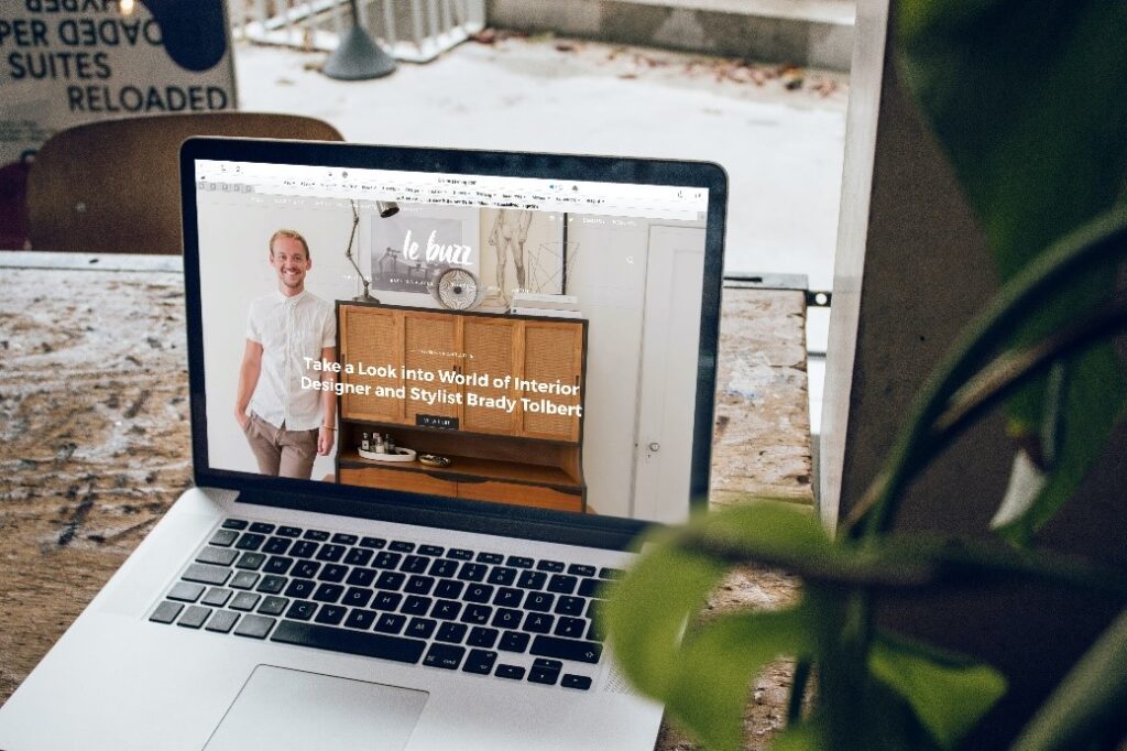
That makes alt text useful for both accessibility and SEO. If a Salt Lake City roofing company posts before and after project images, or a local restaurant posts menu photos and interior shots, useful alt text gives those images more context. It helps communicate meaning instead of leaving the image empty to people who cannot fully view it.

Accessible design reduces frustration

Good websites reduce confusion. They do not make people guess where to click, wonder what a button does, or struggle with a form. They guide users naturally. That is what accessible design often does best. It makes the path easier.

Common accessibility problems many websites still have

Many business websites look decent on the surface but still have basic issues that make them harder to use. These problems are common across many industries.

Low readability

Small text, tight spacing, and weak contrast are very common problems. They make content harder to scan and understand. This affects users with low vision, but it also affects anyone who is tired, distracted, or reading on a small screen.

Unclear buttons and links

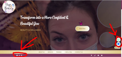
Buttons that say things like Learn More or Click Here without enough context can confuse users. Good calls to action should be specific. Phrases like Request a Quote, Book a Visit, Call Our Team, or View Pricing are much clearer and more useful.

Forms that feel difficult to complete

Forms are one of the biggest places where businesses lose leads. If a contact form has vague labels, poor spacing, weak contrast, or unclear error messages, people may stop before submitting it. A better form experience can make a big difference in conversion rates.

Messy page structure

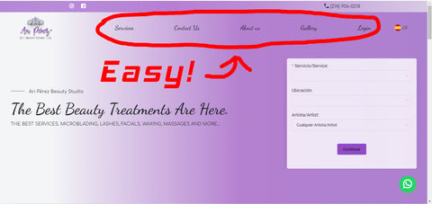
When content is not organized with clear headings and logical sections, visitors can feel lost. Strong page structure helps people scan the information, understand what matters most, and find answers faster.

Mobile problems

Some websites still look fine on desktop but become difficult on phones. Text may be too small, buttons too close together, or important elements may shift into awkward positions. Since many local users first visit from mobile, this can hurt performance quickly.

How accessibility helps different industries in Salt Lake City

Accessibility matters across almost every type of business, but the benefits can show up in different ways depending on the industry.

Healthcare providers

Doctors, dentists, clinics, therapists, and specialists often serve people who need information quickly. Patients may be looking for office hours, insurance details, treatment information, forms, or directions. An accessible website helps them find what they need with less stress.

In healthcare, trust is critical. A clean and easy to use site can create a sense of professionalism and care from the first interaction.

Law firms and professional services

People looking for legal or financial help are often under pressure. They do not want to waste time trying to understand a difficult website. Clear service pages, simple navigation, strong headings, and accessible contact options can help them feel more confident about reaching out.

Restaurants and hospitality businesses

Restaurants, hotels, and local attractions often serve both residents and visitors. These users want quick access to menus, reservation options, hours, locations, and parking information. Accessibility helps make all of this easier to find and understand.

For example, if someone is visiting downtown Salt Lake City and checking restaurant options from their phone, they are likely to choose the place with the clearest and easiest website experience.

Contractors and home service companies

Roofers, plumbers, HVAC teams, electricians, landscapers, and remodelers all benefit from trust and clarity. Local customers want to know what services are offered, what areas are served, and how to get in touch. Accessible service pages can help turn traffic into real leads.

Retail and eCommerce businesses

For stores and online sellers, accessibility can affect product browsing, filtering, image understanding, and checkout. The easier it is to browse and buy, the better the business result is likely to be.

Accessibility and SEO often support each other

Accessibility and SEO are not the same thing, but they often work well together. Search engines want to understand content clearly. Users want to use websites easily. Many of the practices that help one can also help the other.

Better structure helps search engines and users

When a page has clear headings, organized sections, descriptive links, and useful image text, it becomes easier to understand. That helps visitors scan the page, and it can also help search engines understand the topic and structure.

Better usability can improve engagement

If people stay on your website longer, view more pages, and interact more smoothly, that is a good sign for business performance. While SEO includes many factors, user experience still plays an important role in how effective a website is overall.

For Salt Lake City businesses that rely on local search visibility, better accessibility can strengthen the foundation of the website and improve the quality of the visit once people arrive.

Simple ways to improve accessibility on a business website

The good news is that accessibility does not always require a complete redesign. Many improvements can start with practical changes.

Use stronger contrast

Make sure text stands out clearly from the background. This is one of the easiest improvements to make and one of the most helpful.

Write in plain language

Use simple, direct wording. Avoid making people work too hard to understand what you mean. This helps users who are new to the topic, people reading quickly, and people using assistive tools.

Improve navigation labels

Menus and buttons should clearly explain where they lead. Keep navigation simple and predictable. If your website has many services, group them in a way that feels natural.

Review forms carefully

Check that every form field has a clear label. Make sure users know what to enter and what happens after submission. If there is an error, the message should be easy to notice and understand.

Add helpful alt text to important images

If an image adds meaning to the page, describe it in a natural and useful way. Do not stuff it with keywords. Just explain what is there when it helps the user.

Organize content with proper headings

Good headings make long pages easier to read. They also help users jump to the information they need faster.

Test the site on mobile

Open the site on a phone and move through it like a real customer. Read the text, tap the buttons, and complete the forms. You will often find issues quickly this way.

Accessibility is good customer service

At the end of the day, accessibility is about helping people. It shows that your business cares about making the experience easier instead of more difficult. That is a simple but powerful message.

Most businesses in Salt Lake City already work hard to provide good service in person, over the phone, and through email. The website should reflect that same level of care. It should guide people clearly, answer their questions, and help them take action without frustration.

When a site is hard to use, it creates distance between the business and the customer. When it is easy to use, it builds trust. That trust can lead to more calls, better engagement, and stronger results over time.

Building a stronger online presence in Salt Lake City

Salt Lake City businesses face real competition online. Whether you are trying to attract local residents, students, tourists, or nearby communities, your website needs to do more than just exist. It needs to work well.

Accessibility helps make that possible. It supports better design, clearer communication, and a smoother user experience. It helps more people use your website the way it was meant to be used. It can also strengthen the parts of the site that affect trust, SEO, and conversions.

That is why accessibility should not be seen as an extra feature. It should be seen as part of building a website that actually helps the business grow. In a city where people compare options quickly and expect a polished experience, that matters a lot.

A smarter way to think about better design

A website does not need to be flashy to perform well. It needs to be clear, useful, and easy to navigate. That is what many people are really looking for. They want to understand what you do, see why it matters, and know how to contact or buy from you.

Accessibility supports all of that. It helps make websites more welcoming, more practical, and more effective for real people in real situations. For businesses in Salt Lake City, that can mean reaching more customers and making a better impression from the first click.

When you improve accessibility, you are not only helping a wider audience. You are also making your website stronger as a business tool. That is good for your visitors, and it is good for your growth.

Website Accessibility in Tampa, FL: Why It Matters for Users, SEO, and Business Growth

Accessibility is not just about doing the right thing. It is also a smart business decision. A website that is easier to use helps more people stay longer, understand your message faster, and take action with less effort. That means better user experience, stronger trust, and more chances to turn visitors into leads or customers.

In Tampa, FL, businesses compete in a fast and diverse market. Local companies serve families, seniors, tourists, professionals, students, and people from many cultural and language backgrounds. In a city like this, your website should be easy to use for as many people as possible. If it is not, you may be losing traffic, leads, and sales without even realizing it.

Many business owners think accessibility is only for people with permanent disabilities. That is not true. Accessible design helps people in many everyday situations. It helps someone using a phone in bright Florida sunlight. It helps someone with tired eyes after a long workday. It helps a person with a temporary injury who cannot use a mouse easily. It helps a busy user who wants to find information quickly without confusion. In simple terms, accessible design makes websites better for everyone.

This is one reason accessibility is profitable. Clear contrast ratios make text easier to read. Keyboard navigation helps users move around quickly. Alt text improves support for screen readers and can also give search engines more useful information about images. Clean structure and clear headings help users scan a page faster. These improvements do not only support accessibility. They also improve usability, SEO, and conversions.

The idea is bigger than many people think. According to the World Health Organization, around 1 billion people globally live with disabilities. That is a huge number. It also represents a massive audience that many websites overlook. When a site is hard to use, some people leave immediately. They do not call, they do not fill out a form, and they do not buy.

That matters in Tampa. Whether you run a law firm, medical office, restaurant, contractor business, eCommerce brand, nonprofit, church, or tourism related company, your website is often the first impression people get. If that first impression feels confusing, frustrating, or hard to read, trust goes down. If it feels smooth and simple, trust goes up.

In this article, we will explain website accessibility in a clear and practical way. You do not need technical knowledge to understand it. We will cover what accessibility means, why it matters in Tampa, how it affects SEO and conversion rates, the most common website mistakes, and the simple steps businesses can take to improve. The goal is to make the topic easy to follow and useful for real world decisions.

What Website Accessibility Really Means

Website accessibility means designing and building a website so that more people can use it successfully. That includes people with visual, hearing, motor, and cognitive challenges. It also includes people using different devices, browsers, screen sizes, and internet speeds.

An accessible website helps users read content, move through pages, understand buttons, watch or listen to media, submit forms, and complete important actions without unnecessary barriers.

This does not mean a website has to look plain or boring. Accessibility is not the opposite of good design. In fact, many of the best looking websites are also the easiest to use because they are clean, structured, and easy to understand.

Accessibility is about reducing friction

Every website has moments where users need to take action. They may need to read a service page, click a button, use a menu, request a quote, book an appointment, or buy a product. Accessibility reduces friction during those moments. It removes obstacles that make those actions harder than they need to be.

For example, if your text is too light against a white background, many users will struggle to read it. If your menu only works with a mouse, some users may not be able to navigate your site properly. If your form labels are unclear, users may not know what to enter. If your videos have no captions, some users will miss the message completely.

Accessibility supports real people in real situations

Think about daily life in Tampa. A person may be checking your website from a phone while waiting in line at a coffee shop. Another may be searching for a roofing company after a storm. A parent may be browsing a pediatric clinic website while holding a child with one hand. A senior may be trying to increase the text size to read more comfortably. A tourist may be looking for a local attraction, restaurant, or event from a bright outdoor location near the waterfront.

These are not rare situations. They happen every day. Accessibility helps your site perform better in all of them.

Why Accessibility Matters for Businesses in Tampa, FL

Tampa is a growing city with a strong mix of industries and audiences. Healthcare, legal services, home services, hospitality, education, real estate, local retail, and tourism all rely heavily on digital presence. For many of these businesses, the website is one of the main ways people discover services, compare options, and decide who to contact.

If your site is difficult to use, users may leave and choose a competitor. In many cases, they will not tell you why. They will simply move on.

Tampa has a wide and diverse audience

Local businesses in Tampa serve people of different ages, abilities, and levels of technical comfort. Some users are highly confident online. Others are not. Some browse on desktop computers, while many use mobile devices. Some rely on assistive technology. Others simply need larger text, stronger contrast, or a simpler layout.

A business that makes its site easier to use can appeal to a wider audience without changing its core offer. That can be especially valuable in competitive local markets where small experience improvements can influence who gets the lead.

Local trust starts online

When someone in Tampa searches for a dentist, lawyer, contractor, church, clinic, or marketing agency, the website often shapes the first impression before any call happens. If the site looks cluttered, loads poorly, or feels hard to navigate, trust drops fast. If it feels polished, readable, and easy to use, trust grows.

Accessibility supports that trust. It tells users that the business cares about clarity and usability. It shows respect for the visitor’s time. It also suggests professionalism, because details are handled well.

It can support better local conversion rates

Local websites usually depend on a few key actions. Calls. Contact forms. Appointment requests. Quote requests. Direction clicks. If accessibility problems interfere with any of these actions, conversion rates can drop.

For example, imagine a Tampa HVAC company after a hot summer day. A user visits the website needing fast service. If the phone number is hard to find, the text is too small, or the form is confusing, that user may leave. The same goes for a law office, med spa, or roofing company. When urgency is high, clarity matters even more.

Accessibility and SEO Work Well Together

Accessibility and SEO are not the same thing, but they often support each other. Search engines want to show websites that are useful, clear, and easy to understand. Many accessibility improvements help create exactly that kind of experience.

Alt text can support image understanding

Alt text is a written description of an image. It helps people using screen readers understand what the image shows. It can also help search engines understand image content better. Good alt text should be simple, useful, and relevant. It should describe the image naturally instead of stuffing keywords.

Clear headings improve structure

Headings help users scan a page and understand what each section is about. They also help search engines understand how your content is organized. A page with a clear heading structure is easier for people to follow and easier for search engines to interpret.

Readable content lowers confusion

When content is written clearly, people stay engaged longer. They are more likely to find answers and continue exploring the site. That can improve key engagement signals. It also makes your message more useful to a wider audience.

Better usability can support conversions and engagement

SEO helps bring people to your site. Accessibility helps them use it once they arrive. That connection matters. Rankings alone do not create revenue. People must be able to move through the site comfortably and complete actions without friction.

Common Accessibility Problems Many Websites Still Have

Many websites fail basic accessibility standards because they are built with visual style in mind first and user clarity second. Some issues are easy to fix. Others require more planning. Either way, the first step is knowing what problems to look for.

Low contrast text

This is one of the most common issues. Light gray text on a white background may look modern, but it can be hard to read for many users. Strong contrast makes text easier to read in different lighting conditions and on different screens.

Poor keyboard navigation

Some users do not navigate with a mouse. They use a keyboard or assistive tools. If a website menu, button, popup, or form cannot be accessed properly with a keyboard, that creates a serious barrier.

Missing alt text on images

When images have no alt text, users relying on screen readers may miss important context. This is especially harmful when the image contains useful information, such as a product photo, team photo, chart, or service related visual.

Forms that are hard to use

Forms should be simple, clear, and properly labeled. If fields do not explain what is needed, or if error messages are confusing, people may abandon the form. This is a common source of lost leads.

Unclear link and button labels

Buttons that say things like click here or learn more without clear context can create confusion. Users should understand what will happen when they click. Strong labels improve both accessibility and conversion clarity.

Videos without captions

Captions help users who are deaf or hard of hearing. They also help people in noisy places or quiet environments where audio is not practical. In Tampa, where people often browse on mobile while out and about, captions are useful far beyond accessibility needs alone.

Text that is too small or tightly packed

Small text can be difficult for many people to read, especially on phones. Tight spacing between lines and sections can also make content feel overwhelming. Good spacing improves comfort and clarity.

How Accessibility Helps Everyday Users, Not Just a Small Group

One of the biggest misunderstandings about accessibility is that it only serves a small number of users. In reality, it improves the overall experience for nearly everyone.

It helps mobile users

Mobile users benefit from larger tap areas, clearer buttons, readable text, and simpler navigation. These are all accessibility friendly improvements.

It helps older adults

Many older users appreciate larger fonts, strong contrast, and straightforward layouts. Businesses in Tampa that serve families, medical needs, home services, or financial services can benefit greatly from this.

It helps busy users

Clear headings, simple forms, and direct page structure save time. Even users without any disability benefit when the path to information is faster and easier.

It helps people with temporary limitations

Someone recovering from an injury, dealing with eye strain, or using a cracked phone screen may still need your website to work well. Accessibility prepares your site for real life conditions, not just ideal ones.

Practical Tampa Examples of Why Accessibility Matters

Let us look at a few simple local style examples to make this more real.

Healthcare clinics

A clinic in Tampa may serve seniors, parents, and patients under stress. If appointment forms are confusing or contact information is hard to find, patients may leave. Accessibility improvements can make scheduling smoother and reduce friction during important moments.

Law firms

Someone searching for legal help may already feel overwhelmed. If the site uses clear headings, readable text, and easy contact options, the user feels more supported. This can improve trust and lead quality.

Restaurants and hospitality businesses

A restaurant site should make menus, hours, directions, and booking information easy to access. Tourists and locals alike may view the site from mobile devices while on the go. Simple and accessible design makes that process faster.

Contractors and home service companies

Users often need quick answers when looking for roofing, plumbing, electrical, or air conditioning help. Accessible design helps them find services, service areas, reviews, and contact options quickly, especially during urgent situations.

Churches, nonprofits, and community groups

These organizations often serve broad audiences. Accessibility helps make event details, contact forms, donation pages, and service times easier for everyone to access.

Simple Accessibility Improvements That Make a Big Difference

The good news is that not every improvement is difficult. Many accessibility gains come from practical changes that also improve the overall user experience.

Use stronger text contrast

Make sure your text stands out clearly against the background. If users need to strain to read, the design is working against them.

Write clear headings and page titles

Use headings that explain each section in simple language. This helps users scan the page and find what they need faster.

Add useful alt text to important images

Describe images naturally where it helps users understand meaning. Not every image needs a long description, but important visuals should not be ignored.

Make forms easier to complete

Use clear field labels, simple instructions, and helpful error messages. Keep the number of required fields reasonable.

Ensure buttons are clear and easy to click

Buttons should stand out visually and explain the action. Good examples include Request a Quote, Book an Appointment, or Call Our Tampa Team.

Check keyboard usability

Important menus, buttons, and form fields should be reachable and usable without a mouse.

Add captions to videos

If your business uses video, captions can improve accessibility, mobile usability, and message retention.

Keep layouts clean and predictable

Do not make users guess where things are. Consistent navigation, clean spacing, and clear content flow reduce confusion.

Accessibility is Good Design, Not Extra Design

Some people hear the word accessibility and think it means extra work added on top of design. A better way to see it is this: accessibility is part of good design. It is one of the qualities that separates a website that looks nice from a website that actually works well.

A good website should not only impress users visually. It should guide them, support them, and help them take action comfortably. If design gets in the way of that goal, then it needs improvement.

In many cases, accessible design leads to cleaner layouts, better messaging, stronger calls to action, and more thoughtful user journeys. Those are wins for everyone, including the business.

How Tampa Businesses Can Start Improving Accessibility

You do not need to rebuild your website overnight. A better approach is to start with the pages and actions that matter most.

Start with key pages

Focus first on your homepage, service pages, contact page, booking pages, and lead forms. These pages often carry the most business value.

Review the mobile experience

Many local users in Tampa will visit from their phones. Check whether text is readable, buttons are easy to tap, and forms are simple to complete.

Test your website like a normal user

Try navigating your site without rushing. Can you quickly find the phone number, service area, pricing clues, and form? If not, your visitors may struggle too.

Look for friction points

Ask simple questions. Is the menu easy to use? Are pages easy to scan? Are calls to action clear? Is contact information obvious? Can users understand what to do next?

Improve content clarity

Accessibility is not only technical. Content matters too. Use plain English, short paragraphs, clear headings, and direct explanations. That alone can improve the user experience dramatically.

The Business Value of Accessibility Over Time

Accessibility can create long term benefits that go beyond compliance or user support. It can strengthen the whole digital performance of a business.

Better user experience

People are more likely to stay on a website that feels easy to use. That improves the chance of engagement and action.

Broader audience reach

An accessible website is usable by more people in more situations. That expands your potential market without changing your core service.

Stronger brand trust

When a website feels thoughtful and user friendly, the business appears more professional and more reliable.

Support for SEO and conversion goals

Accessibility improvements often strengthen site structure, readability, and usability. These qualities can support better search performance and higher conversion rates over time.

Final Thoughts

Accessibility is not just ethical. It is profitable. That idea is simple, but powerful. When a website is easier to read, easier to navigate, and easier to understand, more people can use it successfully. That leads to better experiences, stronger trust, and more opportunities to grow.

In Tampa, FL, businesses operate in a competitive market where user experience matters. Whether your audience includes local residents, tourists, families, seniors, or busy professionals, your website should work well for real people in real situations. Accessibility helps make that possible.

Clear contrast ratios help everyone read. Keyboard navigation helps users move faster. Alt text supports accessibility and can improve image understanding for search engines. Captions, clean forms, clear buttons, and simple page structure all make a real difference.

Most websites still fail basic accessibility standards. That means there is a real opportunity for businesses that choose to improve. A more accessible website is often a better website overall. It feels cleaner, smarter, and more useful from the first click to the final action.

If you want better usability, stronger SEO support, and a smoother path to conversions, accessibility is a practical place to start. It is not only about compliance or checking a box. It is about creating a site that respects users, supports business goals, and performs better in the real world.

For Tampa businesses that want to compete online, that is not a small detail. It is a real advantage.

Website Accessibility in Phoenix, AZ: Better UX, SEO, and More Sales

Why Website Accessibility Matters for Businesses in Phoenix, AZ

Accessibility is not only the right thing to do. It is also a smart business decision. When a website is easy to read, easy to navigate, and easy to use for more people, it creates a better experience for everyone. That can lead to more trust, more engagement, better search visibility, and more conversions.

Many business owners think accessibility is only for a small group of users. That is not true. A large number of people live with visual, hearing, motor, or cognitive challenges. Others may have temporary limitations, like a broken arm, tired eyes, or trouble hearing audio in a noisy place. Some people simply want a faster, cleaner, and easier experience on your website. Accessibility helps all of them.

In a growing city like Phoenix, AZ, businesses compete hard for attention online. Whether you run a law firm, roofing company, medical office, restaurant, local shop, or service business, your website often gives the first impression. If that website is difficult to use, visitors may leave before they ever call, book, or buy. If it is clear and accessible, more people can stay, understand your offer, and take action.

That is why accessibility is not just ethical. It is profitable.

What website accessibility really means

Website accessibility means building and organizing a website so people with different abilities can use it without unnecessary barriers. A good accessible website helps visitors read text, understand images, move through pages, fill out forms, and complete actions with less friction.

This includes many practical details. Text should be easy to read. Colors should have enough contrast. Buttons should be clear. Menus should work with a keyboard, not only with a mouse. Images should include helpful alt text. Videos should have captions when needed. Forms should clearly explain what to enter and what went wrong if there is an error.

These improvements may sound small, but together they make a big difference.

Accessibility is about real people using your site

Think about a visitor in Phoenix searching for an emergency AC repair company during the summer. They may be outside, in bright sunlight, trying to read your page on a phone. If the text has poor contrast, they may not be able to read it. Or think about an older visitor looking for a medical clinic in the area. If the font is too small or the site structure is confusing, they may leave and choose another provider.

Accessibility is not only for one type of user. It helps busy people, older adults, mobile users, users with disabilities, and anyone who wants things to work smoothly.

Why accessibility matters in Phoenix, AZ

Phoenix is a large, active, and diverse city. People of all ages and backgrounds use local business websites every day. They search for home services, legal help, healthcare, restaurants, churches, schools, events, and local stores. Because competition is strong, your website needs to do more than just look good. It needs to work well for real people in real situations.

Local businesses in Phoenix often depend on fast decisions from website visitors. A person may need a roofer after a monsoon storm. A family may need urgent care. A tourist may be searching for a place to eat near downtown Phoenix. A homeowner in Scottsdale, Glendale, Mesa, or Chandler may need a contractor and compare several websites in just a few minutes. If your website is easier to use than the others, that matters.

Phoenix users are often on mobile devices

Many local searches happen on phones. People search while commuting, while at work, while sitting in a parking lot, or while handling a problem at home. Mobile accessibility matters a lot. Text must be readable without zooming too much. Buttons must be easy to tap. Menus should be simple. Forms should not feel frustrating on a small screen.

An accessible mobile experience can help your Phoenix business keep more visitors on the site and turn more of them into leads.

Heat, sunlight, and fast decisions affect usability

Phoenix has unique real world conditions that make accessibility even more useful. Bright sunlight makes weak contrast harder to read. Fast local service decisions mean users do not have patience for cluttered pages. If your text, layout, and navigation are clear, users can find what they need faster.

That is good for user experience, and good for business.

Accessibility helps your SEO

Many accessibility improvements also support search engine optimization. This is one reason accessibility can be profitable. A well structured site is often easier for search engines to understand. Clear headings help organize content. Alt text gives context to images. Better usability can increase time on site and reduce frustration. Cleaner code and thoughtful structure can support stronger performance overall.

Accessibility and SEO are not exactly the same thing, but they often work well together.

Alt text gives images meaning

Alt text is a short written description added to images. It helps screen readers explain images to users who cannot see them clearly. It can also help search engines better understand what the image is about.

For example, a Phoenix landscaping company might use an image of a desert style front yard. Instead of leaving the alt text blank or stuffing it with keywords, a helpful version could say: “Desert landscape design for a front yard in Phoenix, Arizona.” That gives context in a natural way.

Clear headings improve structure

Using proper headings like H2 and H3 makes content easier to scan. Visitors can quickly understand what each section covers. Search engines also benefit from this structure because it helps define the main topics on the page.

If your website has messy headings, repeated text, or unclear sections, both users and search engines may struggle. Clear structure is a basic accessibility improvement that also supports SEO.

Better usability can improve engagement

If users can navigate your site more easily, they are more likely to stay longer, view more pages, and complete actions. That does not guarantee rankings on its own, but it supports a better overall experience. Search engines want to show users pages that are useful. Accessibility helps move your site in that direction.

Accessibility can improve conversions

A website is not just there to be seen. It should help the business grow. That means generating calls, form submissions, appointments, purchases, or other valuable actions. Accessibility can support this by removing barriers that stop users from taking the next step.

Clear buttons and forms get more action

If your call to action button is hard to find, low contrast, or confusing, users may not click it. If your form has vague labels or error messages, users may give up. Accessibility improves clarity. It makes actions easier to understand and easier to complete.

For a Phoenix plumbing company, for example, a visitor may want to request service quickly. If the contact form clearly labels each field and works well on mobile, more users may complete it. If the form is hard to use, you may lose the lead.

Accessible design builds trust

When a website feels polished, readable, and easy to use, people trust it more. Trust matters in every industry, especially for healthcare, legal, financial, home service, and high ticket services. A site that feels confusing or broken can make people question the business itself.

Accessible design often feels cleaner and more professional. It sends the message that the business cares about the experience of its visitors.

Common accessibility problems many websites have

Most websites fail basic accessibility standards because the problems are easy to overlook during design or development. Many of these issues are common, but they are also fixable.

Low color contrast

Light gray text on a white background may look modern, but it is often hard to read. This becomes worse on mobile devices or in bright outdoor light. In Phoenix, where sunlight is intense, poor contrast can quickly make a page frustrating.

Missing alt text

Many sites upload images without adding useful alt text. That leaves screen reader users with less context and weakens the clarity of visual content.

Menus that do not work with a keyboard

Some users cannot rely on a mouse. They use a keyboard or assistive technology to move through a page. If your menu, popup, or form cannot be used that way, the experience becomes difficult or impossible.

Unclear link text

Links that say “click here” or “read more” without context are less helpful. Better link text tells the user what they will find next. For example, “View our Phoenix dental services” is much clearer than “learn more.”

Forms with confusing errors

If a user submits a form and gets a vague message like “invalid input,” that is not helpful. Good accessibility means telling the user exactly what needs to be fixed in plain language.

Videos without captions

If your website uses video content, captions can help users who are deaf or hard of hearing. They also help people watching with the sound off, which is common on mobile.

Simple ways to make your website more accessible

The good news is that accessibility does not always require a full rebuild. Many improvements can begin with practical updates.

Use readable font sizes

Make body text large enough to read comfortably. Avoid tiny font sizes that force users to zoom in. Good spacing between lines and paragraphs also helps.

Improve contrast

Make sure text stands out clearly from the background. Strong contrast is one of the easiest wins for readability.

Add helpful alt text to images

Describe the purpose of each important image in simple, natural language. If an image is purely decorative, it may not need descriptive alt text. The key is to be intentional.

Use clear headings in order

Organize pages logically. Your main page title should be followed by sections and subsections in a clear order. This helps screen readers and human readers alike.

Check keyboard navigation

Try using your website without a mouse. Can you move through the menu, buttons, and form fields easily? Can you tell where the cursor is? This quick test can reveal real issues.

Write clearer labels and instructions

Forms should explain exactly what the user needs to enter. Required fields should be obvious. Error messages should be specific and easy to understand.

Make your buttons obvious

Buttons for calls to action should stand out visually and use simple text. “Schedule an Appointment,” “Request a Quote,” or “Call Our Phoenix Team” are much clearer than vague phrases.

Local examples of accessibility in Phoenix business websites

Let’s make this practical. Imagine a few common Phoenix business types and how accessibility can help each one.

Restaurants and cafes

A restaurant website should let users view the menu, location, hours, and contact information easily. If the text is too small, the menu is trapped in an image with no alt text, or the reservation button is hard to tap on mobile, users may leave. Accessibility makes that process smoother.

Medical and dental offices

Patients may be older, stressed, or trying to book quickly. Large readable text, simple service pages, clear forms, and accessible appointment requests can improve trust and make booking easier.

Home service companies

Roofers, HVAC companies, plumbers, and electricians in Phoenix often get leads from urgent searches. Accessible calls to action, fast mobile navigation, and readable service pages can help users act quickly.

Law firms

Legal websites often contain a lot of information. If that information is poorly organized, visitors may feel overwhelmed. Clear headings, readable text, and strong navigation help visitors find the right service and contact the firm.

Accessibility is part of better design overall

Some people think accessibility limits creativity. In reality, it usually leads to better design choices. Clear design is often stronger design. Simpler navigation, better contrast, readable text, and cleaner structure make websites easier to use and more effective.

That is why accessible design benefits everyone. It helps users with disabilities. It helps busy users. It helps mobile users. It helps older users. It helps people in poor lighting conditions. It helps users who want to move quickly. It even helps your team by making the website easier to maintain and improve over time.

Why waiting can cost your business

If your website is hard to use, the cost is not always obvious. You may not see a warning message telling you that users are leaving because of poor accessibility. But it happens quietly every day. Visitors bounce. Leads drop off. Forms go unfinished. Calls never happen. Trust gets lost before the conversation even starts.

For Phoenix businesses competing online, that hidden loss can add up. Accessibility is not just about avoiding problems. It is about creating a stronger website that works better for more people.

Final thoughts

Website accessibility matters because it improves usability, supports SEO, builds trust, and can increase conversions. It helps your business serve more people while also creating a better online experience overall.

In Phoenix, AZ, where users are often on mobile devices, competition is strong, and people make quick decisions online, accessibility is especially valuable. A website that is easy to read, easy to navigate, and easy to use has a better chance of turning visitors into customers.

If your site has clear contrast ratios, strong keyboard navigation, useful alt text, readable content, and simple forms, you are already moving in the right direction. These are not small details. They are practical improvements that can make your website more effective.

Accessibility is not just ethical. It is profitable. And for many businesses in Phoenix, it may be one of the smartest website improvements to focus on next.

Web Accessibility in San Diego, CA: Why Better Websites Help Everyone

Accessibility is not only the right thing to do. It is also a smart business decision. When a website is easier to use, more people can read it, move through it, understand it, and take action. That means more calls, more form submissions, more trust, and better results.

Many people still think accessibility is only about a small group of users. That is not true. Accessible websites help people with permanent disabilities, temporary injuries, age related vision changes, reading difficulties, and even people using a phone in bright sunlight or a noisy place. In simple words, accessible design makes websites better for everyone.

This matters in a city like San Diego, CA, where businesses serve a wide mix of residents, tourists, students, military families, professionals, retirees, and people from many language and cultural backgrounds. A local restaurant, law firm, contractor, medical office, nonprofit, or eCommerce business can all benefit from a site that is easier to use. If your website is hard to read, hard to click, or confusing to navigate, people may leave before they ever contact you.

Accessibility also supports growth. Clear contrast ratios make content easier to read. Keyboard navigation makes a site faster for advanced users and necessary for others. Alt text helps screen readers and can also support SEO. Good headings make content easier to scan. Better forms reduce frustration. All of this can improve the overall experience and help more people become customers.

According to the World Health Organization, around 1 billion people globally live with disabilities. That is a huge part of the population. Businesses that ignore accessibility are often ignoring a large group of potential customers. Even beyond that number, accessible design improves usability for almost every visitor.

The truth is simple. Most websites fail basic accessibility standards. Some use low contrast text. Some have buttons that are too small. Others have missing image descriptions, poor form labels, or menus that are difficult to use on a keyboard. These issues can make a website frustrating or impossible to use. And when users struggle, businesses lose opportunities.

In this article, we will break down what accessibility means, why it matters in San Diego, and what practical steps website owners can take to improve their site. You do not need technical knowledge to understand the basics. The goal here is to explain accessibility in a clear, useful, and real way.

What Website Accessibility Means

Website accessibility means designing and building a site so that people with different abilities can use it successfully. This includes people who are blind, have low vision, are deaf or hard of hearing, have limited mobility, have cognitive challenges, or use assistive technologies like screen readers, voice tools, or keyboard only navigation.

Accessibility is not about making a separate website for a separate group. It is about making one better website that works for more people. A truly accessible website helps visitors understand the content, find what they need, and complete important actions without confusion.

For example, imagine someone visiting a local San Diego roofing company on their phone while standing outside in bright sun. If the text has poor contrast, they may not be able to read it. Now imagine someone with a wrist injury who cannot use a mouse easily and depends on the keyboard to move through the site. If the menu and buttons do not work with keyboard navigation, the site becomes difficult to use. These are real user problems, and accessibility helps solve them.

Accessibility Is Not Just for One Type of User

It is easy to assume accessibility only helps a small number of people, but that misses the bigger picture. Good accessibility supports many real life situations. Someone may have perfect vision but still struggle with tiny text on mobile. Someone may not have a disability but may be holding a baby with one hand while trying to use your site with the other. Someone may be older and prefer clearer fonts and stronger contrast. Someone may speak English as a second language and benefit from simpler layouts and clearer headings.

In San Diego, where businesses often serve both locals and visitors, a more usable website can make a major difference. Tourists looking for a hotel, local families trying to schedule a doctor visit, or a homeowner searching for an electrician all benefit from a site that is easy to understand and easy to use.

Why Accessibility Matters for Businesses in San Diego

San Diego has a diverse economy and a wide range of local businesses. From hospitality and tourism to healthcare, home services, education, legal services, nonprofits, and retail, competition is strong. A business website often creates the first impression. If that first impression feels frustrating, visitors may leave and choose someone else.

Accessibility matters because it improves user experience, expands your reach, supports trust, and can lead to stronger results. When people can actually use your site, they stay longer, understand more, and are more likely to take action.

It Helps You Reach More People

Every business wants more qualified visitors. Accessibility supports that goal by removing barriers. If a person cannot read your text, understand your form, or navigate your menu, they are less likely to contact you. A more accessible website gives more people the chance to become customers.

Think about local industries in San Diego. A medical clinic needs patients to find office details, insurance information, and appointment forms. A restaurant needs diners to read menus and location details. A law firm needs potential clients to understand services and complete a consultation request. A contractor needs homeowners to quickly find service pages and call buttons. Accessibility improves each of these interactions.

It Improves SEO

Accessibility and SEO often support each other. When you use proper heading structure, descriptive alt text, readable content, and clear page organization, search engines have an easier time understanding your website. Users also have an easier time using it, which is just as important.

Alt text is a good example. Alt text helps screen readers describe images to users who cannot see them. At the same time, it also gives search engines more context about the image. This does not mean stuffing keywords into every image. It means using useful, honest descriptions that add value.

Good accessibility can also reduce bounce rates and improve engagement because people are less likely to leave out of frustration. When visitors can read your content, move through the site smoothly, and trust what they see, that creates better user signals overall.

It Creates a Better Brand Experience

People remember how a website feels. If it feels easy, clear, and respectful of the user’s time, that creates trust. If it feels messy or hard to use, that creates doubt.

In San Diego, where many businesses depend on reputation and referrals, trust matters a lot. Whether someone is choosing a dentist in North Park, a moving company near Chula Vista, a boutique in La Jolla, or a contractor serving Mission Valley, the website experience affects how professional the business appears. Accessibility helps create a smoother, more polished experience.

Common Accessibility Problems Many Websites Have

Many websites look fine at first glance but still create problems for users. Accessibility issues are often hidden until you test the site in real ways. Some are visual. Some are structural. Some affect navigation or forms.

Low Contrast Text

One of the most common issues is poor contrast between text and background. Light gray text on white may look modern, but it is often hard to read. This affects people with low vision, older users, mobile users, and really anyone reading quickly. Strong contrast makes content easier to read for all visitors.

Missing Keyboard Navigation

Not everyone uses a mouse. Some users rely on a keyboard to move through a page using the Tab key and other controls. If menus, popups, buttons, or forms do not work well without a mouse, the website creates a serious barrier.

Keyboard navigation also helps power users who simply move faster that way. So this improvement supports accessibility and speed at the same time.

Missing Alt Text

Images need alternative text when they add meaning. Without alt text, screen reader users may miss important information. For example, if a local San Diego real estate site shows a property photo, map screenshot, or neighborhood image without description, that leaves out part of the experience for some users.

Alt text should be clear and useful. It should describe the image when the image matters. If the image is only decorative, it may not need a full description. The goal is to support understanding, not to force extra words onto every picture.

Poor Heading Structure

Headings help people understand the structure of a page. They also help users scan quickly. If a page uses headings in the wrong order or skips structure completely, it becomes harder to follow. Screen reader users especially benefit from logical heading order because it helps them move through content efficiently.

This article, for example, uses clear sections and subsections so readers can follow each idea step by step.

Confusing Forms

Forms are often where conversions happen. That means accessibility matters even more. If labels are missing, instructions are unclear, or error messages do not explain what went wrong, users may give up.

Imagine a San Diego dental office with an appointment request form that does not clearly label the phone number field or fails to tell the user which field is required. That creates friction and can cost the business leads.

How Accessibility Improves Everyday User Experience

One of the biggest mistakes businesses make is seeing accessibility as separate from normal website quality. In reality, accessibility often improves the site for everybody.

Clearer Content Is Easier for Everyone

Simple writing, readable fonts, good spacing, and strong contrast help all visitors, not only those with disabilities. Many users skim pages quickly. If your website explains things clearly, people are more likely to stay and act.

This is especially important for local service businesses in San Diego. People often visit those sites with a direct goal. They want to know what you do, where you are, how much you charge, and how to contact you. Clear content helps them get there faster.

Better Navigation Means Less Frustration

A website should guide people naturally. Menus should make sense. Buttons should look clickable. Links should be easy to spot. Page layouts should feel organized. Accessibility encourages these good habits, which improve the experience for everyone.

For example, if a local San Diego HVAC company has a clear menu with services, financing, reviews, and contact info, users can move through the site confidently. If the menu is cluttered, hidden, or hard to use on mobile, people may leave.

Accessible Mobile Design Helps Real World Users

Many users browse on mobile while multitasking. They may be walking, traveling, waiting in line, or using one hand. Bigger tap areas, readable text, clear buttons, and simpler forms all help. These are accessibility friendly decisions, but they are also just smart user experience choices.

Practical Accessibility Improvements Website Owners Can Make

The good news is that website accessibility does not always start with massive changes. Many important improvements are practical and manageable. Small upgrades can make a real difference.

Use Strong Color Contrast

Make sure text stands out clearly from the background. Avoid faint gray text or low contrast button labels. If users have to strain to read your site, the design is working against them.

Check Keyboard Access

Try using your website without a mouse. Can you reach the menu, links, buttons, and forms with the keyboard alone? Can you clearly see where the focus is on the page? If not, that is an area to fix.

Add Useful Alt Text

Review important images and add clear descriptions where needed. Product images, team photos, maps, charts, and service related visuals often need meaningful alt text. Decorative images can stay simple if they do not add information.

Organize Content with Real Headings

Use headings in a logical order. This helps readers and assistive technology understand the page. A page should not just look organized visually. It should be structured properly in the code too.

Improve Forms

Make sure every form field has a label. Mark required fields clearly. Write error messages that explain what needs to be fixed. Keep forms as short as possible and easy to complete on mobile.

Write Clear Link Text

Avoid vague phrases like “click here” when possible. Instead, use text that tells the user what they will get, such as “View our San Diego service areas” or “Request a free consultation.” This improves clarity for all users.

Use Readable Fonts and Spacing

Fancy fonts may look stylish, but they often reduce readability. Clean fonts, comfortable spacing, and shorter paragraphs help users process information more easily.

Accessibility in a Local San Diego Context

San Diego businesses often compete on trust, convenience, and customer experience. Accessibility supports all three. It helps people feel respected, helps them find what they need faster, and creates a smoother path to action.

Consider a few local examples. A hotel near downtown San Diego needs a booking experience that works well for all guests. A local nonprofit needs donation pages that are easy to read and complete. A coastal restaurant needs menus that are readable on mobile for both locals and tourists. A home service company serving neighborhoods across San Diego County needs clear location pages, contact buttons, and service information that work well for every user.

Accessibility can also support local search performance when pages are better structured and easier to understand. If your site serves San Diego, your content should be clear, locally relevant, and easy to use on every device.

Why Many Businesses Delay Accessibility

Some businesses think accessibility is too technical or too expensive. Others assume it can wait until later. But waiting often means more problems over time. Small issues build up. Content gets added without structure. Images go up without alt text. Forms become harder to use. Fixing problems early is usually easier than cleaning up years of neglect.

Another reason businesses delay is that they do not realize how many users are affected. They may only notice when someone complains or when they test the site properly for the first time. By then, they may have already lost leads, sales, or trust.

The better approach is to treat accessibility as part of good website management. It should not be seen as extra. It should be part of what makes a website effective.

Accessibility Is Better Design

At its core, accessibility is about helping people succeed on your website. When users can read your content, move through your pages, understand your message, and take action without struggle, the website is doing its job.

This is why accessibility is not only ethical. It is profitable. Better usability leads to better engagement. Better engagement can lead to more conversions. Better structure can support SEO. Better trust can strengthen your brand. Everyone benefits from a website that works better.

For businesses in San Diego, CA, this matters more than ever. People have options. They compare businesses quickly. They judge professionalism in seconds. If your website is confusing, hard to read, or difficult to navigate, people may never give you a second chance.

Final Thoughts

Most websites fail basic accessibility standards, but that also means there is a real opportunity to stand out. A more accessible website is easier to use, easier to trust, and often easier to rank. It helps more people engage with your business and creates a stronger experience from the first click.

You do not need to know everything at once. Start with the basics. Improve contrast. Check keyboard navigation. Add alt text where it matters. Clean up your headings. Make forms easier to complete. Write clearly. These steps may seem simple, but together they can create a much better website.

Accessibility is not about making a site look less modern. It is about making it more effective. In a city like San Diego, where businesses need to connect with a broad and active audience, that can be a real advantage.

If your website is meant to help people, then it should be built so more people can actually use it. That is good for your visitors, good for your brand, and good for your business.

Why Better Design Helps More People and Grows Your Business

Accessibility is often treated like a technical checklist or a legal issue, but it is much more than that. It is about making websites easier to use for real people. It is also a smart business decision. A website that is clear, readable, and simple to navigate helps more users stay longer, trust your brand faster, and take action with less frustration.

That matters everywhere, but it matters especially in a city as large and diverse as Los Angeles. This is a place with millions of residents, visitors from around the world, and businesses competing every day for attention online. If your website is hard to read, difficult to navigate, or confusing on mobile devices, many people will leave before they ever learn what you offer.

Accessibility is not only about serving people with permanent disabilities, though that is a major part of it. It also helps people with temporary injuries, older adults, busy parents using one hand on a phone, users in bright sunlight, people with slow internet connections, and anyone who just wants a faster and easier online experience. In simple terms, accessible design is better design.

Many business owners do not realize how much opportunity they lose when their website creates friction. Small issues like poor color contrast, missing alt text, unclear buttons, tiny fonts, or forms that do not work with a keyboard can quietly push people away. And because these issues are often invisible to the business owner, they stay unresolved for months or even years.

That is why accessibility should not be seen as optional. It is part of a strong website foundation. It supports usability, improves trust, helps search performance, and opens the door to a larger audience. According to the World Health Organization, around 1 billion people globally live with disabilities. That is not a small audience. It is a massive part of the population, and many websites still fail to serve them well.

In Los Angeles, where businesses rely heavily on local searches, mobile traffic, and first impressions, accessibility can become a real advantage. Whether you run a law firm in Downtown LA, a dental office in Glendale, a restaurant in Santa Monica, a contractor service in Pasadena, or an online store serving all of Southern California, a more accessible website can help more people interact with your business without barriers.

What website accessibility actually means

Website accessibility means designing and building a website so that more people can use it successfully. That includes people who are blind, have low vision, are deaf or hard of hearing, have limited mobility, use assistive devices, or have cognitive conditions that affect how they process information.

But accessibility also includes everyday situations that many people experience. Someone might be holding a baby while browsing on a phone. Another person may have forgotten their glasses. Someone else may be recovering from a hand injury and cannot use a mouse comfortably. A person may be in a noisy area and need captions to understand a video. All of these users benefit from accessible websites.

Accessibility is not about making a website look plain or basic. It is about removing barriers. A website can still be modern, attractive, and on brand while being much easier to use. In fact, when accessibility is done well, the result is usually cleaner, more organized, and more user friendly.

At its core, accessibility asks a simple question. Can people get the information they need and complete the actions they want without unnecessary struggle? If the answer is no for a large group of users, the website has room for improvement.

Why accessibility matters for businesses in Los Angeles

Los Angeles is one of the most competitive business markets in the country. Consumers have many options, and they make quick decisions. If a website feels confusing, slow, cluttered, or difficult to read, users will often go back and choose a competitor instead. They may not complain. They may not tell you what went wrong. They simply leave.

That is why accessibility has a direct connection to business performance. It reduces friction. It helps users understand your message faster. It makes forms easier to complete. It helps people trust what they are seeing. When users can move through a website smoothly, they are more likely to call, submit a form, book an appointment, request a quote, or make a purchase.

Los Angeles also has a wide and varied audience. Businesses here often serve different age groups, language backgrounds, income levels, and levels of technical comfort. A website that only works well for highly skilled users on a perfect connection is leaving out a big part of the market. Accessibility helps make your website more welcoming to that broader audience.

Local behavior also matters. Many people in Los Angeles search on mobile while on the move. They may be checking a service provider while sitting in traffic as a passenger, walking through a shopping district, or comparing businesses quickly between tasks. If your text is too small, your contrast is poor, or your menu is hard to use, the visit may end before it really begins.

For local businesses, that can mean fewer leads. For service providers, it can mean fewer calls. For ecommerce brands, it can mean abandoned carts. Accessibility may sound like a design topic, but in practice it connects directly to sales, lead generation, and customer experience.

Accessibility is profitable, not just ethical

There is an important idea that many companies still overlook. Accessibility is not just the right thing to do. It is also profitable. It helps more people use your site, and that can create measurable business results.

When text has clear contrast, more people can read it quickly. That lowers frustration and reduces bounce rates. When navigation works with a keyboard, power users and people with mobility challenges can move through your pages more efficiently. When images include alt text, your content becomes more understandable for screen reader users and more useful for search engines. Each improvement may seem small on its own, but together they create a better experience that supports stronger performance.

Accessible design also helps protect the value of your traffic. Businesses spend money on SEO, Google Ads, social media, referrals, and content marketing to bring visitors to their sites. But if those visitors land on a page that is hard to use, much of that investment is wasted. Accessibility helps make sure more of your traffic can actually engage with your content.

Think of it this way. Getting people to your website is only the first step. Helping them succeed once they arrive is what creates results. Accessibility supports that second step.

It can also improve brand perception. A site that feels clean, thoughtful, and easy to use gives people confidence. In a competitive place like Los Angeles, confidence matters. People often judge a business by its website before they ever speak to anyone. If the online experience feels careless, they may assume the service will feel the same way.

How accessible design helps everyday users

One of the biggest myths about accessibility is that it only helps a small number of people. In reality, accessible design improves the experience for almost everyone.

Clear contrast makes content easier to read

When text stands out clearly from the background, reading becomes easier. This helps users with low vision, but it also helps people on mobile devices, people in bright California sunlight, and users who are moving quickly through a page. A stylish design means very little if the text is hard to see.

Keyboard navigation improves speed and usability

Some people cannot use a mouse, but keyboard navigation is also useful for power users who prefer faster movement through a page. Menus, forms, buttons, and popups should all be usable without requiring a mouse. This is a practical improvement, not just a technical one.

Alt text adds context

Alt text describes images for people who use screen readers. It also adds structure to content and supports SEO when done properly. For example, if a Los Angeles landscaping company shows project photos without alt text, some users miss that information completely. A short, clear description makes the visual content more meaningful and more inclusive.

Captions make videos more useful

Captions support users who are deaf or hard of hearing, but they also help people watching without sound. That happens all the time on social media, mobile devices, and public spaces. If your business uses video to explain services, testimonials, or product details, captions help more people understand the message.

Simple layouts reduce confusion

People process information in different ways. A well organized layout with clear headings, plain language, and obvious next steps helps everyone. This is especially important for users who may feel overwhelmed by clutter, but it also improves scanning and comprehension for the general public.

Common accessibility problems many websites still have

Even now, many websites fail basic accessibility standards. Often, the business owner has no idea. The website may look good visually, but still create major problems for users.

Low contrast text

Light gray text on a white background may look modern, but it can be difficult to read. This is one of the most common issues on business websites.

Missing image descriptions

When images have no alt text, users with screen readers miss important content. This is especially harmful when images contain product details, service examples, charts, or buttons.

Poor heading structure

Pages should be organized logically. Headings help users scan the page and understand how information is grouped. They also help screen readers interpret content more clearly.

Buttons and links that are unclear

Buttons that say things like click here or learn more without context can create confusion. Good labels should tell users what will happen next.

Forms that are hard to complete

Forms often cause major problems. Missing labels, unclear error messages, poor tab order, or tiny input fields can stop users from contacting a business. In Los Angeles, where many businesses depend on leads from quote forms and contact pages, this is a serious issue.

Popups that interrupt the experience

Popups are common, but many are not built well. If a popup traps the user, is hard to close, or cannot be navigated with a keyboard, it creates frustration and can block access to the rest of the page.

What accessibility looks like in real Los Angeles business situations

To understand the value of accessibility, it helps to picture real local examples.

A restaurant in Santa Monica

A visitor searches for a place to eat near the beach. They open your site on a phone outdoors in bright sunlight. If your menu text has weak contrast and your reservation button is hard to see, they may give up quickly. Better contrast and clearer buttons help them book faster.

A law firm in Downtown Los Angeles

A potential client visits your site while stressed and trying to find legal help quickly. If the page is cluttered, the text is dense, and the contact form is confusing, that person may leave and contact another firm. A simpler layout with readable text and clear calls to action can make a major difference.

A medical practice in Glendale

Older adults often visit healthcare websites to check services, locations, insurance information, or appointment options. Larger readable text, clear navigation, and easy forms improve the experience immediately.

A contractor in Pasadena

Homeowners looking for repair or remodeling services may browse on mobile while comparing several companies. If your site loads a gallery with no image descriptions, weak navigation, and tiny clickable areas, users may not stay long enough to request a quote. A more accessible layout helps them move through the site with less effort.

The connection between accessibility and SEO

Accessibility and SEO are not the same thing, but they often support each other. Search engines aim to deliver useful, well structured content. Many accessibility best practices also make a site easier for search engines to understand.

For example, strong heading structure helps organize information clearly. Alt text helps explain image content. Descriptive link text gives context. Faster, cleaner page experiences often support lower bounce rates and better engagement. All of these can contribute to stronger overall website performance.

This is one reason accessibility should not be treated like a separate add on. It connects to broader digital strategy. A business in Los Angeles may invest heavily in local SEO and content creation, but if the site itself is difficult to use, that effort may not reach its full potential.

Accessibility helps make your website easier to understand for both people and systems. That is a strong long term advantage.

Simple ways to improve website accessibility

The good news is that accessibility improvements do not always require a full redesign. Many practical changes can be made step by step.

Use readable font sizes

Small text creates strain. Make body text easy to read on desktop and mobile. Give users enough spacing between lines and sections so content feels comfortable, not crowded.

Improve color contrast

Make sure text stands out from the background clearly. This is one of the fastest ways to improve usability for a wide range of users.

Write clear button text

Instead of vague labels, use text that tells users exactly what they are doing, such as Book Your Appointment, Request a Quote, or View Pricing.

Add alt text to meaningful images

Not every image needs a long description, but important visuals should include useful alt text. Keep it natural and relevant.

Make forms easier to understand

Every field should have a clear label. Error messages should explain what went wrong in plain language. Forms should work smoothly on keyboard and mobile.

Use headings in the right order

Pages should flow logically. This helps readability, scanning, and screen reader navigation.

Test your website on mobile and keyboard

Try moving through your site without a mouse. Try reading it on a phone in bright light. Small tests like these can reveal problems quickly.

Accessibility is a long term investment

It is easy to think of website accessibility as one more thing to fix later, but that approach usually costs more in the long run. Every month a website stays difficult to use, it risks losing leads, reducing engagement, and creating friction that hurts trust.

By contrast, a more accessible website keeps paying off over time. It improves usability for new visitors. It helps mobile users. It supports SEO. It strengthens brand credibility. It makes your site more inclusive and more practical at the same time.

For Los Angeles businesses, that long term value is important. Competition is high, user expectations are high, and digital experiences matter. A website should not just exist. It should help people move forward easily.

Accessibility supports that goal. It helps your website work better for more people in more situations. That is not only ethical. It is a smarter way to build online.

Final thoughts

Website accessibility is not about checking a box. It is about creating an experience that respects people’s time, needs, and abilities. When a site is clear, readable, and easy to use, more users can engage with confidence. That leads to better outcomes for them and for the business.

In Los Angeles, where businesses compete for attention across many industries, accessibility can be the difference between a visitor who leaves and a visitor who becomes a customer. Better contrast, better navigation, better structure, better forms, and better content clarity all work together to remove barriers.

And that is the key idea. Accessibility is not separate from good design. It is part of good design. It makes websites more useful, more welcoming, and more effective.

If your website has never been reviewed through the lens of accessibility, now is a smart time to start. Even a few improvements can make the experience better for a large number of people. In a city as active and diverse as Los Angeles, that is an opportunity worth taking seriously.

Why Accessible Web Design in Las Vegas is Essential for Your Business

The Ultimate Winning Bet: Why Web Accessibility is the Future of Las Vegas Business

Las Vegas is a city built on the concept of the “Grand Welcome.” From the moment a tourist steps off a plane at Harry Reid International Airport to the second they hit the casino floor, every detail is choreographed to make them feel accommodated. We have spent decades perfecting physical accessibility in our resorts, ensuring that everyone, regardless of physical ability, can enjoy a show, a meal, or a slot machine. However, there is a massive gap growing in our local economy: the digital front door.

Web accessibility is no longer just a “nice-to-have” feature for tech giants in Silicon Valley. It is a fundamental shift in how we do business online. For a Las Vegas business—whether you are a boutique law firm in Summerlin, a family-owned restaurant in Henderson, or a massive entertainment venue on the Strip—making your website accessible is the smartest strategic move you can make this year. It is ethical, it is legally sound, and most importantly, it is highly profitable.

Understanding the Massive Scale of the Accessible Market

To understand why this matters, we have to look at the numbers. According to the World Health Organization, over 1 billion people globally live with some form of disability. That is roughly 15% of the global population. When you translate those statistics to the Las Vegas market, the impact is staggering. We welcome over 40 million visitors a year. If 15% of those visitors struggle to use your website to book a room or view a menu, you are effectively turning away 6 million potential customers before they even arrive in Nevada.

Accessibility covers a wide range of needs. It includes people with visual impairments who use screen readers, individuals with motor disabilities who cannot use a mouse, people with hearing loss who need captions for videos, and those with cognitive disabilities who need simple, clear navigation. By ignoring these users, most websites are failing at basic hospitality, which is the very backbone of the Las Vegas economy.

The Financial Logic of Inclusion

In business, we often talk about “friction.” Friction is anything that stops a customer from completing a purchase. An inaccessible website is the ultimate friction. If a veteran with a service-connected disability tries to order catering from your local business but cannot navigate the checkout buttons with their keyboard, they will simply close the tab. They won’t call you to complain; they will just go to your competitor. Accessibility removes that friction, opening up your revenue streams to a massive, underserved demographic with significant spending power.

How Accessibility Functions as “Digital Hospitality”

In Las Vegas, we know that the little things matter. A cold bottle of water upon check-in or a clear map of the casino floor makes a difference. In the digital world, accessibility is the equivalent of that high-end service. It is about anticipating the needs of your guests before they even have to ask. Let’s look at the specific features that make a website accessible and why they benefit everyone, not just those with disabilities.

Clear Contrast Ratios: Visibility for All

Think about the Nevada sun. It is bright, unforgiving, and makes looking at a smartphone screen difficult when you are walking down Las Vegas Boulevard. If your website uses light gray text on a white background, it becomes invisible in the sun. This is a contrast issue. By ensuring a high contrast ratio (the difference in brightness between the text and the background), you aren’t just helping people with low vision; you are helping every single local and tourist trying to use your site outdoors.

Keyboard Navigation: Speed and Precision

Not everyone uses a mouse or a touchscreen. Many people with motor impairments rely on the “Tab” key to move through a website. However, keyboard navigation is also a favorite for “power users”—the fast-moving professionals who want to get things done quickly. If your site is built with a logical tab order, it feels snappier and more professional. It shows that your site is robust and well-coded, which reflects positively on your brand’s reputation for quality.

Alt Text: The Secret Weapon for SEO

Alt text is a short description added to the code of an image. Its primary purpose is to be read aloud by screen readers for users who are blind. But here is the “Vegas secret”: search engines like Google love alt text. Google’s bots cannot “see” the beautiful photo of your penthouse suite or your award-winning steak, but they can read the alt text. When you describe your images accurately, you are giving Google more data to index, which helps your business show up higher in local search results. It is a rare “win-win” where helping a blind user directly results in more traffic to your site.

The “Curb Cut Effect” in the Las Vegas Context

You have likely noticed the sloped curbs at every street corner in Downtown Las Vegas. Those were originally designed for people in wheelchairs. But look at who uses them today: parents with strollers, tourists dragging heavy luggage, delivery drivers with dollies, and skaters. This is the “Curb Cut Effect”—the phenomenon where a feature designed for a specific disability ends up benefiting everyone.

The same applies to your website. Captions on your promotional videos are essential for the deaf community, but they are also used by people in noisy sports bars or parents trying to watch a video quietly while a baby sleeps. Simplified navigation helps people with cognitive disabilities, but it also helps a stressed-out traveler trying to find your address quickly while stuck in traffic on the I-15. When you design for the “edges” of the population, you end up making a better product for the “middle.”

Why Las Vegas Businesses Face Unique Risks

Beyond the profit and the ethics, there is a very real legal landscape that Nevada business owners must navigate. The Americans with Disabilities Act (ADA) has been interpreted by courts to apply to websites as “places of public accommodation.” In recent years, there has been a surge in “surf-by” lawsuits, where law firms use automated tools to find websites that don’t meet accessibility standards and then file lawsuits against the owners.

Protecting Your Business from Litigation

Las Vegas is a high-profile city. Our businesses are targets because we are seen as successful and visible. Getting hit with an ADA website lawsuit is an expensive, time-consuming headache. The cost of a legal settlement and the subsequent rush to fix the website is almost always ten times more expensive than just building the site correctly in the first place. Accessibility is a form of digital insurance. It protects your hard-earned reputation and your bottom line from unnecessary legal exposure.

The Aging Population in Southern Nevada

We also have to consider our local demographics. Areas like Summerlin and Sun City are home to a massive population of seniors. As we age, our vision, hearing, and fine motor skills naturally decline. These are your neighbors and your most loyal customers. If your website is difficult for them to use, you are essentially telling them that their business is no longer welcome. Making your site accessible is a way of showing respect to the seniors who have helped build this community.

Common Myths About Web Accessibility

Many business owners in the Valley hesitate to start their accessibility journey because of common misconceptions. Let’s clear those up with some straightforward talk.

Myth 1: “It’s Too Expensive”

The truth is that building an accessible site from the start costs almost the same as building an inaccessible one. It’s just about using the right techniques. If you are retrofitting an old site, yes, there is a cost, but compare that to the 15% of market share you are currently losing. The “cost” is actually an investment with a very clear Return on Investment (ROI).

Myth 2: “Accessible Sites Look Ugly”

This is a big one for the design-heavy world of Vegas entertainment. People think an accessible site has to look like a boring government document. That is completely false. Some of the most beautiful, award-winning websites in the world are fully accessible. Accessibility is about how the code is structured, not about removing your brand’s personality or style.

Myth 3: “My Customers Don’t Have Disabilities”

Unless you are checking medical records at the door (which you aren’t), you have no way of knowing this. Many disabilities are “invisible.” Someone might have a tremor in their hand, color blindness, or a learning disability like dyslexia. You are interacting with people with disabilities every single day in your business; you just might not realize it because your current website is acting as a barrier that keeps them from engaging with you.

Step-by-Step: How to Make Your Vegas Business Site Accessible

You don’t have to fix everything today. In the spirit of a “marathon, not a sprint,” here is a logical path forward for your business.

1. Conduct a Basic Audit

Start by using your own website like a customer would. Put your mouse away and try to navigate using only the “Tab” and “Enter” keys. Can you get to your booking page? Can you close a pop-up ad? If you get stuck, you’ve found a major issue that needs attention. There are also free tools like “WAVE” or “Lighthouse” that can give you a technical report on your site’s health.

2. Fix Your Images

Go through your most important pages—your homepage, your services, and your contact page. Make sure every meaningful image has alt text. If the image is just for decoration (like a gold line or a spacer), you can leave the alt text empty, but the “Alt” attribute must still be there in the code. For your key photos, describe them like you are talking to a friend over the phone.

3. Check Your Contact Forms

This is where most Vegas businesses lose money. If a customer wants to hire you or visit you, they usually fill out a form. Ensure every box has a clear label. Don’t rely on “placeholder text” (the faint gray text inside the box) because it disappears when people start typing, which confuses users with cognitive impairments or memory issues.

4. Add Captions to Videos

If you have a video showing off your venue or explaining your services, add captions. Most platforms like YouTube or Vimeo have automated tools to help, but you should always go in and manually edit them for accuracy. Remember, in a busy place like a Vegas terminal or a loud office, people often watch videos with the sound off anyway.

Accessibility as a Branding Tool

In a city as competitive as ours, brand perception is everything. When you make accessibility a priority, you are telling a story about your values. You are saying, “We care about everyone.” In an era where “Social Responsibility” is a major factor in where people choose to spend their money, being an accessible leader in the Las Vegas community is a powerful marketing angle.

You can even include an “Accessibility Statement” on your website. This is a simple page that explains your commitment to inclusion and provides a way for people to contact you if they encounter a barrier. This one page can do wonders for your brand’s trust and can even act as a “good faith” effort in the eyes of the law.

The Future of Web Design in Nevada

As Las Vegas continues to evolve into a world-class technology and sports hub, our digital infrastructure must keep up. We are no longer just a “gambling town”; we are a global city. Global cities prioritize accessibility. Whether it is the new medical facilities in the Symphony Park area or the tech startups moving into Downtown, the standard for the web is rising.

By making your site accessible now, you are “future-proofing” your business. You won’t have to scramble when new regulations are passed or when search engines change their algorithms to favor accessible sites even more heavily. You will already be at the top of the mountain, looking down at your competitors who are still trying to figure out why their traffic is dropping.

Practical Summary for Local Owners

Let’s wrap this up with a simple reality check. You spend money on signage so people can find your shop. You spend money on lighting so they can see your products. You spend money on cleaning so they feel comfortable in your space. Web accessibility is simply the digital version of those exact same business practices.

It is about making sure that when someone looks for a “Las Vegas plumber,” “Henderson dentist,” or “Strip steakhouse,” they can actually use the website they find. It is about making sure that the 1 billion people with disabilities are treated with the same respect and hospitality as any other “high roller” in our city.

Your Next Move

Don’t let your website be a “No Entry” sign for millions of people. Start small, focus on the user experience, and remember that better design is simply better for business. Accessibility is the bet where the house doesn’t always win—the customer does, and when the customer wins, so does your business.

Let’s make the Las Vegas internet as welcoming as the city itself. It is time to open your digital doors to everyone. It is ethical, it is smart, and it is the most profitable move you will make all year.

Navigating the Digital World: How to Find Peace of Mind in Web Design and Digital Marketing Services

In today’s fast-paced digital landscape, establishing a strong online presence is essential for businesses and individuals alike. From websites that serve as virtual storefronts to digital marketing strategies that drive engagement, the digital world offers tremendous opportunities. However, it’s also a realm that can evoke a range of worries and concerns, especially for those embarking on the journey for the first time. In this blog post, we’ll explore some of the common concerns that prospective clients often have when considering web design and digital marketing services and offer insights on how to find peace of mind in this dynamic space.

At Strive Enterprise, we’re your silent companions on the path to digital peace. Together, we can explore how our expertise can transform concerns into confidence, and hesitation into harmonious success in the digital sphere!

The Budget Worries

https://unsplash.com/photos/black-android-smartphone-3-Tc_5LROrM

Concern: One of the most common worries is the budget. Clients often wonder if they can afford professional web design and digital marketing services, especially if they’re a small business or a startup.

Solution: It’s essential to recognize that digital services come in a variety of price ranges. The key is to align your budget with your goals. Start with a clear understanding of what you want to achieve and find a service provider that offers scalable solutions. Remember, digital marketing can be highly cost-effective when executed strategically, delivering a strong return on investment (ROI).

The ROI Question

https://unsplash.com/photos/500-indian-rupee-banknote-4kIM7ED8F1A

Concern: Clients often question the return on investment for web design and digital marketing services. They wonder if the money they invest will translate into tangible results.

Solution: ROI is a legitimate concern, but it’s essential to view it in the long term. Digital marketing, when done right, can yield substantial ROI. Look for a service provider that can provide case studies or references to demonstrate their track record. Moreover, define clear, measurable goals and ensure they align with your business objectives. Transparency and data-driven strategies can help you track progress and gauge the impact of your investment.

The Complexity Conundrum

https://unsplash.com/photos/green-blue-and-yellow-text-on-computer-screen-O2MdroNurVw

Concern: The digital world can seem complex and overwhelming. Clients worry about navigating the intricacies of web design, SEO, PPC advertising, and other digital marketing strategies.

Solution: Digital marketing can indeed be intricate, but you don’t have to go it alone. Seek a service provider that offers guidance and education throughout the process. A good partner will explain the complexities in simple terms and involve you in decision-making. You don’t need to be a digital expert; you just need a trusted guide.

Transparency and Trust

https://unsplash.com/photos/a-man-and-a-woman-shaking-hands-in-front-of-a-laptop-qFSQFSmfZkA

Concern: Clients may fear a lack of transparency in digital marketing services. They worry about hidden costs, undisclosed strategies, and uncertain outcomes.

Solution: Transparency should be a non-negotiable factor in your partnership. Look for a service provider that provides clear, itemized pricing and a breakdown of services. Ask for regular reports and updates on progress. A trustworthy provider will have nothing to hide and will welcome your questions.

Achieving Desired Results

https://unsplash.com/photos/turned-on-black-and-grey-laptop-computer-mcSDtbWXUZU

Concern: The ultimate worry is whether the services will deliver the desired results. Clients fear investing time and resources without seeing their online presence grow.

Solution: Finding the right partner is crucial to achieving desired results. Look for a service provider with a proven track record and a portfolio of successful projects. Ask for references and case studies. Additionally, communicate your goals and expectations clearly from the beginning. A good provider will tailor strategies to align with your objectives.

At Strive Enterprise, we are dedicated to turning your concerns about achieving your desired results into successful outcomes. Hand-in-hand, we can discover how our time-tested strategies and customized approach can propel you towards your online objectives.

Finding Peace of Mind in the Digital World

  • Seek Recommendations: Ask for recommendations from peers or industry associations. Word of mouth is a powerful indicator of a service provider’s reliability.
  • Check Reviews: Look for online reviews and testimonials. Feedback from previous clients can provide valuable insights into the service provider’s performance.
  • Inquire About Experience: Don’t hesitate to ask about the service provider’s experience in your industry or niche. Experience often translates into a better understanding of your specific needs.
  • Evaluate Communication: Assess the provider’s communication style and responsiveness. Effective communication is key to a successful partnership.
  • Request a Consultation: Many service providers offer free consultations. Take advantage of this opportunity to discuss your concerns, goals, and expectations in detail.
  • Review Contracts Carefully: Before committing, review service agreements carefully. Ensure they outline services, timelines, pricing, and expectations clearly.
  • Start Small: If you’re unsure, consider starting with a smaller project to gauge the service provider’s capabilities and reliability.

The digital world is undoubtedly complex, but it’s also a realm of boundless opportunities. Your peace of mind in web design and digital marketing services can be achieved through careful planning, education, transparency, and choosing the right partner.

At Strive Enterprise, we understand the worries and concerns that can come with venturing into the digital landscape. Our team is dedicated to addressing these concerns and empowering you to navigate the digital world with confidence. We offer scalable solutions that align with your budget and goals, ensuring that you receive a strong ROI on your investment. Our transparent communication and data-driven strategies provide clarity and peace of mind as we work together to achieve your desired results.

In your quest for peace of mind in web design and digital marketing services, don’t hesitate to reach out to us. We are experienced professionals who can provide guidance, support, and a customized approach to help you succeed in the digital age. The digital landscape is full of potential, and with Strive Enterprise as your partner, you can harness it to achieve your goals and thrive online.

“Why Do I Need a Website if I Have Social Media?” Dallas Web Design vs Social Media for Business

In the era of social media dominance, you might be wondering, “Do I really need a website if I have a strong presence on platforms like Facebook, Instagram, and Twitter?” It’s a valid question, but one that deserves careful consideration. While social media is undoubtedly a powerful tool for connecting with your audience, building a brand, and driving engagement, it shouldn’t be a substitute for having your own website. In this blog post, we’ll explore the reasons why a website is still essential, even in the age of social media.

Elevate your digital strategy with Dallas Web Design at Strive Enterprise, where we blend the art of web design with the science of digital marketing. Hop on a transformative journey that transcends the limits of social media and unlocks the true potential of your brand online with the help of a trusted Dallas website design agency!

https://unsplash.com/photos/a-close-up-of-a-computer-screen-with-a-graph-on-it-qfp4-Ud6Fyg

1. Ownership and Control

Your Digital Headquarters: Your website is like your digital headquarters. It’s the one place on the internet that you own and control entirely. Unlike social media platforms, where rules and algorithms can change at any moment, your website is yours to design, manage, and customize as you see fit. You have full control over the content, design, and user experience.

No Algorithmic Limitations: Social media platforms use algorithms to determine what content is shown to your followers. With a website, you don’t have to worry about your content getting lost in a crowded feed or facing restrictions due to platform policies. Your website’s content is always accessible to visitors.

2. Credibility and Professionalism

Online Credibility: Having a website lends credibility to your brand. It shows that you’re serious about your business or endeavor. A well-designed website with professional content and contact information instills trust in your audience. It’s a place where potential customers or partners can go to learn more about you in a structured and professional manner.

Branding Control: Your website allows you to create a cohesive and branded online presence. You can align your website’s design, colors, and messaging with your brand identity, ensuring consistency across all touchpoints.

Here at Strive Enterprise, we help boost a brand’s credibility and establish trust with their audience through Dallas Web Design. As a trusted Dallas website design agency, we always work together with our clients to create a professional and credible online presence that aligns perfectly with their brand identity.

3. Content Ownership and Longevity

Content Preservation: On social media, your posts may disappear over time, buried by newer content. On your website, you have the ability to create an archive of your content, making it accessible for years to come. This not only helps with SEO but also allows you to showcase your journey and accomplishments over time.

https://unsplash.com/photos/white-and-pink-digital-device-Tk9m_HP4rgQ

Evergreen Content: Websites are perfect for hosting evergreen content such as blog posts, articles, and resources. These pieces can continue to attract organic traffic and provide value to your audience long after they’re published.

4. Search Engine Visibility

SEO Benefits: Search engines like Google favor websites when it comes to ranking content. A well-optimized website with quality content can rank higher in search engine results pages (SERPs). This means more people can discover your business or content through organic search, expanding your reach beyond your social media followers.

5. Customization and Flexibility

Tailored User Experience: Your website allows you to create a tailored user experience. You can design landing pages, interactive features, and e-commerce capabilities that align with your specific goals. This level of customization is often limited to social media platforms.

6. Data and Analytics

In-Depth Insights: Websites provide you with detailed analytics about your visitors. You can track user behavior, demographics, and engagement metrics. These insights help you understand your audience better and make data-driven decisions to improve your online strategy.

https://unsplash.com/photos/graphs-of-performance-analytics-on-a-laptop-screen-JKUTrJ4vK00

7. E-Commerce and Monetization

Direct Sales: If you sell products or services, a website offers a direct platform for e-commerce. You have full control over your sales process, payment gateways, and customer interactions. It’s an essential tool for businesses looking to sell online.

Monetization Opportunities: For bloggers, content creators, and entrepreneurs, websites offer various monetization opportunities, from affiliate marketing to ad revenue. You can diversify your income streams beyond what social media platforms provide.

8. Ownership of Customer Relationships

Direct Communication: With a website, you can collect visitor information and build your email list. This allows you to communicate directly with your audience, nurturing relationships and keeping them informed about your latest updates, products, or offers.

9. Privacy and Data Control

Data Security: You have control over user data and privacy on your website, ensuring that you comply with data protection regulations. This is crucial for safeguarding your reputation and building trust with your audience.

10. Future-Proofing Your Presence

Adaptability: While social media platforms come and go, your website remains a constant. It serves as a hub that can adapt to changing trends and integrate with new technologies. You can seamlessly incorporate social media feeds, plugins, and integrations into your website.

If you’re prepared to make your website a dynamic hub that adapts to trends and integrates new technologies effortlessly, Dallas website design agency Strive Enterprise is the perfect partner as we always communicate properly—your dream design + our magic = your website’s enhanced adaptability and staying ahead of the digital curve!

https://unsplash.com/photos/macbook-pro-on-top-of-brown-wooden-table-during-daytime-KiEiI2b9GkU

At Dallas Web Design agency Strive Enterprise, we’re committed to helping you achieve your online goals. With a team of experts led by our founder, Jose Silvera, boasting over nine years of industry experience, we offer comprehensive web design and SEO services.

Our dedication to excellence and recognition in the form of international awards set us apart as a leading Dallas website design agency. We specialize in tailoring solutions to your unique needs, ensuring your digital presence stands out. If you’re ready to enhance your online presence and achieve digital success, contact us today.

15 Signs That You Are Talking to a Good Las Vegas Website Design Agency

In the digital age, your website is often the first point of contact between your business and potential customers. It serves as your virtual storefront, a reflection of your brand, and a powerful marketing tool. Therefore, when it comes to Las Vegas website design, you want nothing but the best. But how can you tell if you’re talking to a good Las Vegas website design agency? We’ve got you covered with an in-depth guide to help you identify the signs of a top-notch Las Vegas web design partner.

Ready to transform your online presence? Your journey to exceptional web design starts here. Join forces with Strive Enterprise, where innovation meets design excellence—embark on a digital transformation that will set your brand apart in the digital arena!

https://unsplash.com/photos/black-smartphone-near-person-5QgIuuBxKwM

1. A Stellar Portfolio: The Proof Is in the Pudding

A good Las Vegas website design agency will proudly showcase its portfolio of past projects. Take the time to explore their previous work in detail. Look for diversity in design styles and industries served. A portfolio should reflect creativity, innovation, and the ability to tailor designs to the unique needs of each client. Pay attention to the user experience (UX) in the showcased websites. A well-designed site should be intuitive and easy to navigate.

2. Client Testimonials and Reviews: Real-World Feedback

Client feedback is invaluable. Check for client testimonials and reviews on the agency’s website, Google, or social media platforms. Positive reviews and satisfied clients are strong indicators of a reputable Las Vegas website design agency. Dive deeper by reading the content of the reviews. Are clients praising the agency’s communication, responsiveness, and problem-solving skills? These factors are often just as important as design prowess.

At Strive Enterprise, we take pride in our long list of satisfied clients and positive reviews. Our commitment to communication, responsiveness, and delivering exceptional results sets us apart as a trusted Website Design Las Vegas agency.

3. Clear and Open Communication: The Foundation of Success

Effective communication is paramount to a successful web design project. A good agency will be transparent about their processes, timelines, and costs. They will listen to your ideas and goals and provide clear explanations of their strategies. Look for an agency that asks questions about your business, target audience, and objectives. Their understanding of your needs will shape the success of your project.

https://unsplash.com/photos/two-person-handshaking-vWchRczcQwM

4. Comprehensive Services: Beyond Aesthetics

Website design is more than just aesthetics. It involves user experience (UX) design, responsive design for mobile devices, SEO optimization, content strategy, and more. A good agency offers a comprehensive suite of services to ensure your website not only looks great but also performs well and ranks high on search engines. They should be well-versed in the latest design trends and digital marketing strategies.

5. Customization: Tailored to Your Business

One size does not fit all when it comes to web design. A reputable agency will tailor their designs to your specific business needs and target audience. They won’t rely on cookie-cutter templates but will create a unique online presence for your brand. Customization goes beyond aesthetics; it involves understanding your brand’s identity and values.

6. SEO Expertise: Visibility in the Digital Jungle

A well-designed website is only effective if it can be found online. A good agency understands the importance of search engine optimization (SEO) and will incorporate SEO best practices into your site’s design and content. They should conduct thorough keyword research, optimize meta tags, and ensure your site is structured for search engine visibility.

https://unsplash.com/photos/laptop-computer-on-glass-top-table-hpjSkU2UYSU

7. Mobile Responsiveness: Where the World Is Heading

With the majority of internet traffic coming from mobile devices, it’s essential that your website is mobile-responsive. A good Las Vegas Web Design agency like Strive Enterprise ensures that your site looks and functions flawlessly on smartphones and tablets. This includes optimizing images and content for smaller screens and providing an intuitive touch experience.

8. Up-to-Date Technology: Staying Ahead of the Curve

The digital landscape evolves rapidly, and your website should stay up-to-date with the latest technologies. A good agency stays ahead of the curve and can integrate new features and trends seamlessly into your site. They should be familiar with emerging technologies such as Progressive Web Apps (PWAs), chatbots, and artificial intelligence.

9. Strong Project Management: Timely Completion

The timely completion of your project is crucial. A good agency will have a well-defined project management process in place, ensuring that your website is delivered on time and within budget. They should provide you with a clear project timeline, milestones, and regular updates on progress.

10. Ongoing Support and Maintenance: Beyond the Launch

Your relationship with a Las Vegas website design agency shouldn’t end when your site goes live. Look for an agency that offers ongoing support, maintenance, and updates to keep your website running smoothly. Regular updates are essential for security, bug fixes, and keeping your content fresh.

Just like how we do things here at Strive Enterprise: making our Clients experience ongoing excellence. We’re committed to providing continuous support to ensure your website stays secure, updated, and vibrant. If you’re seeking a web design partner who values long-term relationships and ongoing excellence, we can embark on a journey of digital growth together!

https://unsplash.com/photos/person-using-laptop-FlPc9_VocJ4

11. Competitive Pricing: Quality Comes at a Price

While quality comes at a price, a good agency offers competitive pricing without compromising on the quality of their work. Be cautious of agencies that significantly undercut the market, as this can be a red flag. A transparent pricing structure with no hidden fees is a sign of professionalism.

12. Legal and Ethical Practices: Respecting the Rules

Ensure the agency adheres to legal and ethical standards. They should respect copyright laws, provide proper attribution for images and content, and use licensed software. Ethical practices build trust and protect your business from potential legal issues.

13. Results-Oriented: Measuring Impact

Ultimately, a good website design agency is results-oriented. They measure success by the impact your website has on your business, whether that’s increased traffic, higher conversion rates, improved brand recognition, or better user engagement. They should be able to provide data-driven insights into the performance of your site.

14. Accessible Portfolio: Inclusive Design

Check if the agency’s portfolio includes accessible websites. Accessibility ensures that all users, including those with disabilities, can navigate and interact with your site. An inclusive design approach not only benefits users but also enhances your brand’s reputation.

15. Personality Fit: A Harmonious Partnership

Last but not least, consider the personality fit between your business and the agency. A good working relationship is built on trust, respect, and collaboration. You should feel comfortable discussing ideas, providing feedback, and working together toward common goals.

https://unsplash.com/photos/selective-focus-photography-of-people-sits-in-front-of-table-inside-room-sggw4-qDD54

In conclusion, choosing a Website Design Las Vegas agency is a pivotal decision for your business. By evaluating these key factors in-depth, you can confidently identify whether you are talking to a good Las Vegas Web Design agency. Remember, your website is an investment in your brand’s future, so it’s essential to partner with a team that can turn your online vision into a reality.

In your pursuit of a top-tier website design agency, consider Strive Enterprise. As an award-winning company with a proven track record, we are dedicated to helping businesses thrive online in the realm of Las Vegas Web Design.

At Strive Enterprise, we bring expertise, dedication to excellence, and a commitment to customization to every project. Whether you’re looking for web design, SEO services, or comprehensive digital marketing solutions in the context of Website Design Las Vegas agency, we’re here to empower your digital journey. Contact us today to take your online presence to the next level with Strive Enterprise.

10 Things Your Small Business Website Should Have In 2021

by Jose Silvera July 25, 2021

WHY I WANT TO TEACH YOU THIS? 

I wrote this blog post based on my most successful YouTube video, which got over a 1000 views when I had only 20 some subscribers, these 10 things that every great website has, are a definite must for your business’s website if you are serious about growing and expanding it to reach its fullest potential. This blog post is straightforward but its intrinsic value is worth millions of dollars, and maybe even more, I’ve used the content of this blog post to improve my own website and each one of my client’s websites, some of these businesses have seen even a 120% increase in visitors, conversions and sales.

These are proven techniques based on buyer’s psychology, sales fundamentals, and professional prospecting strategies. Don’t take any of these ten things lightly or underestimate their potential to lead customers and visitors to do what you want them to do or buying your products and services. If you already pay for digital advertisement or have a decent or great SEO, you will see an almost immediate increase on incoming phone calls, emails, and revenue, so much that you won’t even believe it like most of my clients when I apply them to their website.

If you are wondering who is this guy Jose Silvera and how is he so good and I don’t know about him, well that’s totally normal and it’s not your fault but mine, you see I have been behind the scene most of my career as a Web Designer and Digital Marketer, I’ve worked for other companies as an employee and helped other small and medium-sized businesses on the side for almost 6 years, it was until May 2019 when I decided to start my own company while I was still a full time employee making websites, managing them, doing marketing research on different industries, creating marketing campaigns on Google, Bing, Facebook & Instagram Ads, Graphic Design, Social Media, SEO… you name it and I have done it if it’s related to the internet!

Some of my biggest professional and personal achievements until now include:

  1. Got businesses with $80K a month in sales, all the way up to $230K+ in monthly sales.
  2. Reduced Google Ads cost per click for client’s accounts from $10-7 all the way down to $2.5 and even from $5 to $0.5 in some amazing cases.
  3. Manage Over $250K a year in Digital Advertisement and counting (only in Las Vegas).
  4. Built websites that are valued $60K and more today.
  5. Helped dozens of businesses over the world to dominate their sector.
  6. Gave work to people that needed it the most and have found a career and a better way of living.
  7. Helped Charities.

By the time I’m writing this blog post (2019),
I currently manage over $250K on Digital Advertisement with only 1 year in business and this number keeps growing every single day.

My main goal when doing anything for my clients is never to compete but to dominate the marketplace beyond what competitors can even comprehend, I’m 100% against following the “industry leader” or the competitors because most the time they don’t even have a clue of what they are doing. Everything I do is fully custom and targeted for each one of these businesses audience, I always do a customer and marketing research (on my customer’s customers profile) in order to make the best decision when building a website or a marketing campaign,

Warren Buffet Says: “The more you learn, the more you earn.”

I hope you enjoy this quick read and apply these 10 things to your business’ website, if you do so, please share with me your success story by sending me an email to; successstories@josesilvera.com, I would love to hear them out!

Please also follow me on Instagram @ijosesilvera and subscribe to my Youtube Channel at youtube.com/c/josesilvera


Now let’s roll!

You Can Watch The Video Here If You Prefer That (if not just keep scrolling) ?

I have to tell you before we start, here we are not targeting to compete with other businesses in your niche, we’re trying to be the very best, to DOMINATE.

So to do that, you need to have an excellent website, high-end, top of the line. Here are some of the essential things that every great website should have, for it to help you be the very best inside your industry.

1. MODERN DESIGN

Take a look at your current website, if your website looks like five years old, ten years old or just freaking old, you have to update your website and make it look newer and modern, fresh, you have to make your visitors feel amazing and relate to your business almost in a personal way, you have to make a connection with them. There’s this persona that you have to target, your targeted audience, the perfect customer that is qualified to buy, that needs your product. And your website needs to suit this targeted audience, if for any reason these customers don’t love your website, then you are doing it wrong.

You can’t take the customer’s preferences for granted, this is all valuable data that you can use in your advantage to make them feel good and if they feel good… they pay good!

Did You Know?!
In 2017 Zillow.com was an award winning website, because of their easy search system and modern design.

2. VISIBLE BUSINESS INFORMATION

The second thing is the visibility of your business’ information on your website; your business information has to be in some place of your website that people can always see it. 
Let’s say you have a header sticks top the top and follows you as you scroll up and down. This is called a “fixed header”. (The header is the top part of the website where the navigation menu usually is).

If you have a fixed header, you’re going to make sure that the phone number, email address or whatever contact information you have is visible all the time. You have a website because you want people to be able to reach you, get to know about your products and services, make sales and/or close deals. Your product information should be apparent at the top, and not just at the top but you should have it at the bottom too and everywhere you see it fits.

The contact information is the most important call to action element on your website, it is the most powerful because it’s makes the direct connection with the customer!

Once they dial in, you got them!

3. MOBILE-FRIENDLINESS

This is very important; out of all the listed things, this one is critical. If your website doesn’t look good on the phone and it sucks when viewed from mobile devices. Let me tell you that 60% or more of people that browse the internet, do it through their mobile devices now. So you have to make sure you get this thing covered and works flawlessly.

What should never happen on a mobile friendly or responsive website:

1. Side scrolling.
2. Overlapping Elements.
3. Hard to Read, lack of contrast of text and background. (will talk more about this later on).
4. Menu is too small or too big, and/or is not a toggle retractable menu.

Did You Know?!
Over three-quarters of adults in the United States own a smartphone. More than
twice the percentage back in 2011. Today, it’s impossible not to see anyone
without and Iphone or Android device.

4. THE QUALITY OF YOUR CONTENT

You want to make sure that when people visit your website, your content is fresh. For instance, you are a restaurant, and you are talking about your food, you don’t want to sound boring when describing your dishes, you want to be interesting, you want people to imagine how good it tastes by just reading your content or looking at your images/videos, you want to evoke emotions and they will be like “ I want to go to this business because it sounds so fun and so delicious!”.

Intrigue them and you will get them to your door!

5. INTERNAL LINKS

I think this is the most confusing of them all.

Internal links are hyperlinks or URL’s that direct the visitor to an objective page on your site.

For example, on a website, when navigating up and down through whatever you are reading, there are highlighted links that points people to click if they want more information on a subject and it will look like: “click here, read here, read more” those are internal links too, also the navigation menus, etc.

Internal Links on a site page will enable a reader/visitor to remain drew in with your site longer. This may urge them to turn into a client or adherent. These links are progressively available to readers/visitors, and they increase the authority of your website pages and your website in general. Internal Links are frequently utilized as a source of inspiration. For instance, they may incite a reader/visitor to browse or study a topic by tapping on the internal link, or, in all likelihood, request that a reader/visitor get in touch with you or schedule a visit.

For example, you were talking about this product that is amazing and how it has solved many people’s issues, or you’re talking about a service, or you’re talking about anything you can think of. You want to make sure that these people are able to keep reading and learn more.This is also very important for SEO.

6. SOCIAL MEDIA ICONS OR SOCIAL MEDIA PRESENCE

Right now, more than half of the world’s population is on social media, there are over a billion active users on Facebook already, so at this point it is like everybody is using it. You want to tell everybody, “My Business is on Facebook, Instagram, LinkedIn! I post everywhere, and follow my people religiously, I love my folks on Instagram! Follow me!” and with this, they will keep following you and knowing about your business.

They will see all the new products and services you come up with, so is very important to put social media icons on your website and build that social media presence as well, this will make you lots of money I promise you!

7. VISUAL GRAPHICS OR EFFECTS

 A fresh web design with visual graphics or effects creates a different kind of user experience. Cool features and an interactive website are key to keep these guys engaged and hooked to your business.

Maybe you have seen these effects before. When you are scrolling down, you start to see new elements coming from oneside or the other, and then come together and form one sentence, or you see this effect where it looks like somebody’s typing on the screen. There is countless effects! These effects catch your eye and therefore your absolute attention! Centuries ago, when we were cavemen, we were always hunting and we were also been hunted by other predators of all sorts. So this instincts are still inside of us.

So what are you going to do with this?

Well you can have a call to action button, for example “shop now” after you talked about your product, you say some little things briefly about it and when they scroll down, the button comes up with a smooth and nice movement, then now you make them aware of the button and that button wasn’t there before, now is there and it is big and it is red or something like that, this catches their eye immediately!

This is an amazing tool to converting people into buyers!

But Shh Don’t spread it!

8. CONSISTENT BRANDING

If you are one of those businesses that your business card is green, then you have your website and it is yellow, and then you also have these flyers and they’re freaking blue with orange… or the epic one, you have like three different logos…

Or whatever crazy thing you are currently doing. Honestly, when I think I have seen it all, bang! There’s always someone that breaks a new record on this.
JUST STOP! You’re not creating a brand; you are killing it.

You need to establish a brand. You need to have a standard and maintain that standard forever and if you haven’t yet, do it right now.

Have these standards, and you always use them nonstop, have consistency with your logo, shirts, website, stickers, colors, flyers, etc.

If you get a billboard, and the billboard is yellow. Then they go to your website and your website is also yellow, and your logo is the same than the one they saw on your billboard, they will know it is the same company and that it is a professional, reputable business that is consistent with their branding. And this my friends, believe it or not, creates trust on your business. And trust is VITAL!

As a business owner you should know this, and you have to start creating consistency for your audience and/or your customer base, look at Coca-Cola, Nike, Disney and all these big names. Disney, has this Castle, Nike has the check mark, and they have stayed consistent forever on their style and branding.

So this is very important guys. You should always repeat and repeat, you brainwash them with your brand, they will trust you and eventually they will buy from you for sure.

Did You Know?!
It takes 5 to 7 impressions for people to remember a brand, color improves brand recognition by up to 80% and presenting a brand consistently across all platforms can increase revenue by up to 23%.

9. EASY MENU

This is something that governmental websites just can’t get right, I mean seriously, they have too many things going on. They have all these forms, all these crazy menus that are like endless trees. I suggest you to go to one of these and then you will have the perfect example of what it is that you should never do.

Well getting started with the easy menu is very simple, it can be a sidebar or at the top, even at the bottom but you have to make sure it looks good and it is not confusing. You want even a kid to be able to use it effectively!

The navigation menu has to be easy to use and easy to understand, like for instance, if you click on services, you want the services to show up. And not like, you hover on services and then there is like twenty different services and within each single service, there is like 12 more…

This is the perfect formula to lose all your customers and pass them to your next door competitor almost instantly.

You don’t want that happening on your website, so you need to stop that from happening. (and it might be happening by the time you are reading this and… ups it just happened two times more, you better fix this fast.)

It is better if you create a services tab, and then you show them your main services, so when they click the one they need, they see the different options on the same service.

For Example: Make one for “moving”, and another one for “repair” and “paint”. Visitors will click the one they need, then you distribute that into different types of “moves” or on “paint” you show them all the different colors of paints they can choose from and so on and so forth, you should get the point.

That way it will be easy for them to find what they want step by step.

But if you put everything on the menu, you’re going to confuse people.

So make as easy as possible.

It is fine if they have to look a little bit further on the website by clicking 2 times, than getting confused right off the bat when navigating the main menu, this can be a huge turn-off, you know people are lazy and they want it all stupidly simple.

You don’t want to scare the people that go to your website, and if they go and they are like: “Man, I don’t understand this!”, they will most likely just quit and leave the website because they can’t even browse around. Then all those advertisement dollars you spent will be worthless and you will be better of just lighthing them on fire and dancing around or burning some marshmallows. (BTW, I’ve heard the $100 bills are the best because they last longer when on fire… hey I’m just saying!)

Warren Buffet Says: “Rule #1: Never lose money. Rule #2: Never forget rule #1.”

10. CALL TO ACTION

This is the one thing that is keeping you from converting people and selling.

Getting people closed when buying from you is what really matters, you want your prospects to reach you and then service them to make a profit. (This is the truth)

This is the thing that you’re missing, call-to-action buttons or clear call to action elements on your website.

You have to make sure that you’re talking about your products or services and… Boom! You ought to tell people to buy now and close the deal right there, get their money and finish the transaction ASAP.

So just after you hit them with some good explanation about your product and create value, you go and put a freaking big, buy now, or call us, contact us button!

A lot of businesses are doing this wrong. They got great marketing and they put a lot of money into it, they get people to go to their website, then when they finally get customer’s attention on the product, they read through the text, they love the product and they are all hyped up about them. They are like: “Oh, I love this. I need this product right now!”

Then when they are ready to buy… They don’t even know where to click, they can’t even find where to buy the product, there’s nowhere to click and buy ! OH MY GOD!

There’s no buy now button. There’s no price. There’s nothing to guide them through the process. There’s just no way they can actually buy after they read about the product or service.

If you are thinking: Well they’ll have to go to the menu or look for the product page and… No, no, no, no!

You’re doing it WRONG.

You’re killing the customer’s time and you are destroying all that the previous good things you did. You’re destroying all the funnel and just because you don’t ask people to buy and this is one of the things you need to do when closing a deal.

YOU HAVE TO ASK FOR THE CLOSE.

Grant Cardone Says: “One of the biggest mistakes when closing a deal is never asking for the close.”

If you know about sales and you are reading this, you know what I am talking about and your website is your best salesman, it will work endlessly, it will never talk behind with your other employees and it will never complain.

But you need to have everything in place for it to be a an awesome salesman that will bring you lots of customers and sales.

In conclusion, this call to action button is going to get you more conversions than you will ever imagine, this button is going to be the closing technique of your website when it is going to close the deal!

You need to understand this. You gotta go for the close, you gotta close the customers. Most of your customers already know what they want and/or need. They’ve been researching about this product for six hours or more in average. And this is not BS. I’m telling you these people they know more than you when they go to your website. They have already been through 10 other websites or maybe even more!

And then they find your website. They like your product. They like everything, bang you tell them to buy now.

They freaking go and buy now, and they pay you and that’s what you want!

You want to CLOSE THE DEAL, you want to finish the transaction and take their money.

Grant Cardone Says:
“Business Owner told me, I don’t want to push products on customers.”

Grant replied: “It’s a shame you have products you don’t believe in.”

———————————

So now I’m going to give you two bonuses just for you guys!

Bonuses

11. WEBSITE LOADING SPEED

Bonus number 1 is the loading speed of your Website.

If you have a website that loads in six seconds, 10 seconds, 20 seconds and people is like: “this thing is never-ending!”

You don’t want that to happen; actually, if you care about SEO, this thing extremely important.

Google wants you to have a website that loads in less than one second. If you achieve this time, I’m telling you you’re going to sell more, you are going to get more conversions, because you don’t want your people waiting until your website actually loads and then leave and don’t buy from you.

Does your website takes 20 seconds to load?

If it does, then you’re out of the game and they’re not gonna come back because they hate your website now. You might not have even seen the website at all.

So all the things on this book like, the modern design and all this other key points we talked about, don’t do any good to you.

You put all this effort on making it look good, but if you have a slow website, because you have a bad hosting server, you are doing things in the opposite direction.

Don’t go for bad servers, invest some money. Don’t be cheap!

Don’t be cheap on something that is going to make you thousands of dollars, tens of thousands, hundreds of thousands of dollars or maybe even Millions per month.

You know, your website is your best salesman, you have invest your money on a good server!

Also invest some money probably on a good developer that is going to optimize your website and make it super fast, this matters guys.

Now, like we talked about previously, more than 60% of people, are using their phones to browse online. Their phones are not as fast as a computer, the internet is not landline hardwired internet or maybe not even wifi. It is not the same thing as having LTE 4G 3G than having wifi, you know?

These guys they don’t even know their plan ran out of megabytes, or whatever their thing is, it is super slow.

And if your website loads Superfast on their phones, guess what… They will buy from you!

This is the first impression before the first impression, you get it?

Did You Know?!

40% of people abandon a website that takes longer than 3 seconds to load, and PageSpeed can have a direct impact on your Google and Bing ads campaign’s Quality Score which will also increase your CPC. (Cost Per Click)

12. CONTRAST & SITE READABILITY

I promised you two bonuses and the second one is a no brainer.

So it’s the most stupid thing you can think of, but this is something that almost everybody does wrong, like almost everybody don’t care about this thing and you let it go but this thing is everything. It is so stupid!

You have to make sure this is on check, that the text on your website is easy to read. You have to make it big you and want to make sure that there’s contrast,

For example: You have a dark background, and you have white lettering.

Not like having a dark background and a grey font…

I mean if it is going be hard for them to read it, they are going to leave because they’re going to hate it and have a bad experience on your website. They can’t read anything if they are of an older age; everything is harder for older people. You’ve got to make sure it’s big enough for them to read or else they will have a bad time reading your content.

This is also being monitored by Google believe it or not, when they send their robots to check the SEO on your website, the robot will go over your website and tell Google if there’s good contrast between your background and the text and also the other things your website is missing. You’ve got to fix this. They’ll tell 40% of people abandon a website that takes longer than 3 seconds to load, and PageSpeed can have a direct impact on your Google and Bing ads campaign’s Quality Score which will also increase your CPC. (Cost Per Click) you on the Google “web.dev” tool. (amazing tool BTW, it will tell you everything that is wrong with your website and fixing this will also help you with your SEO)

If you give your business, you’re targeting older people you got to keep that in mind and those are the little things that your competition is doing wrong.

Remember we talked about dominating not competing. You don’t want to be like the rest of the guys that are using a black background with a gray text color. You don’t want that, and that’s where you kill the competition, that way you dominate the market because you do all these little things right.

CONCLUSION

I hope you do all these tips I am giving you, because trust me, this is going to get your business from the ground up to the highest places it can possibly get to and then even more!

If you like to be at the top of the food chain and be the very best in your sector, then you need too invest some money on a website, marketing and make sure your customer service and sales team is top of the line as well.

You ought to have an amazing website, one that is perfect and on check with all these things listed on this book and even beyond that, the best very best in your industry, that way you make it clear on who is superior.

Remember that your website is the best salesman you have! And you need to make it work 24/7 for you, a well made website, will never let you down and bring you lots of sales and money to your business.

If you need any help, more tips, have any questions or would like to work with me & my team to help you get your business to the next level, just give us a call: or send an email to and I promise to: customerservice@striveenterprise.com get back to you ASAP.


Your Friend, Jose Silvera.

————————————-

About Jose Silvera

Owner of Jose Strive Enterprise, youtuber, entrepeneur and author of the “10 things every great website has”, Jose Silvera Manages Over 250K in Digital Advertising a year. Recognized by Google & Bing ads high management for his uncomparable conversion rates and campaign optimization, Jose has helped many businesses all around the globe by increasing their sales by 100%+ through digital marketing and sleek website design.

Strive Enterprise has been selected among the Top Web Design Companies in Las Vegas by Designrush

home Flag es Mobile Español